





GalleryGPT Image

1253.1KNov 18, 2026
Prompt
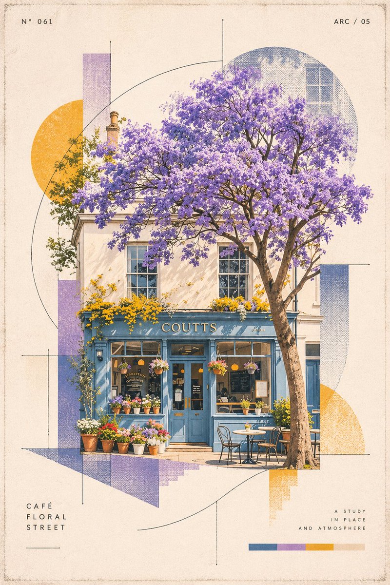
1Transform the uploaded photograph into a standalone, premium-quality 2:3 vertical design poster. The illustration presents an abstract visual symbol derived from the essence of the photographed subject. Make it in slightly light color palette Abstract Visual Identity Extract the photograph's essential visual identity: the subject's silhouette, structure, posture, and narrative relationships. Do not reproduce the entire object literally. Instead, distill these characteristics into a recognizable abstract visual symbol. Use geometric deconstruction, modular forms, linear structures, negative space, and symbolic abstraction to create a distinctive visual identity, similar to a core symbol found in high-end branding and experimental design systems. Focus on the subject's defining character rather than intricate details. Ensure the minimal graphic remains conceptually recognizable and connected to the original photograph. Visual Direction: Post-digital graphic design Deconstructed Swiss design Generative symbol systems Diagrammatic abstraction Incorporate geometric modules, fine lines, curved trajectories, grids, micro-symbols, numbering systems, and abstract nodes to construct a cohesive visual language. Explore the tension between: Order × Error Precision × Handmade Imperfection Digital × Analog Rationality × Emotion Achieve strong visual recognition with minimal elements. Avoid unnecessary complexity. Composition & Layout Maintain an extremely restrained composition. The abstract symbol should be the sole visual focal point, positioned centrally or slightly off-center, surrounded by generous negative space. Avoid multiple decorative icons or infographic-style layouts. The overall aesthetic should reference the visual identities of contemporary art institutions, architecture studios, experimental creative labels, and premium design brands. Typography & Micro-Details Typography should function only as a supporting system component, never as a dominant headline. Optional elements include: Small index numbers Minimal alphabetic codes Short descriptive phrases Subtle annotations connected to the symbol Use refined, understated typography inspired by archival systems, experimental publications, and technical documentation. Color System Extract the photograph's signature colors and reinterpret them as a cohesive brand color palette. Introduce a limited number of high-recognition accent colors as functional visual codes, such as: Teal Blue Magenta Orange Balance these with off-white, warm white, and neutral gray backgrounds. Colors should serve as functional identifiers rather than decoration. Avoid chaotic palettes, cheap neon aesthetics, and generic commercial gradients. Material & Print Texture Integrate subtle physical imperfections and analog printing characteristics, including: Xerox texture Risograph grain Print registration errors Scanner noise Subtle paper texture Introduce delicate print misalignment, grain, scanning artifacts, and imperfect edges to give the digital symbols the tactile quality of physical printed matter. Final Art Direction The final result should extract an independent and self-contained visual DNA from the original photograph. Create a refined, minimal, and culturally evocative abstract logo that communicates a strong identity through carefully controlled geometry, negative space, and a sophisticated visual system. The final poster should feel like a collectible piece of experimental graphic design from a contemporary art institution or independent design publication. Make it quality for the frame printing 50x70 centimeters