Back to Galleryother

14310.5KAug 22, 2026
Prompt
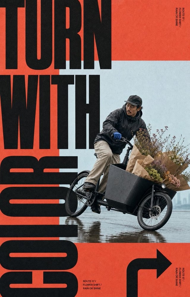
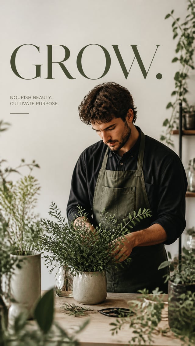
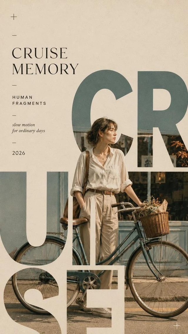
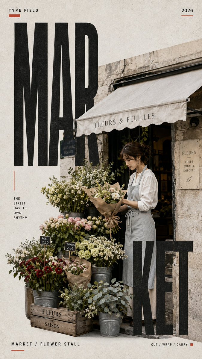
[SCENE]: [Scene] [PEOPLE]: [People] [ACTION]: [Action] [ARCHITECTURE]: [Architecture] [TITLE]: [Title] [ACCENT COLOR]: [Accent Color] [SUBTITLE]: [Subtitle] [FORMAT]: 9:16 Create a vertical editorial poster built around a real everyday moment with visible people, natural interaction, and a distinctive architectural setting. The image should feel like a genuine lifestyle photograph first and a designed poster second. Show the people actively doing something inside the scene, with readable faces, natural expressions, believable body language, and no obvious posing or camera awareness. Use nearby architecture, furniture, objects, plants, signs, boxes, fabrics, flowers, or other real-life details to make the environment feel lived-in and visually rich. Set “[Title]” in oversized bold condensed typography and integrate it directly into the scene. Let people, objects, doorways, awnings, fabric, walls, or architectural lines overlap, interrupt, frame, or pass in front of the letters. Typography should feel embedded in the real space rather than simply placed over the photo. Use a restrained neutral palette with subtle paper and print texture, keeping the image clean rather than heavily distressed. Add [Accent Color] only as a small visual accent. Add only a few meaningful editorial details such as thin lines, small labels, or graphic marks. Avoid random filler text, excessive technical information, numbering, logos, watermarks, sparkles, heavy grunge, and overly clean commercial-ad styling. Overall style: lifestyle photography × editorial poster design × experimental typography × subtle neo-retro print texture.