![High-contrast black and white typographic portrait poster of [Humanoid male robot], shown in side pr](https://images.meigen.ai/cdn-cgi/image/format=auto,quality=85,width=640,fit=scale-down/generations/2026-06/community_2857c0de-b544-43f9-9402-a68d858148a5.png)
Back to Galleryother

1047.3KSep 26, 2026
Prompt
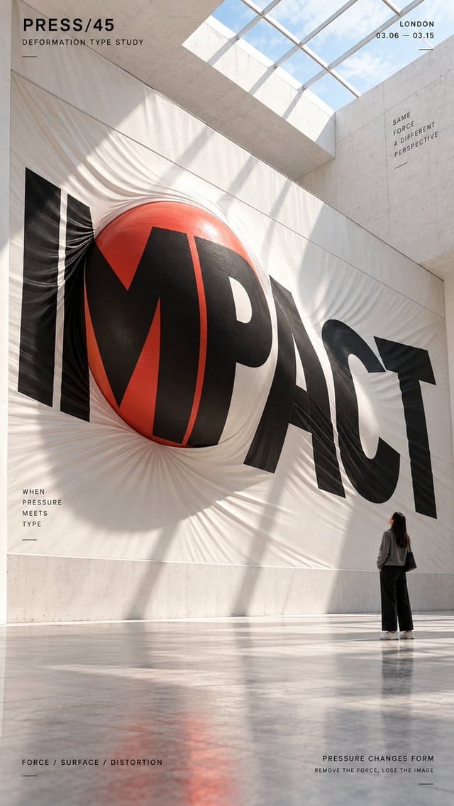
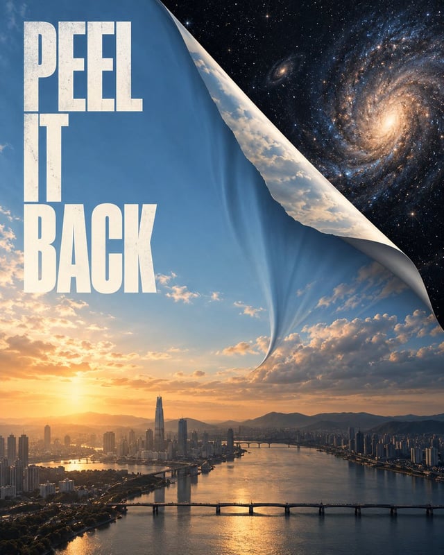
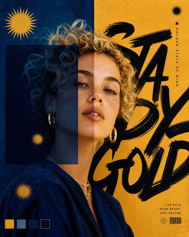
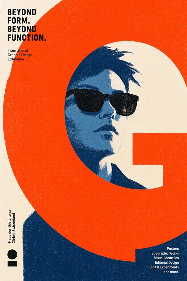
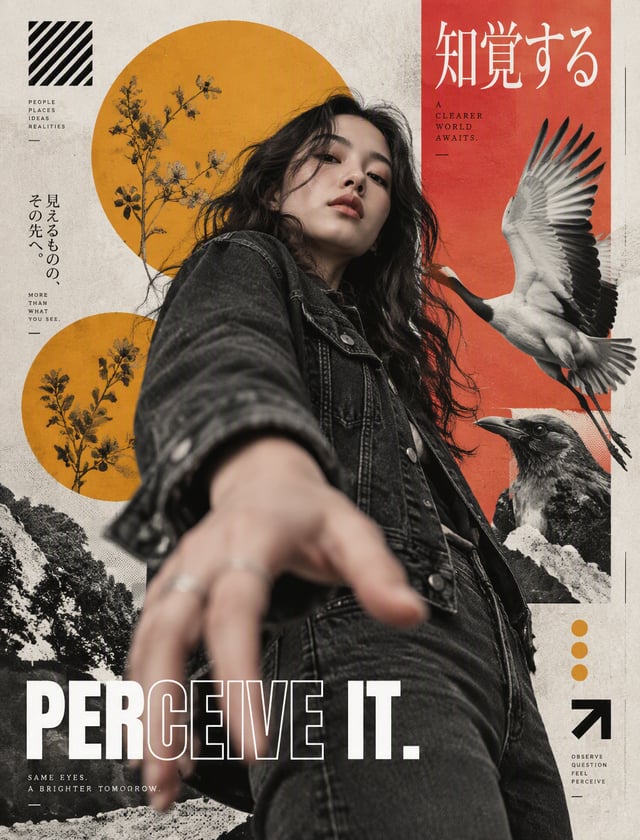
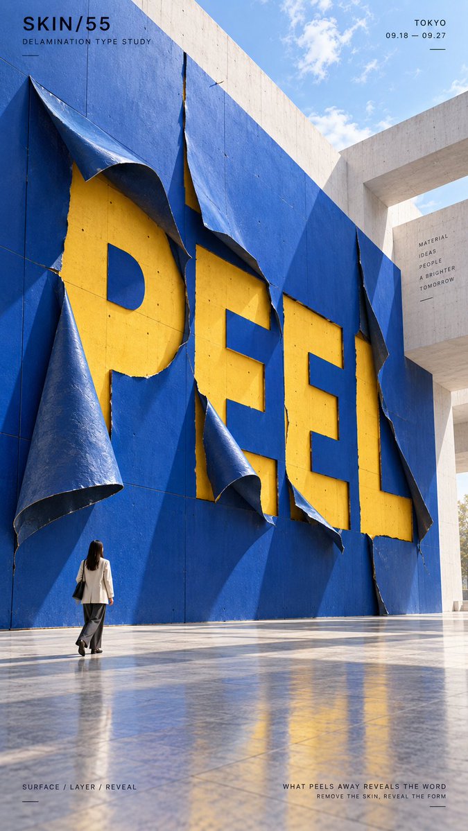
TITLE: [Your Word] PROJECT: [Brand / Exhibition / Campaign] MATERIAL: [Facade Skin / Elastic Membrane / Stone / Plaster / Earth / Other] TRANSFORMATION: [Peeling / Swelling / Erosion / Cracking / Other] HIDDEN LAYER: [Color / Material / None] ENVIRONMENT: [Museum / Outdoor Plaza / Desert / Architecture / Other] SUBJECT: [Small Human Figure / None] MAIN COLORS: [Two to Three Colors] FORMAT: 9:16 vertical poster Create a contemporary material typography poster where the main word is physically generated by the transformation of the material itself. Do not simply print or place the word onto the surface. The typography should emerge through a real material process such as peeling, pneumatic expansion, erosion, cracking, splitting, melting, compression or another believable transformation. The main title should occupy roughly 40–60% of the composition and remain bold, simple and highly readable at thumbnail size. Use large-scale material changes rather than many small decorative details. For peeling, let the outer surface physically lift, curl and separate to reveal a contrasting layer underneath, with the exposed areas forming the typography. For swelling, let internal pressure push a continuous membrane outward so its inflated volumes and pressure valleys create the word. For erosion, remove the outer material through wind, water or weathering so a contrasting inner layer is gradually revealed as readable type. For cracking, let large fractures, broken edges and displaced surface pieces expose a contrasting internal material that forms the word. The transformation should remain physically believable. Show realistic material thickness, tension, depth, shadows, exposed layers, deformation and surface behavior. Keep the word integrated into one continuous material system. Avoid making each letter a separate 3D object. Use one dominant material color, one strong contrasting revealed color, and a restrained architectural or natural environment. The first visual impression should come from large color fields and a clear oversized word. The second impression should reveal how the material transformation actually creates the typography. If a person is included, keep them small and use them mainly as a scale reference. Their pose should feel natural and secondary to the installation. Add only minimal editorial information such as project name, study title, location, date and one short conceptual line. Overall style: material transformation, experimental typography, contemporary installation art, spatial graphic design, architectural photography, editorial poster, strong physicality, clear hierarchy and stop-scroll visual impact. Avoid flat pasted text, ordinary 3D letters, random damage, excessive debris, weak material logic, tiny decorative details, neon sci-fi styling, cluttered environments, excessive filler copy, watermarks and numbering.