
![Vertical editorial collage poster featuring [CHARACTER] in [CLOTHING], full-body cutout positioned a](https://images.meigen.ai/cdn-cgi/image/format=auto,quality=85,width=640,fit=scale-down/generations/2026-08/community_9c2546da-c2ea-4728-9b5e-52ffeeb5642b.png)
![TITLE: [Main Word]PROJECT NAME: [Brand Name]ARCHITECTURAL STRUCTURE: [Architectural Structure]TYPE M](https://images.meigen.ai/cdn-cgi/image/format=auto,quality=85,width=640,fit=scale-down/generations/2026-09/community_9070245a-6b81-4fe8-9a7f-e04ec41cf255.png)
Back to Galleryother

914.7KSep 12, 2026
Prompt
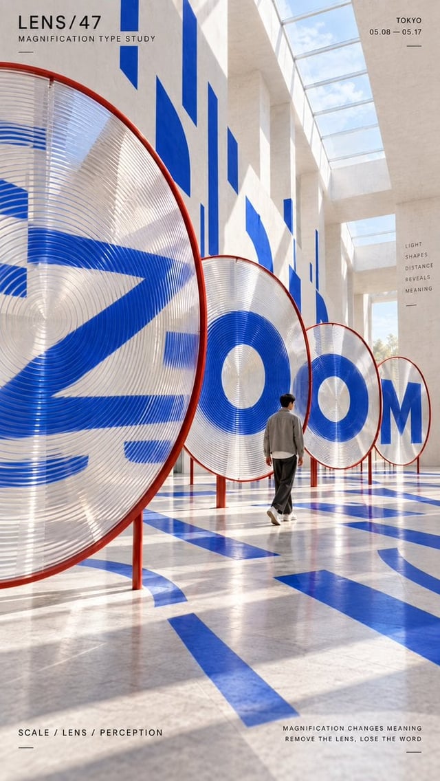
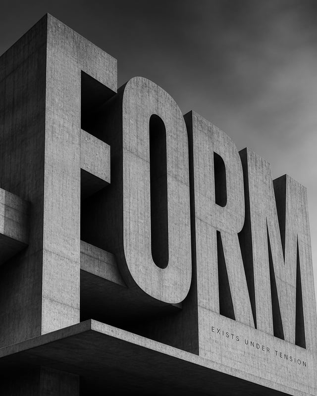
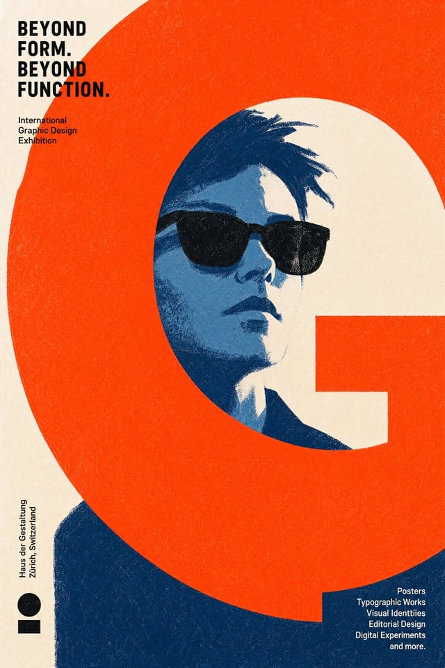
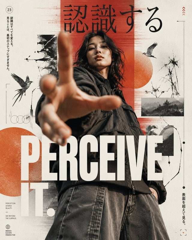
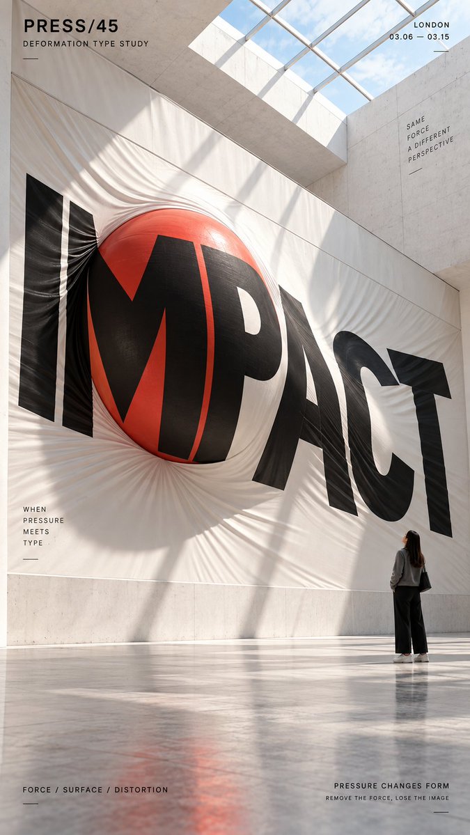
Create a 9:16 vertical poster in a clean contemporary museum-like architectural space, with minimal editorial typography and a small human figure for scale. The style should feel like a high-end exhibition poster: pale stone or concrete surfaces, strong daylight, crisp shadows, refined composition, and a calm but striking atmosphere. Make the word itself become the installation, fully integrated into space. Add small English micro-copy in the corners like a design study poster, but do not add any copyright marks or page numbers. 1. PRESS Use a deformation concept. Show the word “IMPACT” stretched across a large white tensile membrane wall, with a giant red sphere pushing forward from behind the surface so the fabric bulges outward and distorts the typography. The letters should feel pulled, compressed, and tensioned by the pressure. The result should feel physical, dramatic, and instantly readable. 2. TWIST Use a torsion concept. Build the word “TWIST” as a row of tall vertical panels or columns that rotate along their central axis. Each element should carry blue and yellow graphic surfaces, and together they should reveal the full word through twisting alignment. The feeling should be bold, graphic, and highly sculptural. 3. FOLD Use a folded-plane concept. Build the word “FOLD” across a sequence of large hinged standing panels in a bright museum hall. Each panel should pivot at a slightly different angle, so the letters are split and reassembled across the folding surfaces. Use a blue, white, and red palette. The image should feel crisp, architectural, and strongly graphic. 4. BALANCE Use an equilibrium concept. Build the word “BALANCE” from suspended blue geometric letter components hanging from a black structural framework, with orange counterweights, rods, and pendulum-like elements. The composition should suggest weight, tension, and precise mechanical balance. The result should feel intelligent, physical, and visually clean.