Back to Galleryother

10235Sep 18, 2026
Prompt
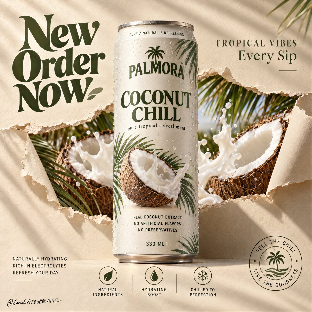
A hyper-real premium beverage poster advertisement for a fictional tropical drink brand called PALMORA, designed as a clean Orbit-plus-Port key visual where the real can remains the absolute hero and the supporting world is reduced into elegant, high-impact structural layers. A tall slim beverage can stands perfectly centered and upright against a warm sand-beige paper backdrop, front-facing and dominant. The can is chilled with fine condensation, subtle aluminum texture, and crisp premium print design. Behind and partially around the can, the paper surface appears torn open in a controlled horizontal rupture, revealing a vivid inner tropical layer of split coconuts, creamy coconut splash, and palm fronds. The tear feels designed rather than chaotic, like a branded reveal window cut through the surface. Framing and composition: vertical poster layout, strict central hierarchy, oversized hero can in the middle, broad negative space in the upper-left for a large graphic headline, smaller premium copy in the upper-right, and a minimal icon-information system aligned along the lower area. Keep the can silhouette untouched and clearly readable. The torn-paper reveal should sit behind the can as a sculptural horizontal band, with curled paper edges on the left and right creating depth and tactile material contrast. Preserve the reference logic of central product, torn reveal, large graphic headline, and bottom icon strip, but simplify and refine every peripheral element for a more curated poster feel. Product design: create a premium tropical coconut drink can with a matte off-white body, deep olive-green brand typography, soft warm-grey metal rim, natural condensation droplets, and a restrained botanical print system featuring palm leaf shadows and one clean coconut visual. Main front label reads exactly: "COCONUT CHILL". Small top ring text reads exactly: "PURE / NATURAL / REFRESHING". Subline beneath the main title reads exactly: "pure tropical refreshment". Ingredient copy in the lower body reads exactly: "REAL COCONUT EXTRACT", "NO ARTIFICIAL FLAVORS", "NO PRESERVATIVES". Bottom volume mark reads exactly: "330 ML". The can must feel globally market-ready, tactile, and beautifully branded. Reveal layer and supporting elements: inside the torn-paper opening, show hyper-real split coconuts with fibrous brown shells, bright white flesh, and dynamic but controlled coconut milk splash forms. Add a few palm fronds entering from the top-right and lower-left edges, but keep them sparse and elegant. This inner reveal should feel like a distilled tropical world, not a cluttered collage. The splash and coconuts must support the can, never overpower it. Keep the overall sensation fresh, breezy, creamy, and premium. Lighting and color: soft directional commercial key light from upper left, warm natural fill from front, subtle shadows cast by palm leaves across the paper background, and refined highlight roll-off on the can body and splash edges. Palette balance: 60% warm sand-beige paper and off-white can body, 30% coconut brown and creamy white splash, 10% olive green typography and botanical accents. Build enough contrast so the can volume, paper tear edges, and coconut textures feel dimensional, while avoiding muddy neutrals or dead shadow patches. Materials and finish: hyper-real product photography fused with tactile paper-set design. Show soft matte paper fibers and curled torn edges, realistic chilled aluminum, tiny condensation beads, fibrous coconut husk detail, smooth white coconut flesh, glossy milk splash, and clean print fidelity on the can. The final image should feel like a Cannes-level beverage launch campaign: minimal, tactile, tropical, and sharply art-directed. Typography: all visible ad copy in English only, integrated into the poster as premium graphic design. Upper-left oversized graphic headline reads exactly: "New Order Now" in a bold retro-organic display style, large and sculptural. Upper-right premium tagline reads exactly: "TROPICAL VIBES" and beneath it exactly: "Every Sip". Lower-left small support copy reads exactly: "NATURALLY HYDRATING", "RICH IN ELECTROLYTES", "REFRESH YOUR DAY". Bottom-center icon labels read exactly: "NATURAL INGREDIENTS", "HYDRATING BOOST", "CHILLED TO PERFECTION". Lower-right circular seal reads exactly: "FEEL THE CHILL / LIVE THE GOODNESS". Keep typography art-directed, spacious, and harmonized with the can branding, always clear of the core product silhouette. Output and constraints: polished premium beverage poster, product-first composition, no copied original brand names, no people, no unrelated props, no cluttered tropical overload. Keep the can geometry correct, typography crisp, tear edges believable, coconut anatomy realistic, splash physics controlled, and the overall visual language calm, premium, and clean. Avoid warped can proportions, unreadable label text, excessive palm leaves, muddy beige cast, dirty whites, chaotic splashes, broken paper physics, cheap stock-ad aesthetics, AI gibberish text, or drift away from high-end commercial realism.