Back to Galleryother

15578Sep 7, 2026
Prompt
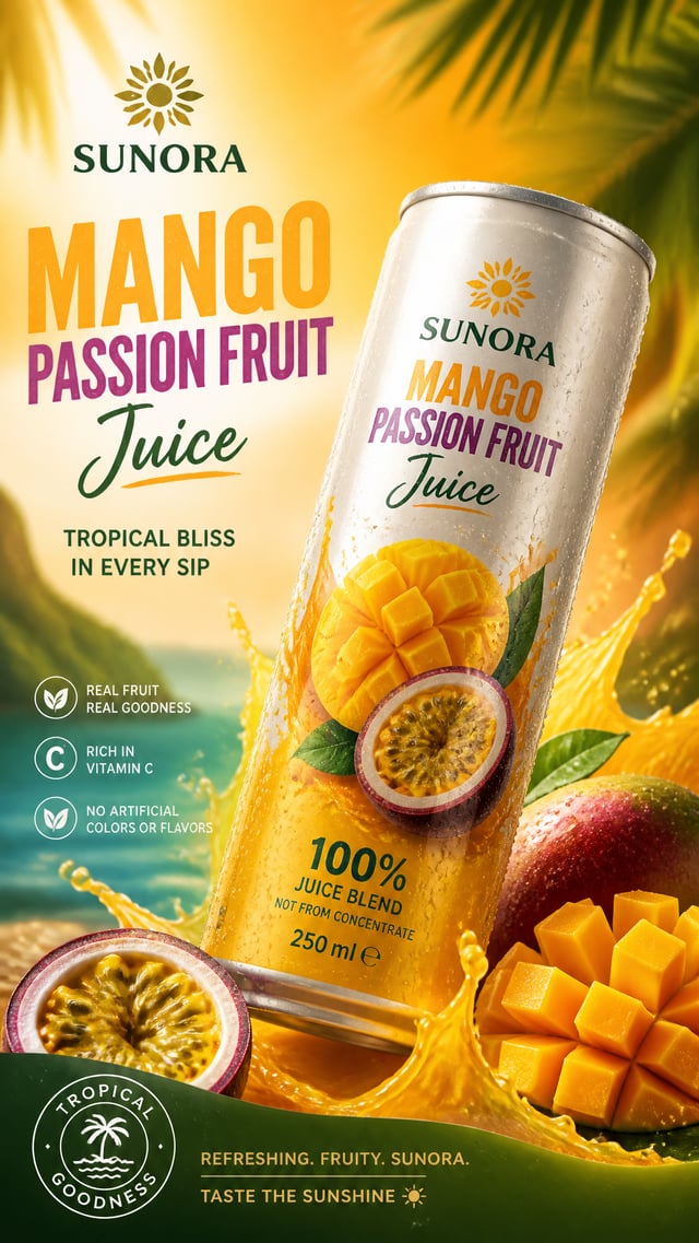
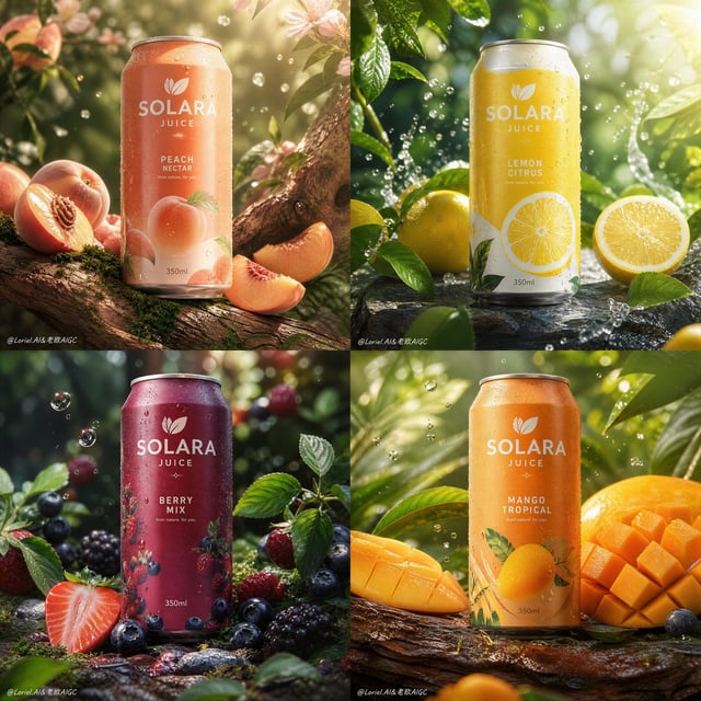
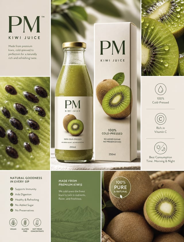
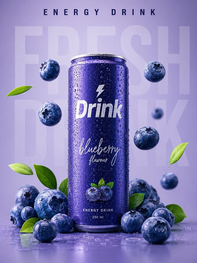
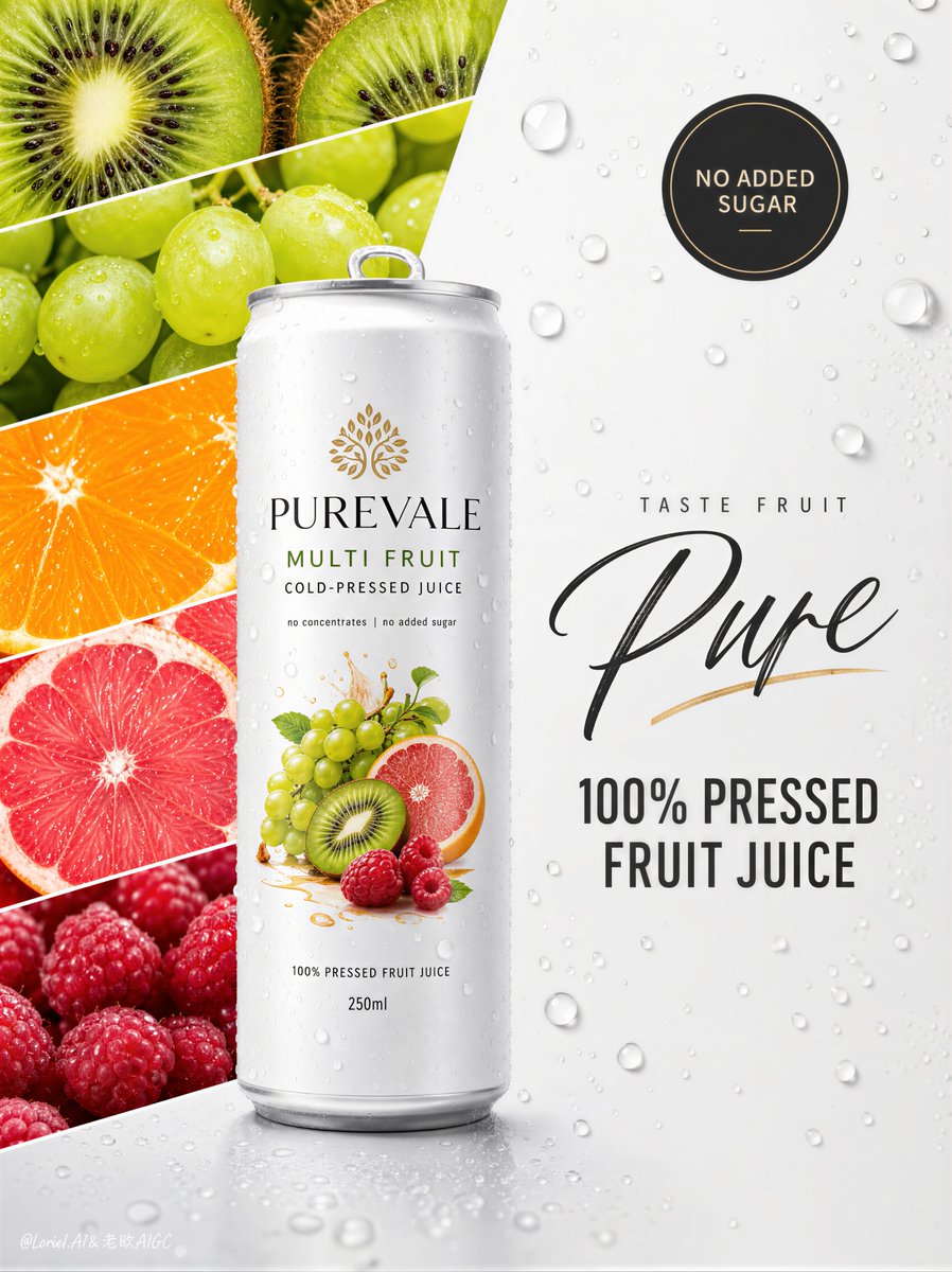
Create a Cannes-level flagship beverage advertising poster for an original premium juice brand named PUREVALE, featuring a slim white can product called PUREVALE Multi Fruit Pressed Juice. Build the image with refined Orbit flow and clean Transit reduction, preserving the exact split-layout logic while elevating it into a more international premium wellness-beverage key visual. Core composition: Square poster format with a disciplined two-zone structure: 1. left side: a vertical stack of clean diagonal fruit-image bands 2. right side: a spacious white premium field with subtle dimensional water droplets Place one tall slim white can slightly left of center, overlapping the split between both zones, making it the absolute hero and visual anchor. Orbit structure: Design the composition so the eye moves in a clear premium loop: upper fruit bands -> descending diagonal fruit rhythm -> hero can -> right-side script headline -> bold juice claim -> circular “no added sugar” badge -> back toward the can. Use the angle of the fruit strips, the vertical pull of the can, the spacing of the typography, and the droplet field to create a calm but continuous circulation. The orbit should feel elegant, refreshing, and product-centered. Transit reduction: Keep the layout highly edited and internationally refined. Reduce the fruit bands to 4 or 5 of the strongest flavor cues only, with no unnecessary clutter or extra icons. Keep the right side spacious and clean, using only one main headline system, one circular claim badge, and minimal footer information. The final image should feel closer to a luxury wellness launch visual than a retail juice flyer. Left-side fruit architecture: Use 4-5 sharply cut diagonal fruit strips with crisp geometric spacing and premium macro realism: - kiwi cross-section with luminous seeds and radial texture - green grape cluster with translucent skin - orange slices with glowing citrus pulp - pink grapefruit cross-sections with juicy segment detail - raspberry texture for one rich red accent The fruit bands should feel vibrant yet controlled, forming a fresh energy wall that supports the hero can without overwhelming it. Hero product logic: At center-left, place one hyper-realistic slim white aluminum can of PUREVALE Multi Fruit Pressed Juice, front-facing with subtle three-quarter volume. The can must feel ice-cold, contemporary, and premium: - smooth matte-white coated aluminum - precise rim and pull-tab geometry - soft condensation and clean highlights - elegant fruit illustration cluster on-pack - refined modern label hierarchy Front can text should read: PUREVALE MULTI FRUIT COLD-PRESSED JUICE Optional supporting line: “no concentrates | no added sugar” The can must dominate the composition and feel globally publishable. Right-side premium field: Use a clean white-to-soft-silver surface with restrained water droplets of varying size, naturally scattered with soft shadowing and gentle specular highlights. Keep the right side airy, polished, and calm to support typography and premium negative space. Typography system: On the right side, place a concise premium headline system: Small line: “TASTE FRUIT” Large expressive word: “Pure” Below in bold uppercase: “100% PRESSED FRUIT JUICE” At the upper right or upper-center-right, place a dark circular badge reading: “NO ADDED SUGAR” Typography must feel art-directed, elegant, and globally premium, with strong spacing and no visual noise. Lighting structure: Use bright soft studio lighting: - broad frontal key light for crisp can readability - gentle illumination across fruit bands to enhance freshness - controlled highlight rolloff on droplets and can rim - subtle grounding shadow beneath the can The result should feel fresh, premium, and highly photographic. Material language: Juicy fruit flesh, translucent grape skin, citrus membrane detail, seeded berry texture, matte-white aluminum, soft condensation beads, dimensional water droplets, and clean luxury poster background. Every surface must feel tactile, credible, and premium. Color hierarchy: White, silver-gray, kiwi green, grape green, citrus orange, grapefruit pink, berry red, and restrained charcoal typography. The palette should feel fresh, clean, energetic, and globally refined. Emotional tone: Pure, restorative, fresh, health-forward, modern, optimistic, premium, product-first. Rendering medium and quality anchors: Ultra-realistic premium product photography fused with high-end FMCG poster design, editorial still-life precision, luxury beverage campaign finish, exact can geometry, tactile fruit realism, pristine hierarchy, award-level commercial composition, world-class image quality. Structured negative prompt: cheap juice ad, cluttered fruit collage, unreadable can label, warped can shape, broken pull-tab geometry, fake condensation, plastic-looking fruit, muddy citrus texture, oversaturated colors, noisy typography, too many claims, low-detail droplets, flat white background, ecommerce-style layout, low-end flyer design, corrupted text, duplicated fruit slices, perspective errors, style drift, low-resolution render