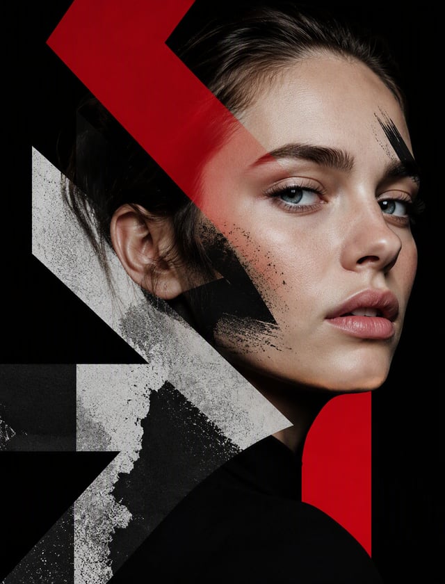
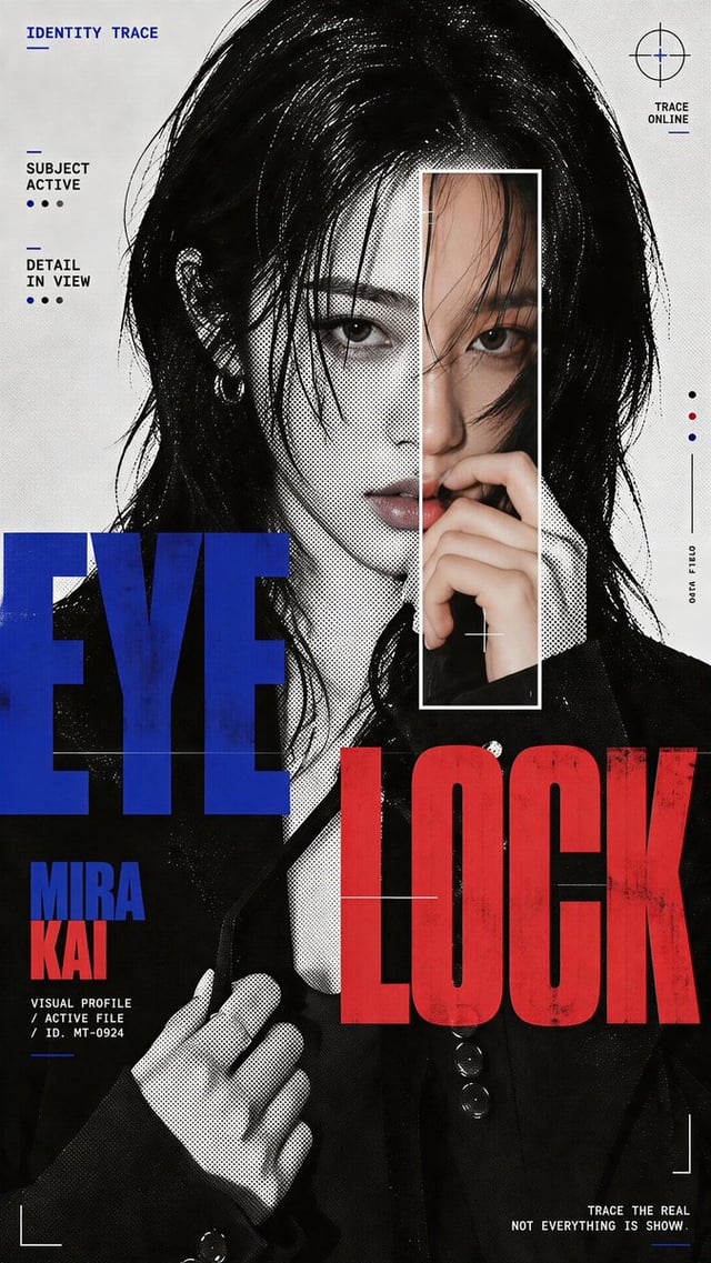
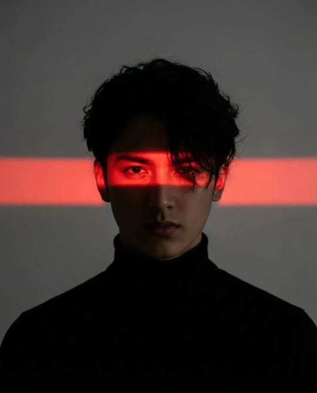
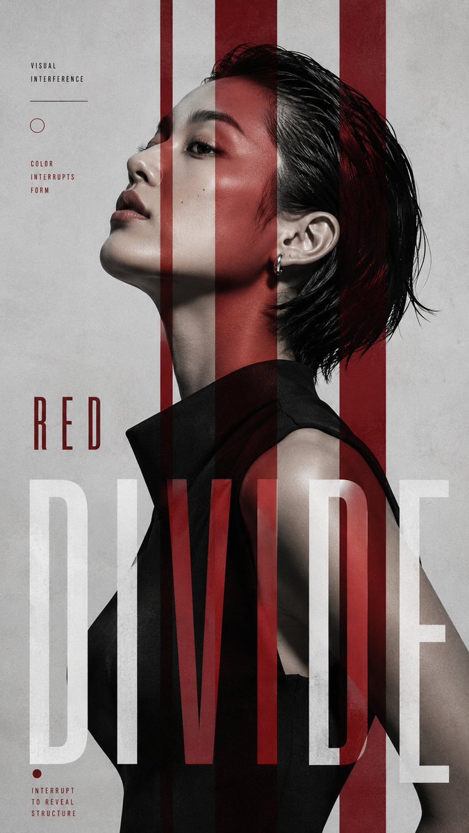
![Editorial poster featuring [CHARACTER] in strict left-facing profile, cropped from mid-torso, with [](https://images.meigen.ai/cdn-cgi/image/format=auto,quality=85,width=640,fit=scale-down/tweets/2084833680560947268/0.jpg)
Back to GalleryGPT Image

15216.7KAug 23, 2026
Prompt
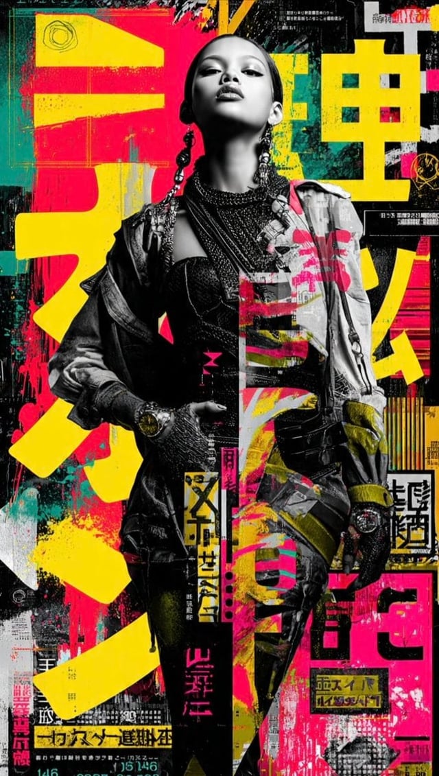
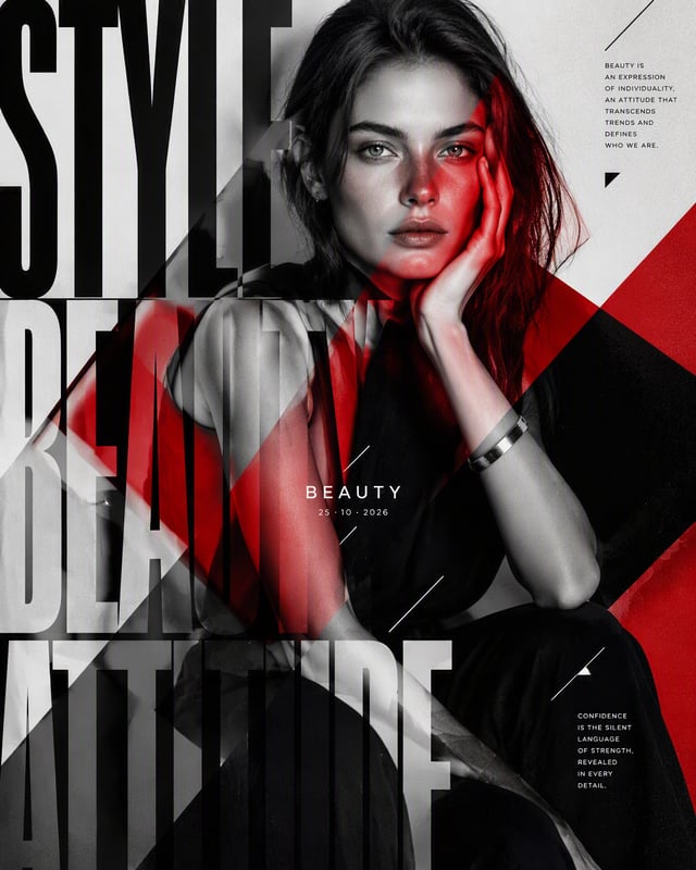
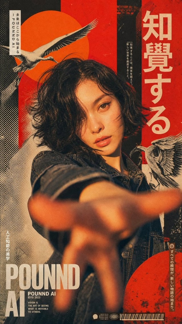
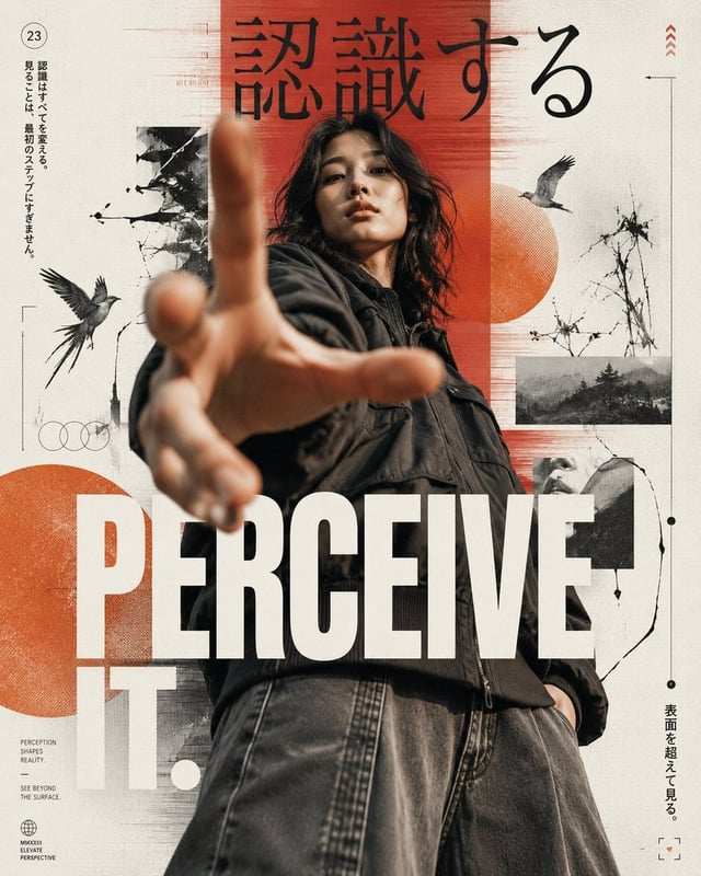
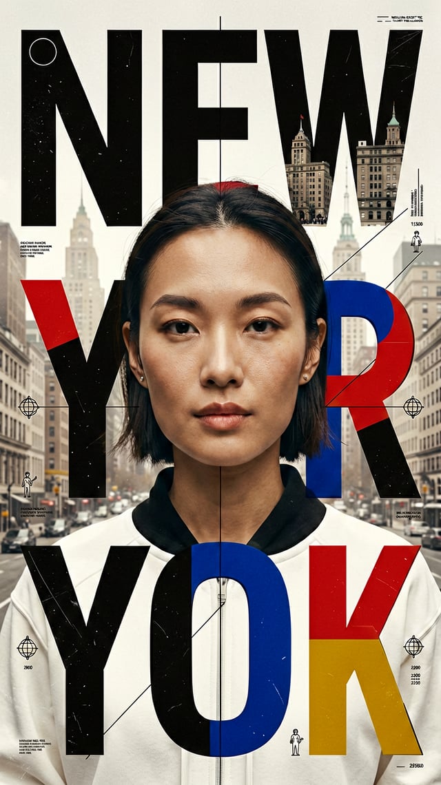
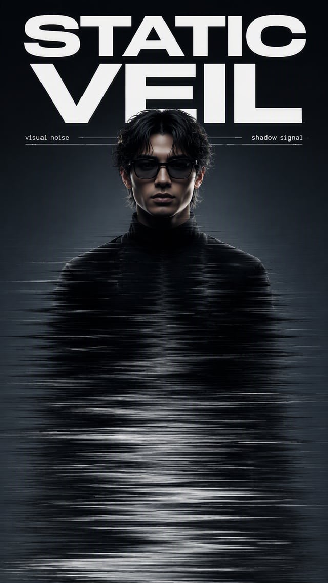
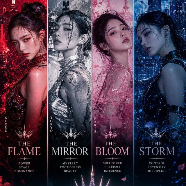
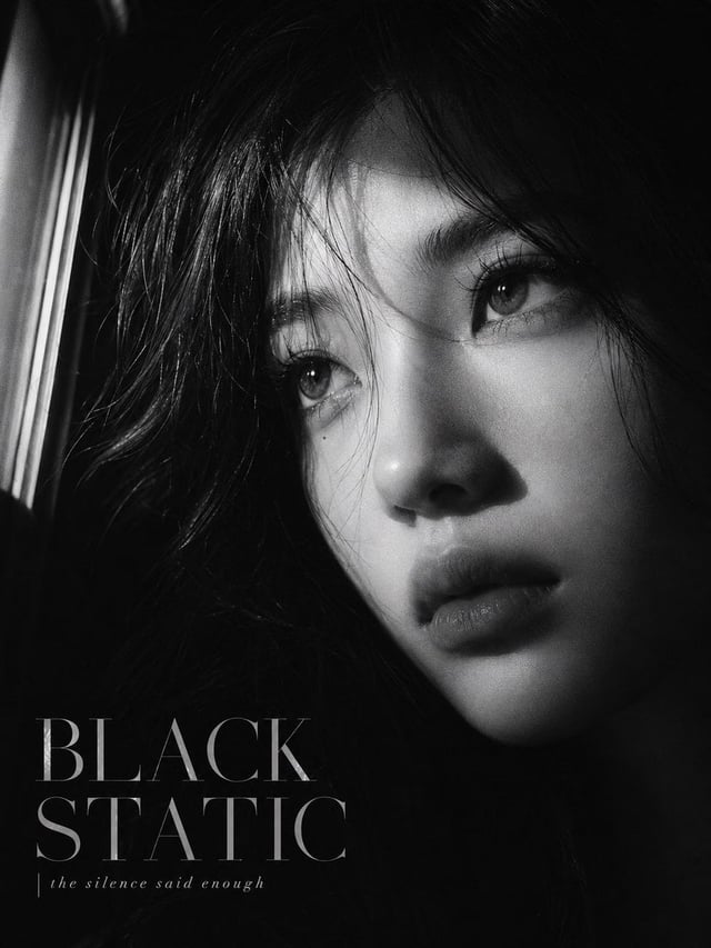
Subject: [Adult Male Or Female Portrait] Interference: [Color Split / Narrow Light Beam / Horizontal Cut / Motion Veil] Title: [Title] Palette: [Main Neutral Tones Plus One Accent Color] Mood: [Sharp / Cinematic / Restrained / Experimental] Create a 9:16 experimental editorial portrait poster where the photography is interrupted by one strong visual intervention. Start with a striking close or waist-up portrait. Keep the subject large in frame, with clear facial emotion, natural skin texture, realistic hair and a strong silhouette. The portrait should already work as a fashion photograph before any graphic elements are added. Choose only one main interference method. For a color split, use uneven translucent bands that pass through the face and body, selectively revealing or shifting color rather than simply covering the portrait. For a light intervention, keep most of the scene cool and restrained, then let one narrow beam of light cut across the eyes, nose or cheek and continue naturally through the surrounding space. For a horizontal cut, divide selected parts of the face or body with bold graphic bands and oversized typography, using the cuts to reorganize the portrait rather than making a simple collage. For a motion veil, keep the main portrait sharp while selected areas such as the eyes, mouth or shoulders stretch into soft horizontal motion trails. It should feel like photographic displacement, not a digital glitch. Typography should be part of the composition. Use one strong headline, allow letters to crop off the canvas, overlap the subject, disappear behind the body or change as they pass through the interference area. Keep supporting text minimal — one series label and one short phrase are enough. Use a controlled palette with mostly black, white, grey or deep neutral tones, plus one accent color. Keep skin tones natural and avoid overly warm or yellow grading. Add only a few fine lines, circles or open corner marks if needed. The final image should feel like a fashion editorial, contemporary poster or art-direction experiment rather than a template. Avoid multiple competing effects, dense micro-text, obvious UI graphics, heavy glitch effects, random collage, numbering, Vol./Issue labels, four-point sparkle symbols, logos or watermarks.