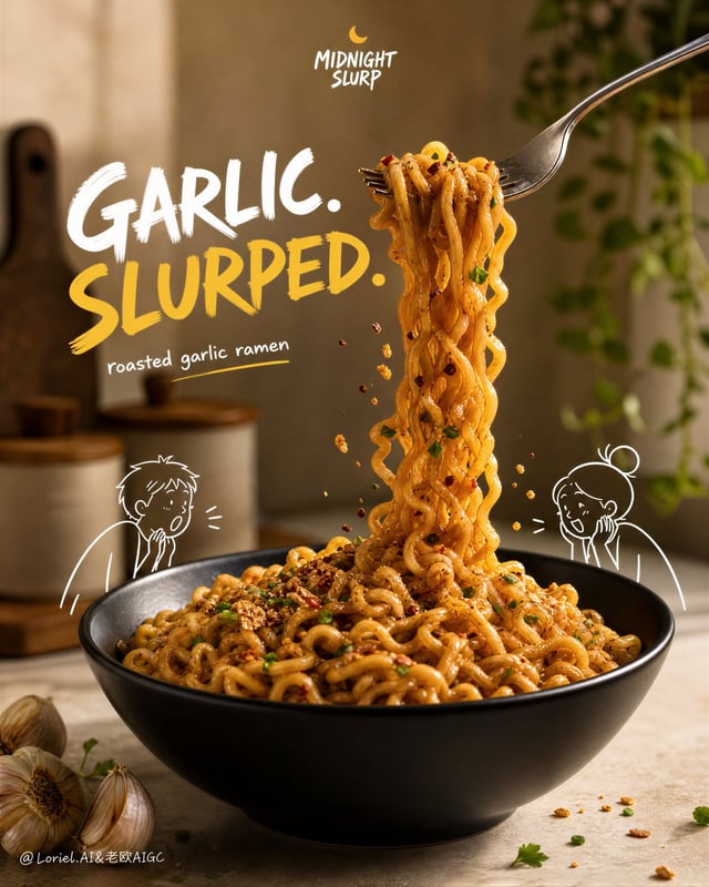
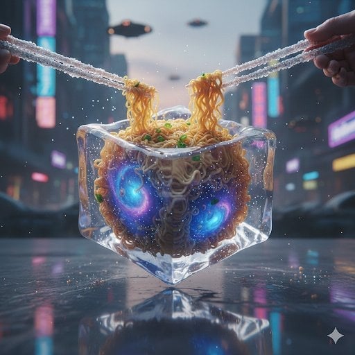
![Brand: [BRAND NAME]](https://images.meigen.ai/cdn-cgi/image/format=auto,quality=85,width=640,fit=scale-down/tweets/2101330066294599974/0.jpg)
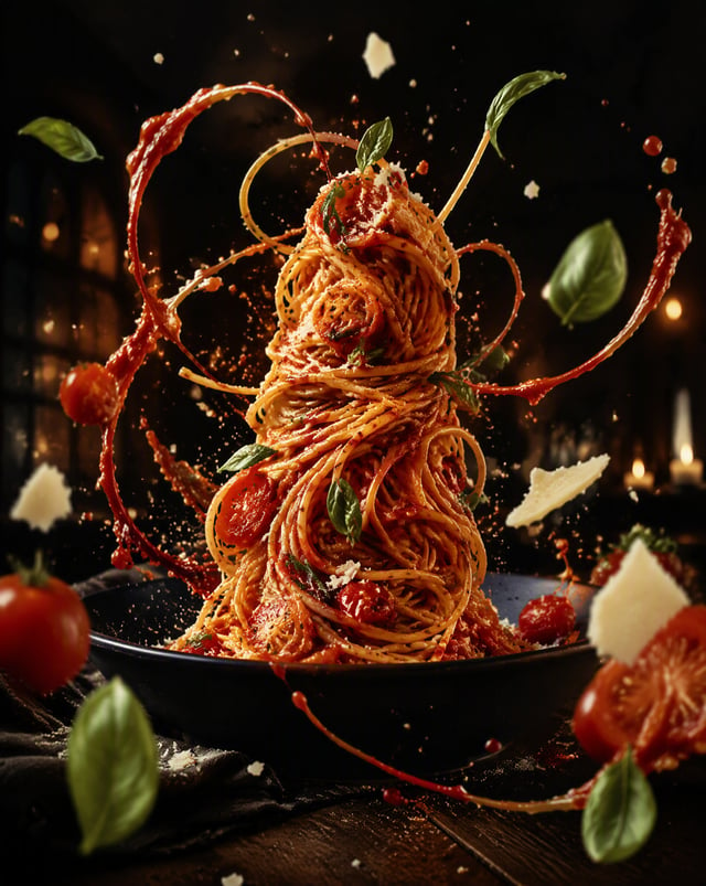
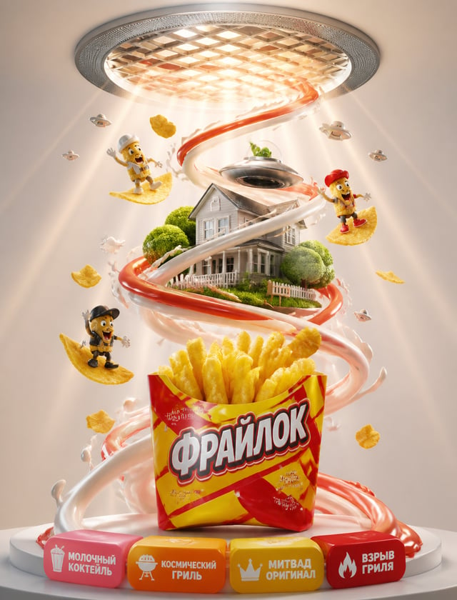
![Ultra-high-resolution 8K cinematic commercial food advertisement of **[BRAND NAME] instant noodles**](https://images.meigen.ai/cdn-cgi/image/format=auto,quality=85,width=640,fit=scale-down/tweets/2008810720826478640/0.jpg)
Back to Galleryother

6341Aug 19, 2026
Prompt
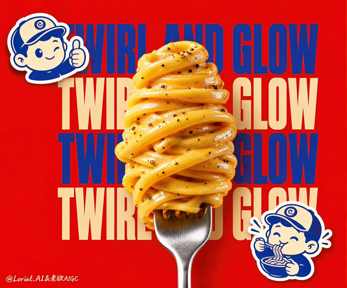
Create a Cannes-level premium poster for a fictional pasta snack brand called TWIRLA, refined into a more internationally polished and more symbolically distilled pop-commercial campaign image. Square format, ultra-clean composition, vivid high-saturation background, one monumental fork-twisted noodle tower in the center as the absolute product hero, a controlled repeated slogan wall behind it, and only a minimal number of playful mascot stickers as accent symbols. The whole image must feel iconic, youthful, addictive, and globally campaign-ready. Push the Transit direction strongly: simplify the layout, reduce visual noise, keep the typography cleaner, control the highlight intensity on the noodles, and make the whole image feel more premium and more editorial rather than simply loud. Push the Port direction strongly: compress the poster into four dominant symbols only, the central noodle tower, the repeated slogan wall, the upper-left mascot sticker, and the lower-right slurping mascot sticker. Everything else must remain highly subordinate. Main food hero: Place one tall vertical silver fork rising from the bottom center, with thick buttery glossy noodles tightly wrapped into a single sculptural spiral mass. The noodles must feel rich, smooth, elastic, indulgent, and extremely realistic, with visible black pepper flakes, soft sauce sheen, subtle oil gloss, and beautiful pasta surface texture. The food should read instantly as one edible monument. Keep the noodle shape tighter, cleaner, and more iconic than a messy food styling shot. Typography wall: Behind the noodle tower, create a layered repeated slogan backdrop using original words only, such as “TWIRL AND GLOW” or “BOWL AND BLISS.” Use large stacked retro-inspired lettering in alternating cobalt-blue and cream, partially hidden by the noodles so the typography acts like branded architecture. Keep the type bold and memorable, but slightly cleaner and more restrained than a noisy poster. No copied wording. Mascot stickers: Add only two flat cartoon-style sticker mascots with thick white outlines: one near the upper-left and one near the lower-right. They should feel like playful brand seals, rendered in a simple blue-and-cream style, one giving an approving gesture and one joyfully eating noodles. Keep them minimal and highly iconic so they support the branding without clutter. Lighting and realism: Render the noodles with premium studio lighting: soft frontal illumination, gentle top highlights, subtle shadow shaping, refined sauce reflections, and crisp metal reflections on the fork. The realistic food must contrast beautifully with the flat graphic background and mascots. Keep all shadows clean and controlled. Color system: Use a vivid tomato-red background, creamy yellow noodles, polished silver fork, cobalt-blue typography, cream text blocks, and blue-white mascot stickers. The palette should remain high-energy but more internationally premium and better controlled. Style: Premium snack-food launch poster, pop-graphic campaign, real food fused with flat mascot illustration, typography-as-stage, youth-market branding with flagship polish, bold but clean, highly memorable, award-level commercial design. Negative prompt: no copied text, no existing brand names, no messy layout, no low-detail noodles, no weak food gloss, no broken fork shape, no muddy shadows, no black blotches, no cheap cartoon feel, no cluttered background, no extra props, no watermark, no existing logos.