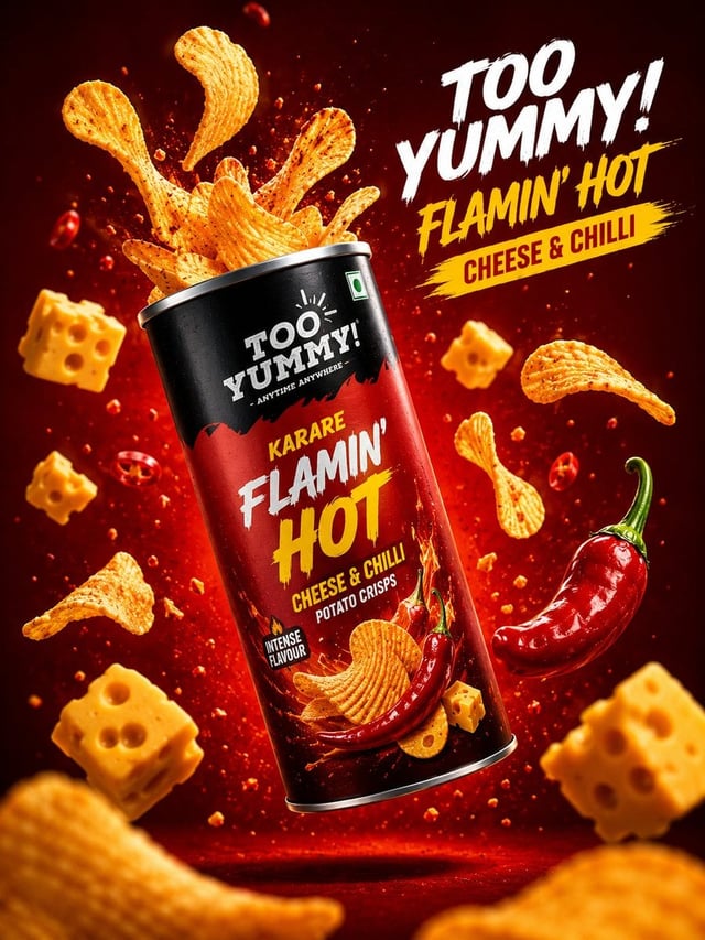
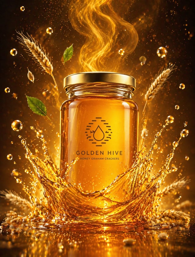
![Dynamic flavor wave composition of [FOOD], with colorful energy ribbons, mist, and motion streaks bu](https://images.meigen.ai/cdn-cgi/image/format=auto,quality=85,width=640,fit=scale-down/tweets/2013636630842876150/0.jpg)
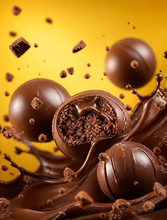
![[Floating Chocolate Explosion]](https://images.meigen.ai/cdn-cgi/image/format=auto,quality=85,width=640,fit=scale-down/tweets/2051919777942155416/0.jpg)
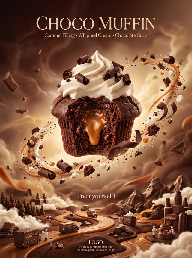
Back to Galleryother

13397Aug 19, 2026
Prompt
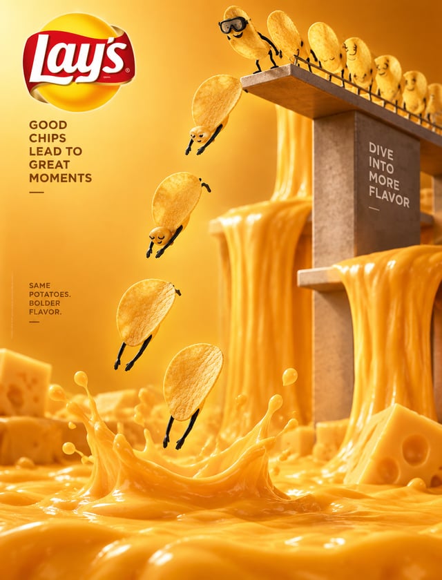
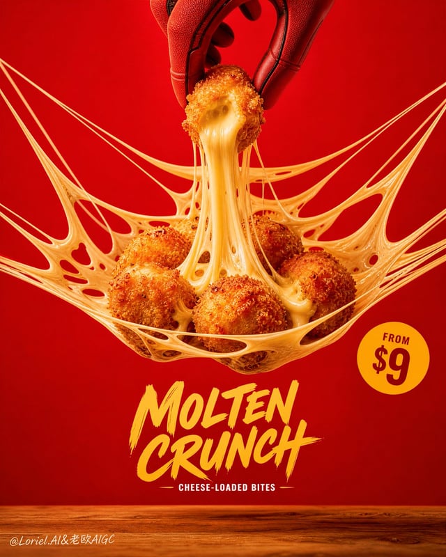
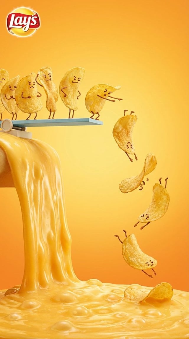
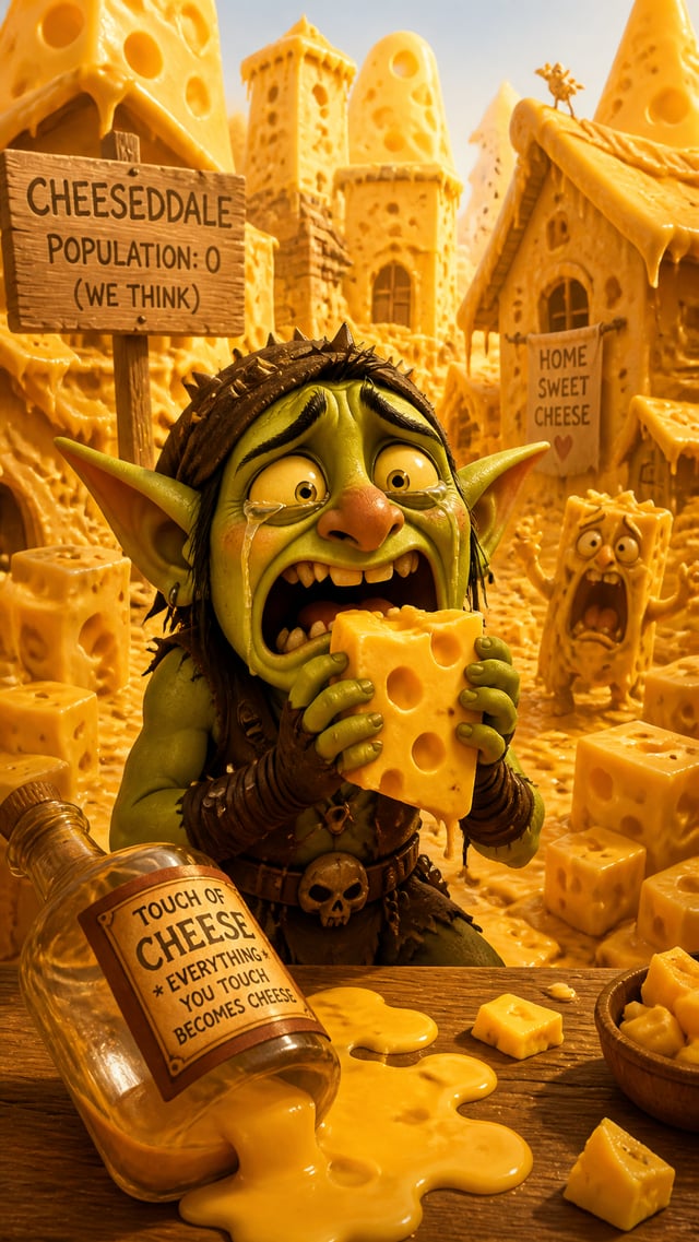
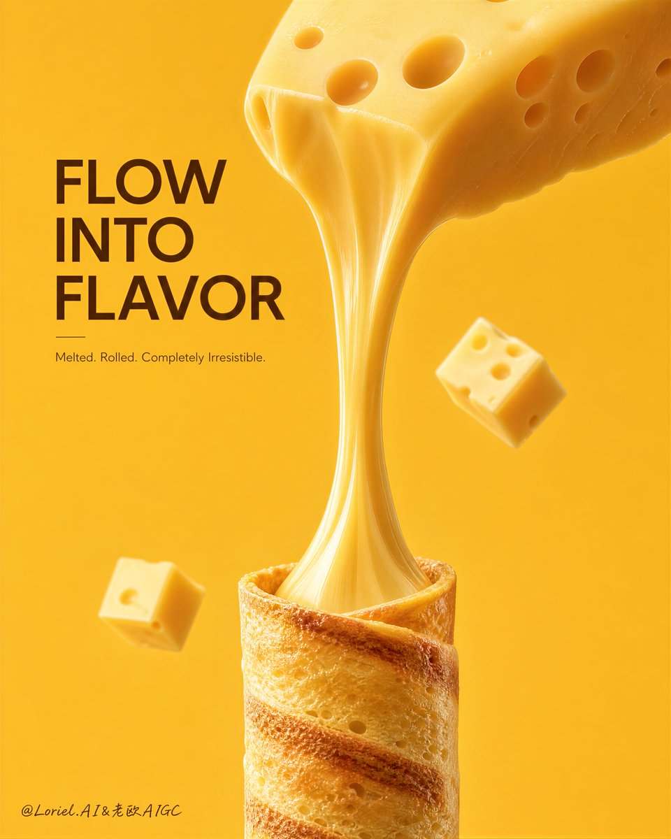
Create a premium vertical food advertising poster for a fictional snack brand called MELTORA, combining stronger Orbit tension with more refined Transit luxury. Preserve the original structural logic exactly: a warm monochrome yellow background, one clean headline block in the upper-left, one giant melted cheese stream descending from a large cheese wedge at the top into a crispy rolled wafer snack at the bottom center, and one or two smaller floating cheese cubes for balance. The whole image must feel bold, clean, indulgent, and internationally premium, with the cheese-pull acting as the central visual axis. Main food story: At the top, place one oversized Swiss-style cheese wedge entering diagonally from the upper-right, with realistic rounded holes, pale creamy-yellow tone, subtle matte texture, and soft edge gloss. Strengthen the Orbit direction by making the wedge feel like it is pressing downward with more force, while the cheese stream stretches with stronger vertical tension toward the rolled snack below. The melted cheese should form one long elegant central pull, thick and silky, with believable elasticity, soft narrowing and widening, luxurious viscosity, and beautiful highlight rolloff. The pull must feel physically intense but clean, like a premium visual ribbon of molten cheese. At the bottom center, place one vertically standing crispy rolled wafer or crepe-like tube receiving the cheese. The roll should have toasted golden bands, fine crisp texture, delicate porous surface, and warm bakery realism. Additional composition: Place one or two smaller cheese cubes around the main axis as restrained support accents, softly lit and secondary. Keep the rest of the background empty and highly controlled. Reduce any unnecessary decorative noise so the eye is immediately captured by the downward cheese flow. Typography and branding: In the upper-left, place one original bold English headline such as “MELT WITH PURPOSE” or “FLOW INTO FLAVOR,” fully original and not copied. Add one smaller original subtitle line beneath it. Typography should feel cleaner, more elegant, and more internationally premium than a typical snack ad. If a tiny brand mark is included, keep it minimal and fully original. Lighting and realism: Use soft premium studio lighting with controlled upper-side and frontal illumination. The cheese wedge and cheese pull must receive the strongest light shaping, showing creamy density, elastic smoothness, and luxurious volume. The rolled snack should have soft warm inner shadow and refined texture detail. Strengthen the light-shadow relationship enough to make the cheese pull feel like a true central monument against the monochrome field, but keep everything bright, polished, and uncluttered. Style: Cannes-level snack-food commercial poster, premium dairy-snack branding, ultra-clean studio food photography, minimal but dramatic composition, flagship FMCG launch visual. Orbit energy comes from the stronger downward cheese force and central pull tension; Transit refinement comes from cleaner typography, tighter palette control, and more luxurious material realism. Color system: Warm butter-yellow background, creamy cheese yellow, golden toasted wafer tones, pale soft shadows, and warm brown headline text. Keep the palette tightly controlled, elegant, and appetite-rich. Negative prompt: no copied headline, no existing brand names, no cluttered props, no messy melted cheese, no broken cheese physics, no low-detail waffle texture, no muddy shadows, no black blotches, no dirty background, no cheap mockup look, no watermark, no extra objects, no existing logos.