Back to GalleryGPT Image
Prompt
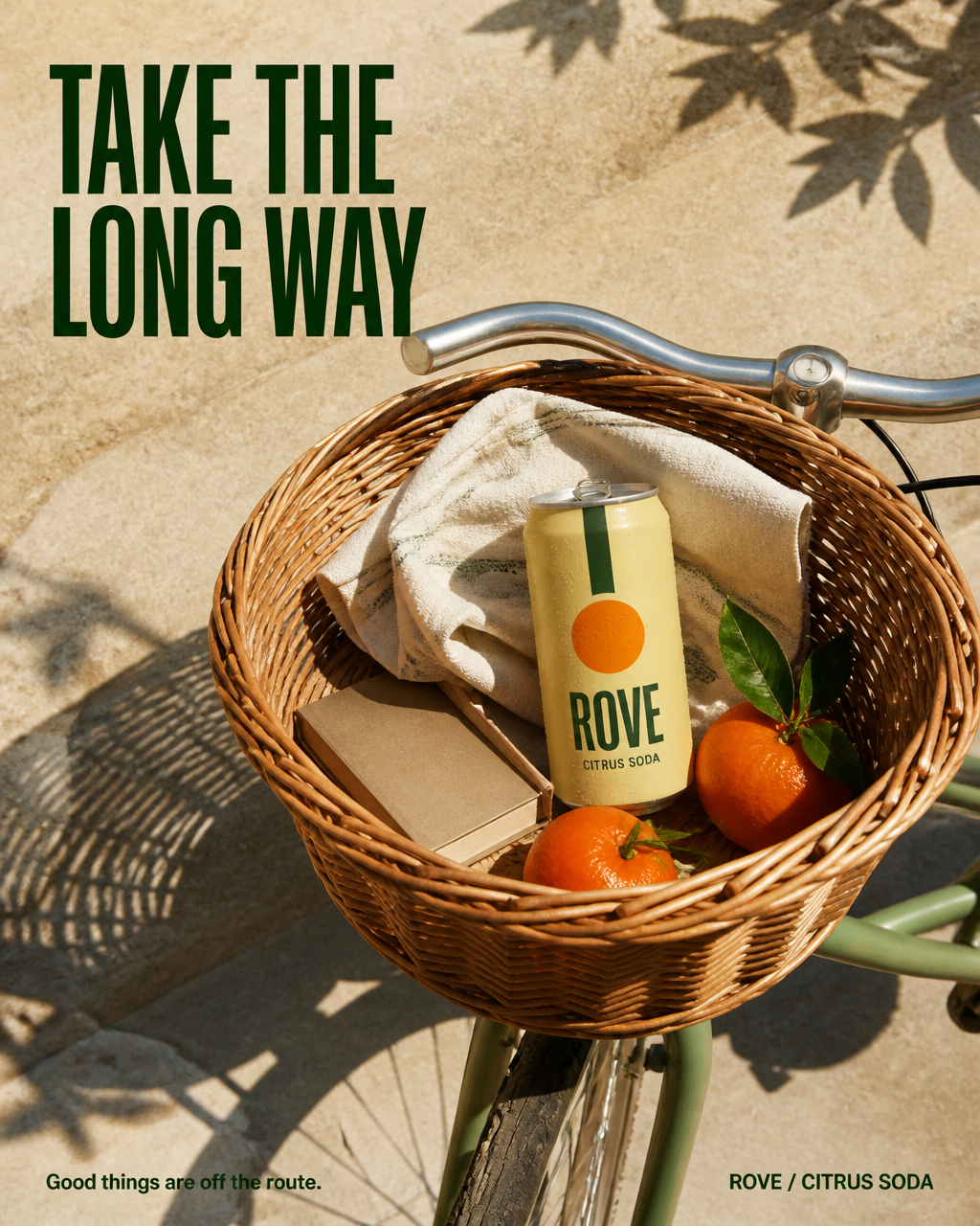
Create a finished vertical 4:5 advertising photograph with integrated editorial typography for a fictional sparkling citrus drink named "ROVE". Campaign idea: "TAKE THE LONG WAY". The product belongs naturally to a small afternoon adventure, not a generic studio packshot.SCENE AND CAMERA: a carefully composed top-down photograph of the front basket of a stationary sage-green city bicycle parked on a pale sandstone lane. No cyclist, hands or feet. The woven willow basket sits in the lower two-thirds of the frame; a slim curved silver handlebar and the front tire at the bottom edge establish the bicycle. In the basket, one upright chilled aluminum can rests securely between a folded cream picnic cloth and two real mandarins with short leaves. Add a single paperback book, closed and blank, tucked partially beneath the cloth. Keep the arrangement sparse and physically plausible. Late-afternoon sunshine from the upper left creates one crisp diagonal basket shadow across the lane. Soft distant shadows of orange-tree leaves appear only at the frame edges. The upper third is a clean area of stone for the headline.PRODUCT: one hero can, pale butter-yellow satin label, a narrow dark-green vertical stripe and a simple orange disk. The can's only text is the large dark-green word "ROVE", and below it "CITRUS SODA". Make these words sharply legible and correctly spelled. Real metallic rim, believable elliptical pull tab, a few delicate condensation droplets. The can is large enough to read but remains proportional to the fruit and basket. Product front faces the camera; no second can or duplicated label.TYPOGRAPHY AND LAYOUT: in the empty upper third, set "TAKE THE" on one line and "LONG WAY" below in a confident large deep-green condensed sans-serif, aligned left with a generous margin. Do not print the headline onto objects. At bottom left, a small caption in deep green reads "Good things are off the route." At bottom right, write "ROVE / CITRUS SODA". Render ONLY the specified text. Keep every letter inside the frame.ART DIRECTION: believable commercial lifestyle photography, warm tactile surfaces, nuanced natural imperfections, controlled palette of butter yellow, sage green, citrus orange and pale limestone. Strong focal hierarchy: can first, basket second, headline third. A complete publishable advertisement with optical spacing and authentic sunlight. Full-bleed image, no frame, no phone mockup. Avoid flowers, branded books, excessive props, crushed or floating objects, impossible bicycle geometry, distorted handles, repeated fruit, gibberish, fake barcodes, extra slogans, watermark and exaggerated glow.