![Create a premium tech launch poster for [App/Device Name], hero interface/device floating in space,](https://images.meigen.ai/cdn-cgi/image/format=auto,quality=85,width=640,fit=scale-down/tweets/2072696481929125978/0.jpg)
Back to GalleryGPT Image
Prompt
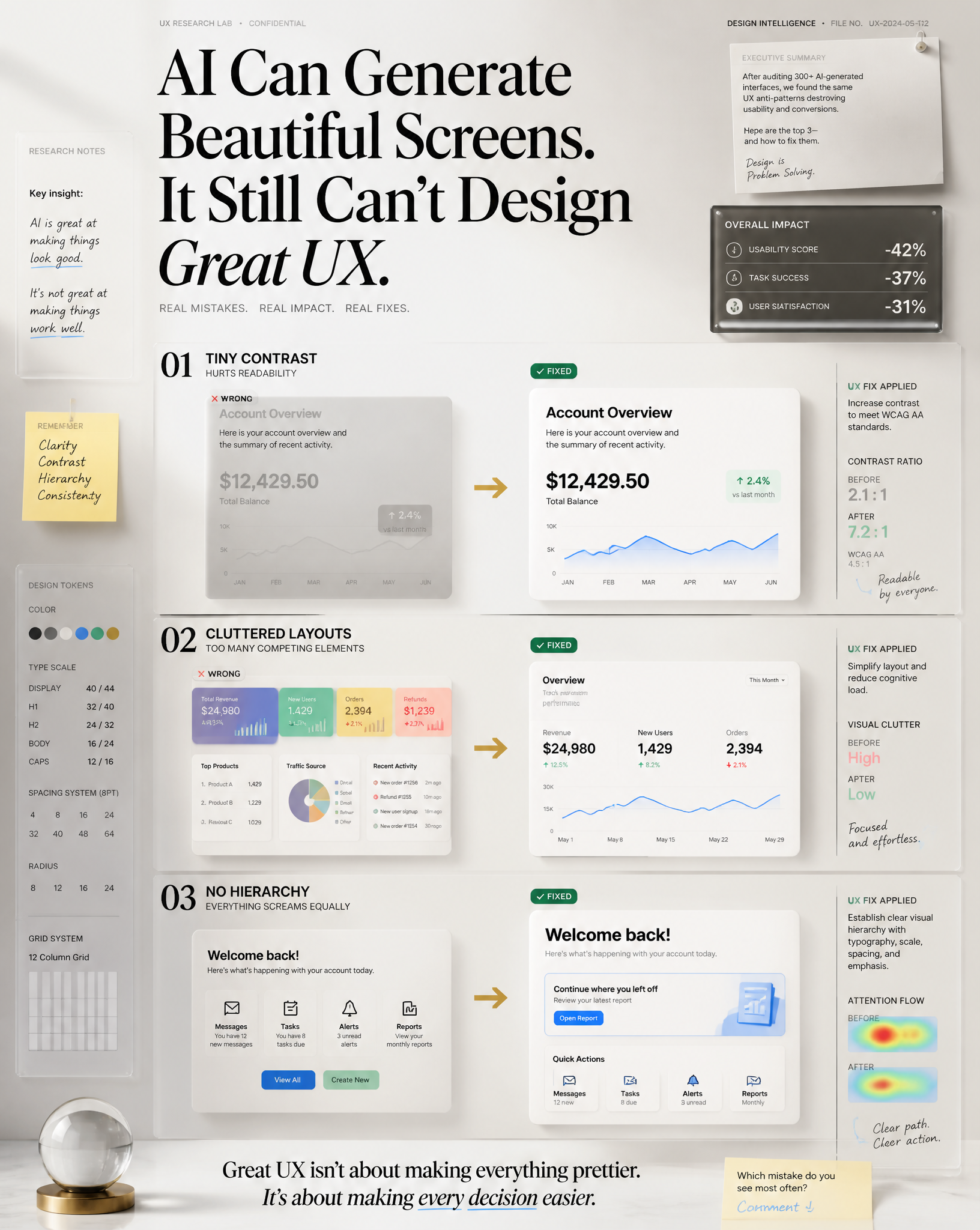
Create a premium LinkedIn educational visual (1080 × 1350 px, 4:5 vertical) designed to stop scrolling instantly.TOPIC3 UX Mistakes I See in AI-generated DesignsCONTENT TYPEEducationalFORMATText + ImageDOMAINMicro-LearnSCRIPTCall out the three most common AI-generated UX mistakes:1. Tiny contrast that hurts readability.2. Cluttered layouts with too many competing elements.3. Zero visual hierarchy where everything screams equally.For each mistake, immediately show the improved version with one practical UX fix.────────────────────────OPENING HOOK (Large Editorial Typography)"AI Can Generate Beautiful Screens.It Still Can't Design Great UX."The hook must dominate the composition and immediately create curiosity.────────────────────────VISUAL STRUCTURECenter the design around three cinematic comparison panels.Each panel containsLEFTWrong Version(desaturated, messy, faded)RIGHTFixed Version(clean, premium, glowing)Panel 01Tiny ContrastSmall gray text on gray background→ transformed into accessible high contrast typographyPanel 02ClutterToo many cardsToo many colorsNo spacing→ transformed into minimal Apple-inspired layoutPanel 03No HierarchyEverything same sizeButtons compete equally→ transformed into perfect typography scale, spacing, emphasis and visual hierarchyAdd animated directional arrows connecting Wrong → Fixed.────────────────────────Blend together the following premium visual concepts naturallyCINEMATIC EDITORIAL KNOWLEDGE WALLDESIGN CONSPIRACY FILEAPPLE KEYNOTE MEETS BRUTALISMFUTURISTIC OPERATING SYSTEM UIDOCUMENTARY STORYTELLINGCEO DESK INTELLIGENCE BOARDVISUAL THINKING MAPAI STRATEGY WAR ROOMEXECUTIVE DASHBOARD3D INFOGRAPHICS3D GLASSMORPHISMXRAY UX METRICSBEFORE vs AFTER TRANSFORMATIONGEN Z INTERNET DESIGNERLuxury SaaS EditorialSwiss Editorial LayoutMinimal Apple Design LanguageFloating Research NotesSticky NotesHandwritten UX annotationsPremium gridsMicro typographyStrategic arrowsHigh-end UI cardsGlass UISoft glowEditorial labelsResearch snippetsDesign system tokensAccessibility metricsContrast ratio visualizationSpacing measurementsGrid overlaysTypography scale indicatorsHeatmapsUser eye trackingInteraction pathsFloating UX metrics────────────────────────Create an environment that feels likeAn elite UX consultant is presenting confidential research inside Apple's design lab.Everything feels expensive.Nothing feels like generic AI art.────────────────────────COLOR SYSTEMLIGHT MODEWarm WhiteSoft BeigeOff WhiteSlate GrayApple BlueEmeraldChampagne Gold accentsDark typographyVery soft shadowsMinimal gradientsDARK MODEMatte BlackGraphiteDark NavyElectric CyanNeo MintApple BlueEmerald GlowPurple Ambient LightFloating volumetric lighting────────────────────────TYPOGRAPHYLarge luxury editorial headlineSwiss typographyApple keynote presentation styleMassive whitespacePerfect alignmentPremium hierarchySmall research labelsTiny metadataMicro captionsBold section dividers────────────────────────CINEMATIC DETAILSVolumetric lightDepth of fieldFloating particlesGlass reflectionsEditorial shadowsPremium realismUltra sharp focusLayered compositionMagazine cover qualityLuxury consulting presentation────────────────────────BOTTOM INSIGHT"Great UX isn't about making everything prettier.It's about making every decision easier."────────────────────────SOCIAL CTASmall elegant footer"Which mistake do you see most often?""Comment ↓"────────────────────────Rendering StyleHyper realisticEditorialUltra premiumHigh-end product designApple event presentationBehance featured projectAwwwards winnerDribbble trendingVisual hierarchy masterpieceCinematic lightingUltra cleanProfessional8KPhotorealisticNo watermarkNo logoNo mockup device frameReady for LinkedIn.