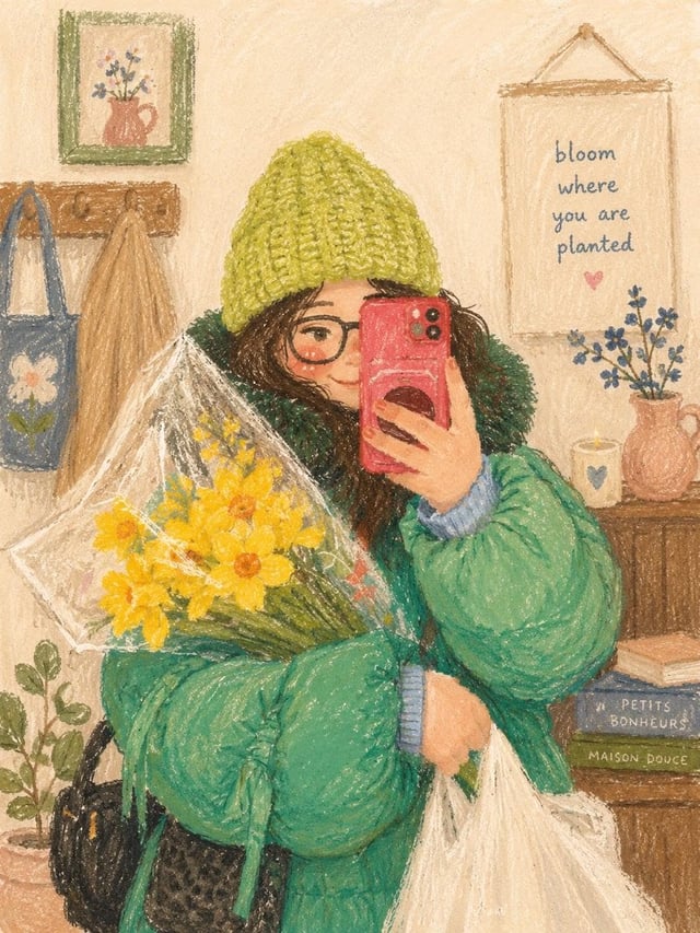
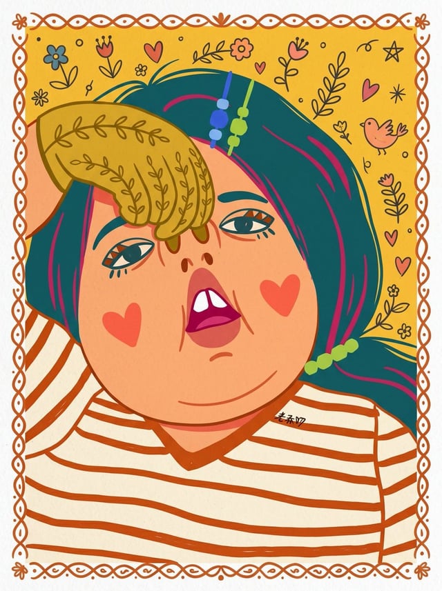
![Illustration of "Me and [Subject]" in a playful and charming pose. Hand-painted look with rich gouac](https://images.meigen.ai/cdn-cgi/image/format=auto,quality=85,width=640,fit=scale-down/tweets/2068567588989464670/0.jpg)
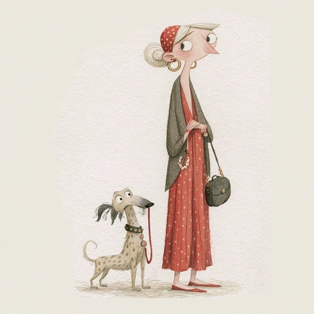
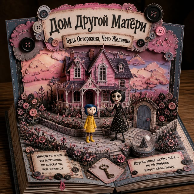
![Create a cute 3D animated travel-themed Polaroid illustration of a character [Appearance] wearing [O](https://images.meigen.ai/cdn-cgi/image/format=auto,quality=85,width=640,fit=scale-down/tweets/2083858898193445059/0.jpg)
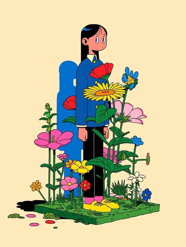
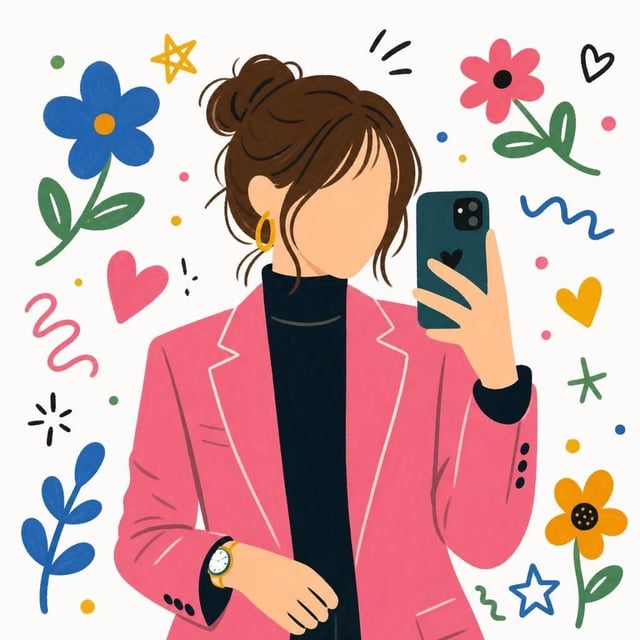
![Vertical quirky flat cartoon portrait of [Human] with a tall geometric head, long narrow neck, overs](https://images.meigen.ai/cdn-cgi/image/format=auto,quality=85,width=640,fit=scale-down/tweets/2076564350920454273/0.jpg)
Back to GalleryGPT Image
Prompt
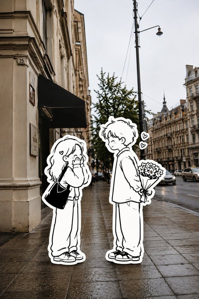
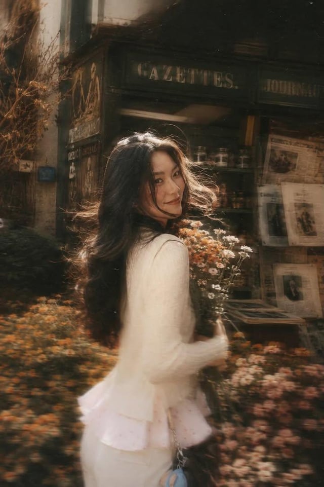
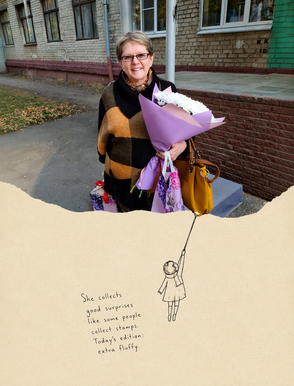
Please make a 3:4 vertical version of the "Second World" photography second creation poster based on the photography works I uploaded. Overall strictly up and down 1:1: The upper part retains the original photo as faithfully as possible, without changing the subject, character movements, spatial relationships, colors, and natural light and shadow, and only does the necessary proportional cropping. The lower half uses a natural warm beige paper background, leaving a lot of blank space. But don't directly apply the fixed template of “Tear paper + villain”. Please observe this photo carefully before generating it: 1.Find out the most recognizable visual structure in the photo, not just the subject matter. For example, water waves, roads, reflections, clouds, branches, beams, shadows, building edges, character movements, ridges, etc. 2.Ask yourself: “If the structure in the photo really becomes something that can be touched, used, or changed, what would it be most natural?“From this, I found the ”second World" that belongs only to this photo. Possible changes include but are not limited to: Pull, push, poke, enter, salvage, measure, repair, unfold, pave, climb, connect, collect....•But don't mechanically reuse these actions. 3.The shape of the photographic scrapbooking itself must also participate in the interpretation of the photo. Do not use ordinary irregular torn paper edges by default. Water can become a small body of water, light can become something that can be borrowed, roads can continue to extend, and clouds or branches may also form new spatial relationships. The specific answer must be generated from this photo itself.4. You can add 0-3 minimalist black hand-painted line draft characters. The villain is not a decoration, but a “user” in this second world. They must really interact with the physical structure in the photo, rather than standing next to them and posing. If the original photo already has a strong character action, you can not add a villain. 5.Based on what happened in this photo, a short English handwritten narration is generated. The tone is natural, relaxed, with a little humor or voice-over. Don't write inspirational quotations, and don't repeat “Same.. different."This kind of fixed sentence pattern. The position of the text is determined according to the blank space on the screen and the direction of action, and it is not fixed in a certain corner. Overall style: Real photography + off-white paper + minimalist black line graffiti, Clean, bright, restrained, with a slight sense of handmade collage and independent magazine. do not: Commercial advertising sense, complex illustrations, intensive villain、 Fix the tear paper template and repeat the action、 In order to look good, add decorations such as leaves and stars at will, change the color of the original photo or redesign the photography content without authorization. The most important principle: Do not decorate photos. First understand the photo, and then discover another world that might have existed in it. The ideal result should make people feel after seeing it: “It turns out that this photo can be understood in this way." Interested friends can give it a try, it's really interesting, welcome to return to the picture in the comments area