
![[SUBJECT]: A naturally beautiful girl with glowing no-makeup makeup skin in a white cotton tank top,](https://images.meigen.ai/cdn-cgi/image/format=auto,quality=85,width=640,fit=scale-down/tweets/2063210118578331987/0.jpg)
Back to GalleryNanobanana Pro
Prompt
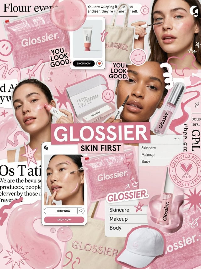
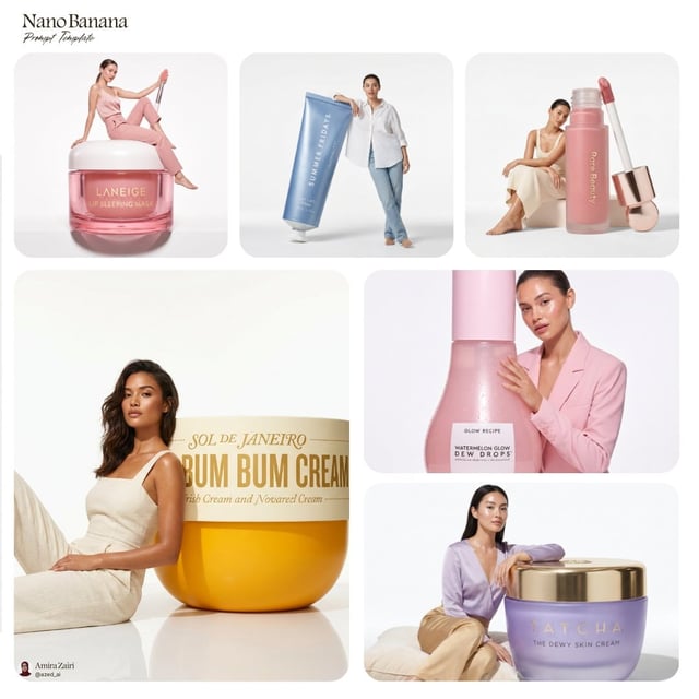
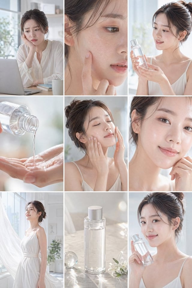
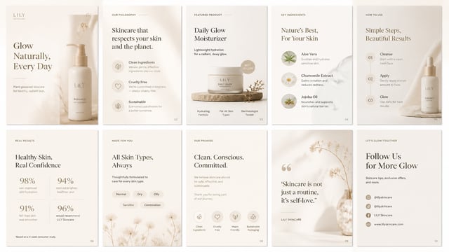
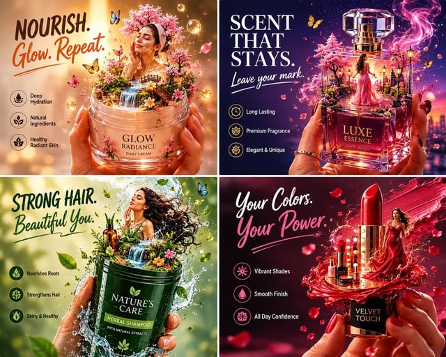
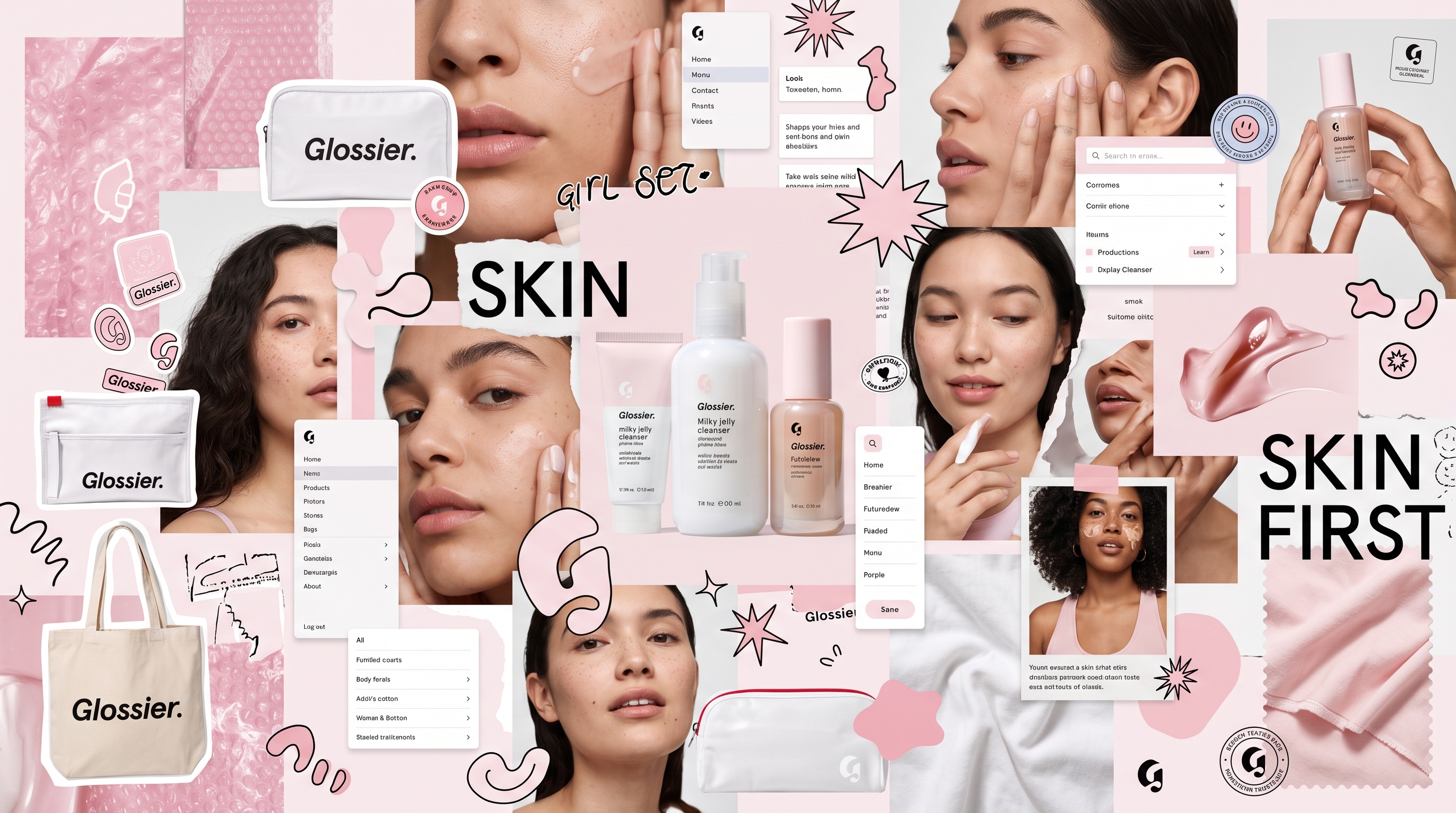
Editorial moodboard collage for Glossier brand identity, featuring a dense, layered, and intentionally chaotic composition. The scene is a visual explosion of beauty and skincare culture, blending premium product photography with raw, tactile design elements. Subject and elements: A central hero shot of Glossier skincare products integrated with lifestyle photography, including close-up skin textures, soft-focus candid portraits, and hands interacting with product packaging. Surrounding these are scattered brand assets: pink bubble wrap textures, iconic white Glossier pouches, adhesive stickers, and playful graphic doodles. Layered UI elements such as digital interface cards, menu panels, and abstract geometric shapes like squiggles, starbursts, and organic blobs. Include textile elements like a branded tote bag or soft cotton fabric swatches to add depth. Composition and framing: Asymmetrical and non-grid layout. The composition uses high-density clusters of items overlapping with negative space to create visual weight and depth. Use cutout-style silhouettes, torn-paper edges, and translucent overlays to mimic a physical collage. Large-scale hero elements balanced by tiny, intricate details like badges, stamps, and icons. Lighting and atmosphere: High-key, diffused studio lighting with soft highlights on translucent gloss surfaces. Clean, bright, and fresh atmosphere. Crisp focus on key textures with a shallow depth of field on background elements to enhance the layered, three-dimensional feel. Color and typography: Dominant palette of soft pink, crisp white, and translucent glossy accents. Typography is integrated into the collage: bold sans-serif headlines reading SKIN FIRST mixed with small, functional UI-style text and editorial snippets. The layout feels like a high-end, scroll-stopping social media campaign board, expressive and youthful. Constraints: No grid-based layouts, no uniform alignment, no plain backgrounds. Ensure all brand elements are high-resolution and sharp. No low-key lighting, no dark shadows, no oversaturated neon colors. The final output should feel like a cohesive, curated brand world explosion.