



Galleryother

10410Nov 1, 2026
Prompt
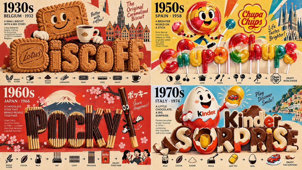
2x2 grid, 16:9, do this for 4 favorite international snacks of different decades: INPUT: [Subject] // ======================================================== // EXPERIMENTAL VISUAL EQUATION // ======================================================== ([Subject]) + (oversized cheerful paper-cut hero) + (vintage graphic poster color) + (bold black minimalist pictograms) + (custom symbolic letterform engineering) + (physically constructed material typography) + (premium editorial micro-labels) + (strong negative space and iconic simplicity) - (generic clip-art collage) - (unrelated decorative objects) - (random literal food textures) - (flat generic font) - (photorealistic character rendering) - (fixed panel arrangement) = [SEMANTIC TYPOGRAPHIC WORLD] // ======================================================== // 1. DEFINE THE SUBJECT // ======================================================== S = analyze([Subject]) NODES = { identity: core_identity(S), label: shortest_title(S), concept: primary_meaning(S), metaphors: rank(visual_metaphors(S), 3..6), symbols: rank(iconic_symbols(S), 5..10), materials: infer_materials(S), palette: infer_colors(S), emotional_tone: infer_mood(S) } // ======================================================== // 2. CREATE THREE VISUAL SCALES // ======================================================== MACRO = { giant_subject_or_title, immediate_recognition, bold_composition } MESO = { illustrative_character, symbolic_typography, physical_material_detail } MICRO = { minimalist_pictograms, tiny_narrative_objects, small_editorial_annotations } RENDERING RULE: MACRO establishes identity. MESO communicates personality. MICRO explains meaning. // ======================================================== // 3. MATERIALIZE THE WORD // ======================================================== WORD = NODES.label For each letter L: G = preserve_glyph_geometry(L) M = choose_relevant_material( L, NODES.materials ) O = infer_symbolic_object( L, NODES.symbols ) L_final = construct( G, material=M, integrated_symbol=O, readability="high" ) Ensure the lettering appears manufactured, grown, sculpted, assembled, or naturally formed. Use whichever process is semantically meaningful. // ======================================================== // 4. GENERATE GRAPHIC CHARACTER ENERGY // ======================================================== CHARACTER = stylize( NODES.identity, mode="playful cut-paper illustration" ) Character properties: - highly simplified shapes - expressive, recognizable identity - thick graphic outlines - rich flat colors - handmade paper texture - confident central gesture - meaningful interaction with the title For an abstract subject, create an inventive symbolic figure. For an object or brand, preserve its core silhouette. // ======================================================== // 5. CONSTRUCT THE ICON SYSTEM // ======================================================== ICONS = map( NODES.symbols, to="minimal black pictograms" ) ICON_RULES: Stroke = bold Detail = low Recognition = high Negative_space = generous Style = consistent Represent relationships with: small arrows, symbolic object groupings, compact silhouettes, simple environmental sketches, or meaningful spatial sequences. // ======================================================== // 6. TRANSFORM THE VISUAL DIMENSIONS // ======================================================== Define a dimensional field D: D = 0 for negative space D = 1 for line-based iconography D = 2 for paper-cut illustration D = 3 for material typography TRANSITION LOGIC: At important semantic intersections: black_line_icon -> flat_color_shape -> dimensional_material_object The transitions are driven by the subject's meaning. A symbolic icon may emerge from within the word. An illustrative object may become a physical fragment. A letter stroke may turn into a miniature environment. Avoid separating the visual systems into unrelated blocks. // ======================================================== // 7. COMPOSITION SOLVER // ======================================================== Optimize: IMPACT = subject_recognition + typography_readability + conceptual_relevance + character_expression + material_authenticity + icon_clarity Minimize: NOISE = redundant_symbols + unnecessary_text + decorative_clutter + generic_materials + disconnected_visual_layers COMPOSITION = maximize(IMPACT - NOISE) // ======================================================== // 8. COLOR ENGINE // ======================================================== Select the palette from the subject. Default aesthetic: - warm ivory paper - confident black outlines - three or four vivid accent colors - realistically colored materials - subtle vintage texture For serious, dramatic, or technical subjects, reduce playful saturation. For cheerful or cultural subjects, increase graphic color energy. // ======================================================== // 9. FINAL RENDERING // ======================================================== Create a single image. The giant material typography forms the main compositional anchor. The playful illustrated subject interacts with the title. Black-and-white pictograms create a secondary knowledge world. Meaningful typographic transformations connect all elements. Use a clean background and strong visual hierarchy. Allow the subject to determine the final balance. OUTPUT: A radical graphic-design hybrid where typography becomes a physical object, illustration becomes a character-driven narrative, and minimalist symbols become a visual language explaining [Subject]. The result should feel like an iconic collectible cultural poster created from paper-cut illustration, clever typographic design, and premium sculptural art.