Back to GalleryGPT Image

281.5KSep 25, 2026
Prompt
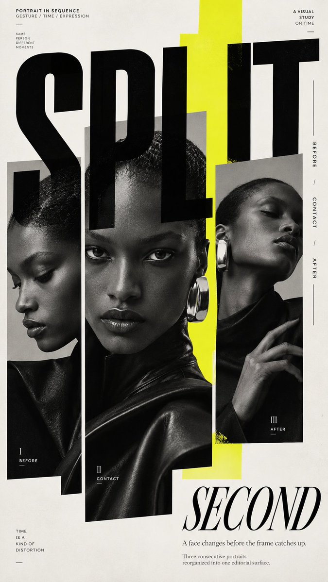
TITLE: [Your Title] SUBJECT: [Model Styling Expression] EDITORIAL MECHANISM: [Type Mask / Unequal Portrait Panels / Repeated Crops / Edge Tension] ACCENT COLOR: [Cobalt / Acid Yellow / Burnt Amber / Vermilion / Another Single Accent] FORMAT: 9:16 vertical poster Create a premium experimental fashion editorial poster where portrait photography becomes part of the layout itself rather than simply sitting behind typography. Begin with a strong, realistic fashion portrait with natural skin texture, distinctive styling, clear facial emotion and a confident editorial silhouette. Use black-and-white or restrained neutral photography as the base, then introduce only one controlled accent color. Deconstruct and reorganize the portrait through one dominant editorial mechanism. The image may appear inside oversized letterforms, split into unequal photographic columns, repeat through differently scaled facial crops, break beyond its frame, or be pushed toward the page edge so the entire layout reacts to the subject. Treat cropping as a design tool. Use close facial fragments, eyes, hands, shoulders or full-body silhouettes at different scales. Allow selected elements to cross image boundaries, typography or color fields so the composition never feels like a rigid grid. Typography should actively construct the page. Combine one monumental display word with refined serif or condensed sans-serif supporting type. Let large letters overlap portraits, disappear behind subjects, extend beyond the canvas or behave like masks and architectural forms. Pair them with concentrated micro editorial copy, vertical edge text and a few precise alignment rules. Use color as structure rather than decoration. Introduce one bold cobalt, acid yellow, burnt amber, vermilion or similar accent as a large block, narrow spine, transparent window or irregular field that changes the relationship between photography and typography. Maintain deliberate information density: a visually dense central or edge zone balanced by quieter negative space. Small text should be grouped into a few clear editorial information islands instead of being scattered everywhere. Use asymmetry, extreme scale contrast, controlled misalignment, partial cropping and layered foreground/background relationships. The final poster should feel like a sophisticated independent fashion magazine, experimental editorial spread and contemporary art-direction piece combined. At thumbnail size, the image should still have one immediate visual hook: a large face, monumental word, bold color field, unusual crop or striking fashion silhouette. On closer inspection, reveal secondary layers of typography, repeated photography, micro copy and frame-breaking details. Avoid generic centered magazine covers, simple photo-plus-text layouts, perfectly even grids, decorative color blocks, excessive empty minimalism, random symbols, fake UI graphics, meaningless dense text, logos, watermarks, barcodes, issue numbers, plastic skin and multiple competing accent colors.