![Create a bold, colorful 1:1 social media campaign grid for "[Product Name]" using the uploaded refer](https://images.meigen.ai/cdn-cgi/image/format=auto,quality=85,width=640,fit=scale-down/tweets/2085431795726823527/0.jpg)

Back to Galleryother

12615Sep 21, 2026
Prompt
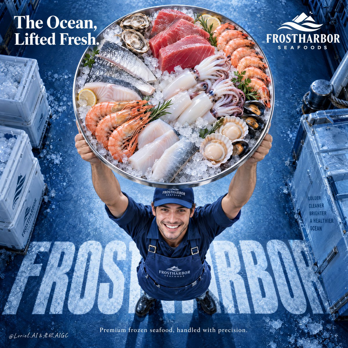
Create a premium frozen seafood advertising poster for a fictional international brand named FROSTHARBOR SEAFOODS, designed as a single vertical commercial key visual with a strong top-down camera perspective and a radically clear product-first hierarchy. Preserve the structural strength of the reference as pure composition logic: one delivery worker positioned near the lower-center, lifting an oversized circular tray of frozen seafood high above his head toward the camera, so the tray becomes the absolute dominant visual object. The final image must merge Orbit, Transit, and Port into one refined campaign: emotionally immediate, materially rich, and compositionally reduced to a bold iconic statement. The product hero is the tray itself. Make it large enough that it feels almost thrust into the viewer’s space, occupying a commanding portion of the upper-middle frame. The tray is a premium stainless-steel round platter filled with a tightly curated arrangement of frozen seafood: thick ruby tuna cuts, translucent squid tubes and tentacles, pale white fish portions, silver-skinned fillets, shrimp with vivid orange-pink shell accents, shellfish, and luminous crushed ice. The arrangement must feel luxurious, clean, abundant, and intentional, not like a busy market heap. Every ingredient should be distinct, appetizing, and premium, with convincing cold-chain realism, subtle frost bloom, clean moisture sheen, and elegant color separation. The worker is secondary but important. He stands below the tray in a proud, uplifting pose, smiling up toward camera with honest energy and clean commercial warmth. He wears a streamlined branded cap, apron, and workwear uniform in refined marine-blue tones. Anatomy must be correct and natural: realistic shoulders, believable arm lift under weight, proper elbows, wrists, and hands, five fingers, clear finger separation, and grounded stance. He must feel trustworthy and human, but the tray must visually overpower him. His role is to deliver the ocean upward, not become the focus. The camera is slightly overhead and compressed enough to exaggerate the round tray’s scale while preserving believable perspective on the body. The background is a premium frozen-marine blue floor or studio surface with subtle crystalline frost texture and a deep cobalt-to-ice-blue gradient. Use large integrated floor typography beneath the figure as a graphic anchor, but keep it cleaner and more reduced than the source. Let the letters feel embedded into the surface, almost like frozen shadow typography underfoot, reinforcing the brand without cluttering the frame. Visible text must be sparse, high-end, and entirely in English. At the upper-right, place a minimal brand lockup: "FROSTHARBOR SEAFOODS". At the upper-left, place one strong campaign line only, such as "The Ocean, Lifted Fresh." or another equally elevated phrase. Across the floor beneath the worker, integrate one giant typographic base in bold condensed uppercase, such as "FROSTHARBOR", partially cropped by the figure and perspective. In the lower area, add only one short commercial line, for example: "Premium frozen seafood, handled with precision." Keep all typography art-directed, crisp, and spacious. No dense body copy, no brochure clutter, no excessive sales lines. Lighting must be bright, controlled, and appetizing. Use a soft overhead-front key light that makes the seafood tray glow with freshness: wet reflections on tuna, icy sparkle on crushed ice, soft translucency in squid, crisp shell highlights on shrimp, and controlled steel reflections on the tray rim. Add gentle fill on the worker’s face and uniform, and enough edge separation to keep the tray clearly cut out from the blue background. The whole image should feel premium, fresh, cold, and authoritative without becoming sterile. Color hierarchy: 60% marine cobalt, frozen blue, and icy cyan environment; 30% seafood flesh tones, silver ice neutrals, and steel highlights; 10% white typography and selective warm accents from shrimp, tuna, and skin. Keep the palette clean and commercial, with strong contrast between cool frozen atmosphere and warm living seafood tones. Material semantics must be explicit and luxurious: crushed ice sparkle, stainless steel rim reflection, tuna marbling, squid skin translucency, shrimp shell gloss, frosted fish surface, matte apron fabric, embroidered cap logo texture, cold studio floor grain, and subtle water condensation. The whole image should feel like a world-class food-retail campaign that turns one tray into a spectacular icon of freshness. Rendering target: photoreal luxury food advertising, product-dominant hierarchy, clean top-down energy, refined typography integration, cold-chain material realism, controlled negative space, and world-class print finish. Quality control and structured exclusions: photoreal only, correct human anatomy, realistic shoulders, arms, hands, and five fingers, no hand deformation, no extra fingers, no missing fingers, no fused fingers, no broken wrists, no warped tray shape, no duplicated seafood items, no muddy ice, no dirty fish texture, no blood, no chaotic market clutter, no cheap supermarket flyer look, no unreadable typography, no garbled letters, no random brand plagiarism, no cluttered background, no style drift, no AI slop.