![A preservation architect's survey board for [BUILDING / STRUCTURE] — [STYLE / ARCHITECT / PERIOD]. L](https://images.meigen.ai/cdn-cgi/image/format=auto,quality=85,width=640,fit=scale-down/tweets/2008559432016286198/0.jpg)
![Create a high-quality [Subject] in a minimalist retro travel-poster style. Feature the subject as a](https://images.meigen.ai/cdn-cgi/image/format=auto,quality=85,width=640,fit=scale-down/tweets/2073722848993305071/0.jpg)
![Create a premium editorial travel poster illustration of [Place]. Automatically identify and depict](https://images.meigen.ai/cdn-cgi/image/format=auto,quality=85,width=640,fit=scale-down/tweets/2080125207164162108/0.jpg)
![A hyper-realistic detailed 3D macro photography shot of a miniature [LOCATION/CITY/LANDMARK] diorama](https://images.meigen.ai/cdn-cgi/image/format=auto,quality=85,width=640,fit=scale-down/tweets/2068179513750556984/0.jpg)
![[DESTINATION]=[Destination]](https://images.meigen.ai/cdn-cgi/image/format=auto,quality=85,width=640,fit=scale-down/tweets/2085233737093050753/0.jpg)
![Create a premium tourism campaign poster for [Country Name] in a sophisticated collage-map style. Th](https://images.meigen.ai/cdn-cgi/image/format=auto,quality=85,width=640,fit=scale-down/tweets/2065717040191799367/0.jpg)
Back to GalleryGPT Image

501.5KSep 18, 2026
Prompt
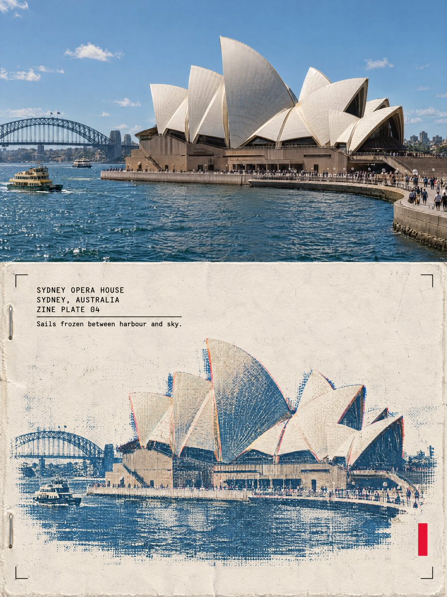
One poster, 3:4 vertical canvas. Split into two roughly equal zones — a realistic photograph on top, a printed reconstruction below — divided by one clean sharp horizontal line. The structure must not be stretched, warped, tilted or repositioned unnaturally. TOP HALF — THE REAL SHOT [Structure Description]. [Plate Light]. Preserve the structure faithfully: same architecture, proportions, perspective, distinctive details, natural light and shadow. Add only a subtle high-end color grade and the faintest film grain. Never redesign or reinterpret the architecture. BOTTOM HALF — THE PRINTED RECONSTRUCTION Rebuild the same structure as a two-color risograph zine print: bold flat spot-color shapes (one deep ink layer plus the structure's muted colors as a second spot layer), visible misregistration offsets between the layers, drum streaks, coarse layered ink-grain, halftone texture from overlapping dots, a zine masthead bar, two staple marks and paste-up edges. The photograph dissolves outward into flat spot-color shapes, misaligned layers and grainy ink. The structure must remain immediately recognizable. [Plate Density]. Texture: cheap zine paper, layered soy ink, misregistration, drum streaks, folded-edge wear, cut-and-paste edges, restrained crop marks, one small fluorescent red calibration bar. Color: cream zine paper, black ink, one deep spot color, the structure's original muted colors, a single fluorescent red accent. Never fully desaturate the structure. The structure occupies roughly 60-88% of the frame width. Leave 22-38% of the paper visibly untouched and empty — generous negative space so the poster reads as an archival specimen, not a packed screen. TYPOGRAPHY — a clean fixed-width architectural title block, pinned top-left at a small fixed inset, black ink, monospaced technical typeface, verbatim, each line in caps: "[Name]" "[City Country]" "ZINE PLATE 0N" A thin horizontal rule under the third line, then one short observational caption verbatim: "[Caption]" A solid vertical red rectangle — the only red in the poster — is pinned to the bottom-right corner zone about 12% from the bottom and right edges. Four thin black crop marks sit in the four corners of the bottom half at identical insets. Red bar, crop marks and text block keep exactly the same position and size relative to the frame. MOOD: underground zine crossed with an architecture fanzine — young, tactile, collectible. Sophisticated, minimal, tactile, intellectual, slightly mysterious, highly collectible. AVOID: solid black terminal backgrounds, dense walls of code, cyberpunk neon, excessive decorative glyphs, distorted architecture, impossible geometry, invented architectural details, fake technical specifications, random meaningless symbols, garbled text, extra colors, brand logos, QR codes, watermarks, author credits, tourist-poster clichés. Priority: preserve the structure's identity and architectural accuracy first. The experimental print treatment enhances the architecture, never hides it.