
![Ultra-clean modern editorial infographic. The topic is [ROUTINE] routine. Base all visuals, colors,](https://images.meigen.ai/cdn-cgi/image/format=auto,quality=85,width=640,fit=scale-down/tweets/2048044376366948849/0.jpg)
Back to GalleryGPT Image

14612Sep 10, 2026
Prompt
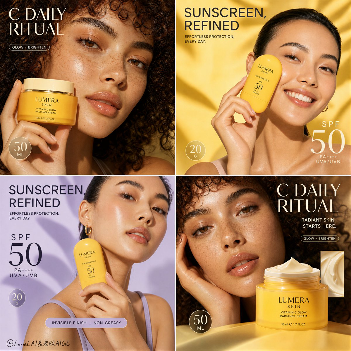
Create a Cannes-level premium four-panel skincare campaign board for a fictional beauty brand called LUMERA SKIN, merging Orbit atmosphere with Transit material precision while slightly reducing the density of callout stickers and copy blocks. Strictly preserve the reference image’s core 2x2 social-poster structure: four square panels arranged in a balanced grid, two alternating hero products, two adult female beauty portraits, one unified color family, and a clear commercial hierarchy that makes every panel instantly readable while feeling more refined, more international, and more luxurious. Overall board structure: design a perfectly proportioned four-quadrant campaign board with clean panel divisions, strong rhythm, and one coherent brand system running through all four images. Alternate between two product categories: a radiant vitamin-C face cream jar in the top-left and bottom-right panels, and a sculptural SPF 50 sun-care stick in the top-right and bottom-left panels. Use two adult female models with distinct but compatible beauty identities. The board must feel like one cohesive award-level skincare launch rather than four disconnected posts. Top-left panel: intimate close beauty portrait of an adult curly-haired woman with visible freckles, luminous skin, soft lips, and expressive eyes. She holds a warm yellow vitamin-C cream jar close to her cheek. The palette is golden, creamy, and sunlit, with a warm editorial mood. Place one large headline in the upper area, one circular quantity badge, and only one or two slim benefit capsules rather than many scattered info elements. Keep the layout airy, elegant, and premium. Top-right panel: bright, fresh portrait of an adult woman with clean pulled-back hair and naturally glowing skin, smiling while holding a rounded yellow SPF stick near her cheek. Use a clean sunlit yellow background with soft organic shapes. Include one strong headline block near the top and one large SPF claim in the lower third, with no extra clutter beyond one restrained circular quantity badge. The mood should feel joyful, summer-ready, and elevated. Bottom-left panel: a second SPF panel that echoes the top-right but shifts slightly into a softer lilac-yellow campaign variation, keeping the same product and model family while introducing a calmer pastel contrast. Maintain the same structural DNA but do not duplicate the pose exactly. Let the lighting remain fresh and beauty-clean, with only minimal supporting copy and one restrained information strip if needed for balance. Bottom-right panel: a second vitamin-C cream panel with a more editorial crop and stronger product emphasis. Show the same or closely related curly-haired adult beauty model in a tighter glow-focused portrait, with the yellow jar enlarged in the lower-right zone and a premium cream texture swatch tile or inset near the product. Use one large headline cluster and one or two elegant benefit markers only. Keep the panel sophisticated, glossy, and materially rich. Product and packaging design: invent elegant premium packaging for LUMERA SKIN. The vitamin-C cream jar should be sunny yellow with creamy ivory or soft gold detailing, refined serif-sans brand typography, and a rich but clean skincare identity. The SPF 50 stick should be a rounded pebble-shaped yellow container with minimalist premium labeling and tactile cosmetic realism. Both products must feel highly manufacturable, distinctive, and beautiful. Label text must be crisp, readable, and elegantly limited. Orbit mood: infuse the entire board with a soft “summer morning skincare diary” atmosphere. Let the yellow and lilac palette feel more breathable, airy, and emotionally warm. The models should feel naturally alive rather than posed like generic ad stock. Build a gentle sense of sunlight, optimism, and skin confidence across the campaign while maintaining high-end brand polish. Transit precision: push material realism to a world-class commercial standard. Emphasize premium jar and stick surfaces, label clarity, cream texture density, subtle gloss on plastic or coated packaging, realistic cream swatch folds, skin microtexture, pores, natural freckles, hydrated cheekbone reflections, lip detail, brow hairs, and finger anatomy. Hands holding products must be elegant, realistic, and fully correct. Lighting must be beauty-clean and controlled, with crisp highlight placement and no muddy skin rendering. Typography and information system: use original English-only campaign copy. Create large editorial headlines such as “C DAILY RITUAL” for the vitamin-C panels and “SUNSCREEN, REFINED” for the SPF panels. Supporting copy should be concise, premium, and limited, for example one short claim row and one quantity badge rather than dense clusters of stickers. Typography must remain bold, graphic, and commercially effective, but cleaner and less crowded than the reference. The result should feel more expensive because of restraint. Color direction: build the campaign around 45% citrus yellow, marigold, and soft golden cream, 25% skin beige and ivory, 20% lilac and lavender pastel support tones, and 10% soft charcoal, white, and champagne highlight accents. Keep the entire board visually unified and elegant, with each panel carrying a slightly different emotional temperature inside the same brand world. Rendering style: ultra-photoreal luxury skincare campaign board, four-panel social advertising system, premium beauty portraiture, sunny yellow and lilac palette, Orbit-grade airy summer mood, Transit-grade packaging and skin realism, crisp editorial typography, world-class commercial art direction, high-end social campaign finish, 8k detail. Negative prompt: cheap beauty flyer design, inconsistent panel styling, too many stickers, overcrowded copy, unreadable text, generic fonts, low-detail packaging, warped cosmetic containers, childish layout, plastic skin, over-smoothed faces, broken fingers, mismatched lighting, muddy yellow palette, cluttered callouts, duplicate poses, low-end influencer aesthetic, oversaturated neon colors, messy composition