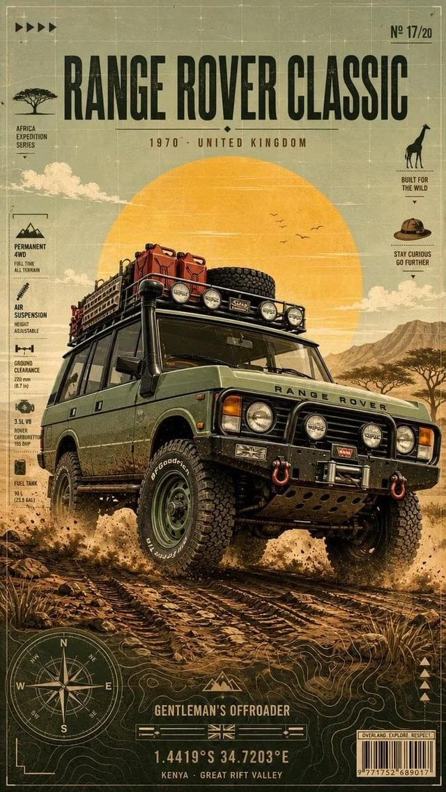
![Title: [Poster Title]](https://images.meigen.ai/cdn-cgi/image/format=auto,quality=85,width=640,fit=scale-down/tweets/2109874644564271597/0.jpg)
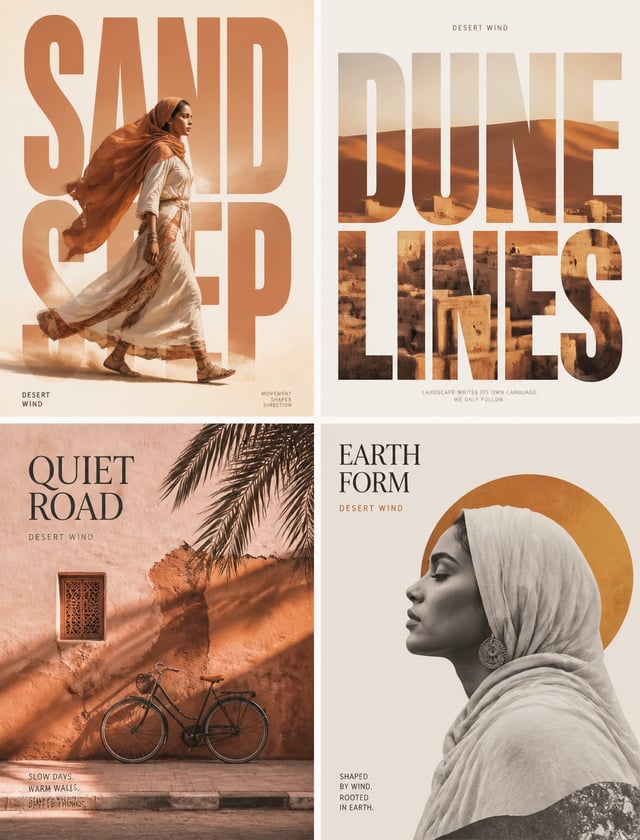
![A minimalist logo design where the word "[WORD]" is transformed into a physical object related to it](https://images.meigen.ai/cdn-cgi/image/format=auto,quality=85,width=640,fit=scale-down/tweets/2010633691014603147/0.jpg)
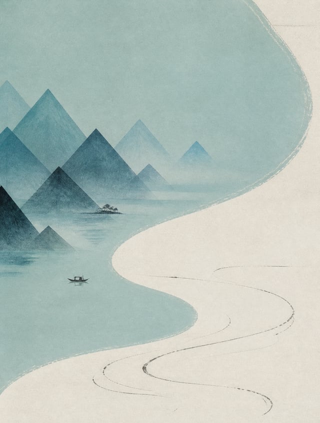
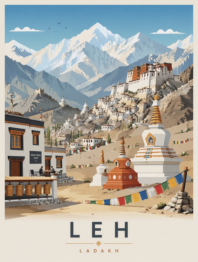
![Create a premium minimalist vintage travel poster of [Location], inspired by Japanese editorial illu](https://images.meigen.ai/cdn-cgi/image/format=auto,quality=85,width=640,fit=scale-down/tweets/2071815503212130407/0.jpg)
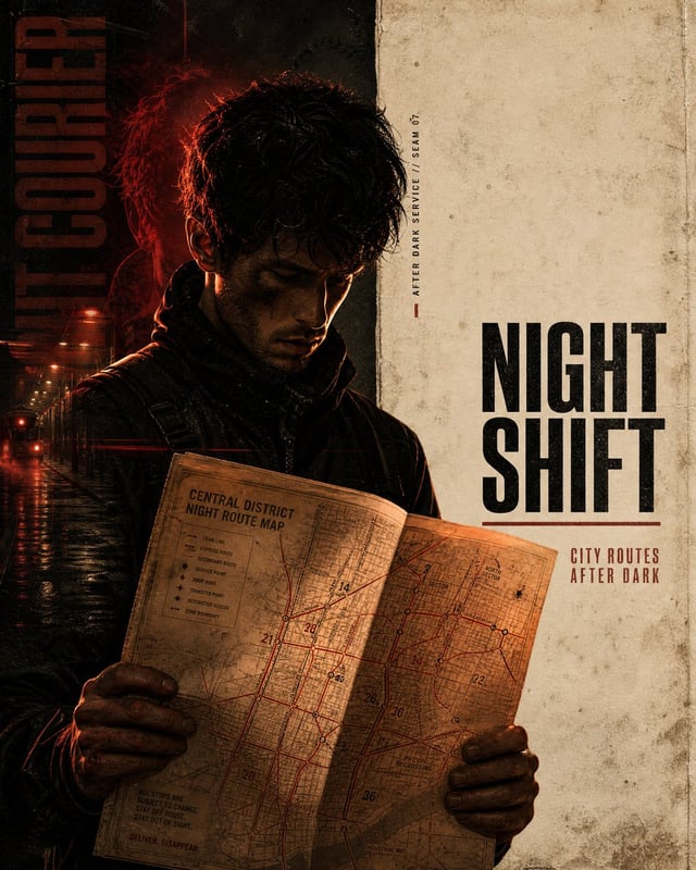
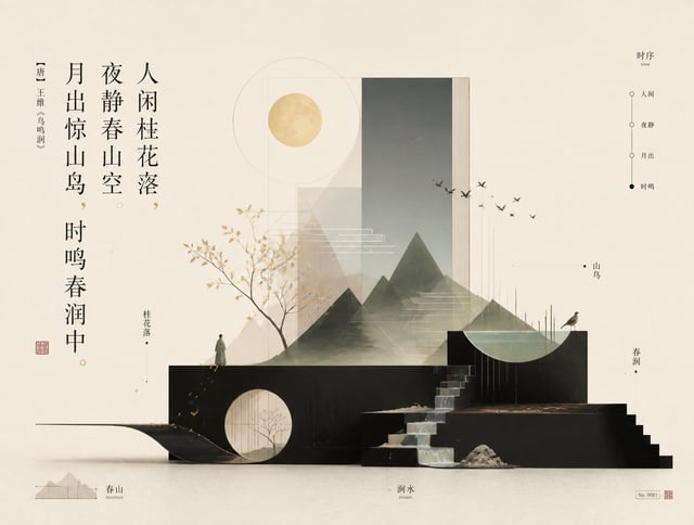
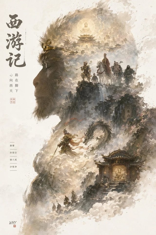
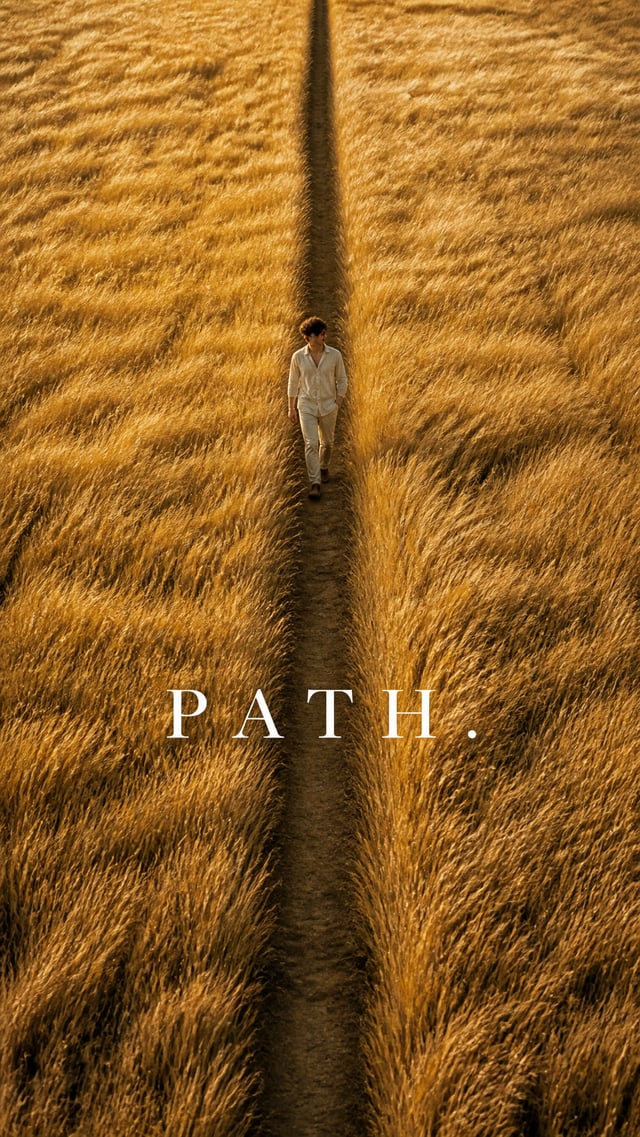
Back to Galleryother

16811.6KSep 3, 2026
Prompt
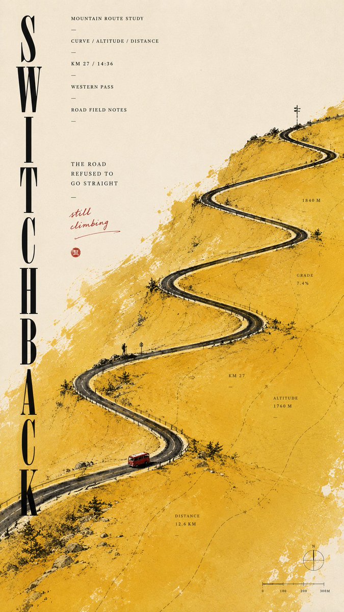
[TITLE]: [Title] [LANDSCAPE]: [Landscape] [GRAPHIC STRUCTURE]: [Graphic Structure] [COLOR FIELD]: [Color Field] [MICRO SCENE]: [Micro Scene] [SUBTITLE]: [Subtitle] [HANDWRITTEN NOTE]: [Handwritten Note] [FORMAT]: 9:16 vertical Create a refined minimalist editorial poster built around a huge abstract color field and a tiny landscape scene. Use clean warm ivory fine-art paper with subtle natural texture. Let one irregular [COLOR FIELD] occupy around 40–55% of the composition, with soft silkscreen, gouache and mineral-pigment texture rather than a flat digital block. Build one strong [GRAPHIC STRUCTURE] as the main visual hook — such as a winding road, flowing wind lines, repeating architecture or a long horizon. Add a thin black [LANDSCAPE] with very small [MICRO SCENE] details to create a strong sense of scale. Set “[TITLE]” in sophisticated editorial typography and add: “[SUBTITLE]” Include a few small, meaningful field notes related to the theme, such as route, altitude, wind, temperature, time, distance or survey data. Add one natural handwritten note: “[HANDWRITTEN NOTE]” Keep the hierarchy clear: huge color field, strong structural gesture, tiny scene, refined typography and micro information. From far away it should feel minimal and graphic; up close it should reveal paper texture, measurements and narrative details. Each poster should redesign the structure, color-field direction, tiny scene and typography according to its theme rather than simply swapping colors and titles. Avoid flat vector blocks, cheap gradients, oversized scenery, random text, dense UI, dirty grunge texture, logos, watermarks, numbering, starbursts and sparkle symbols.