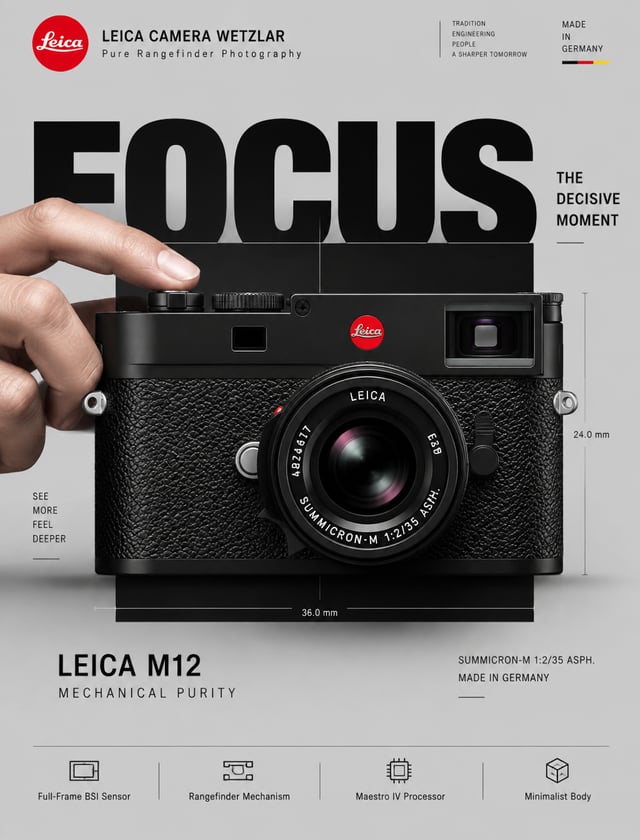
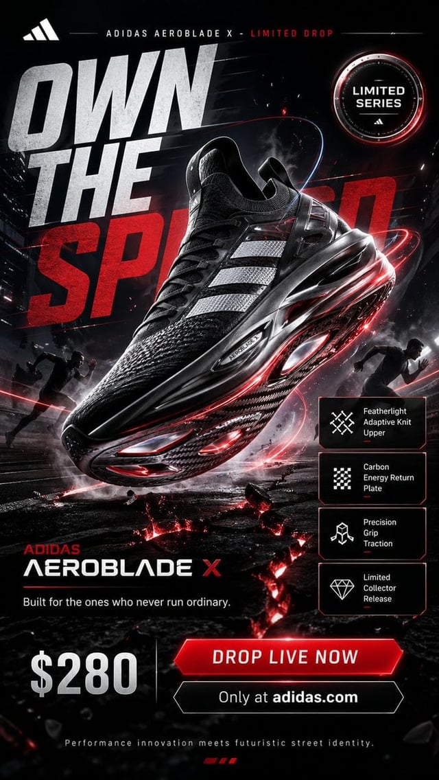
![Create a premium advertising poster for [Brand] featuring [Product].](https://images.meigen.ai/cdn-cgi/image/format=auto,quality=85,width=640,fit=scale-down/tweets/2071674030998933562/0.jpg)
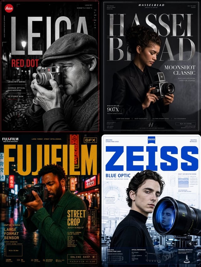
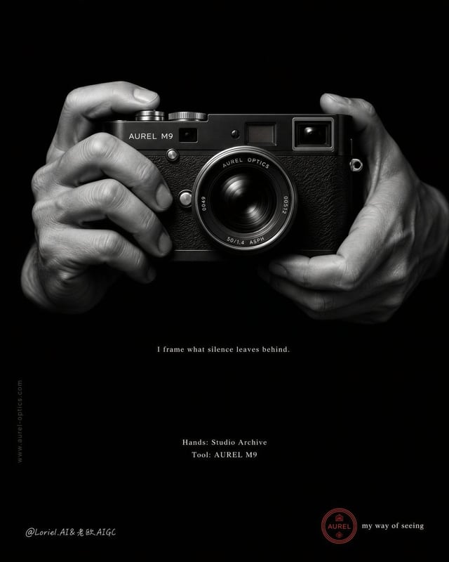
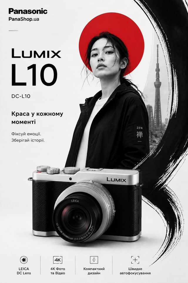
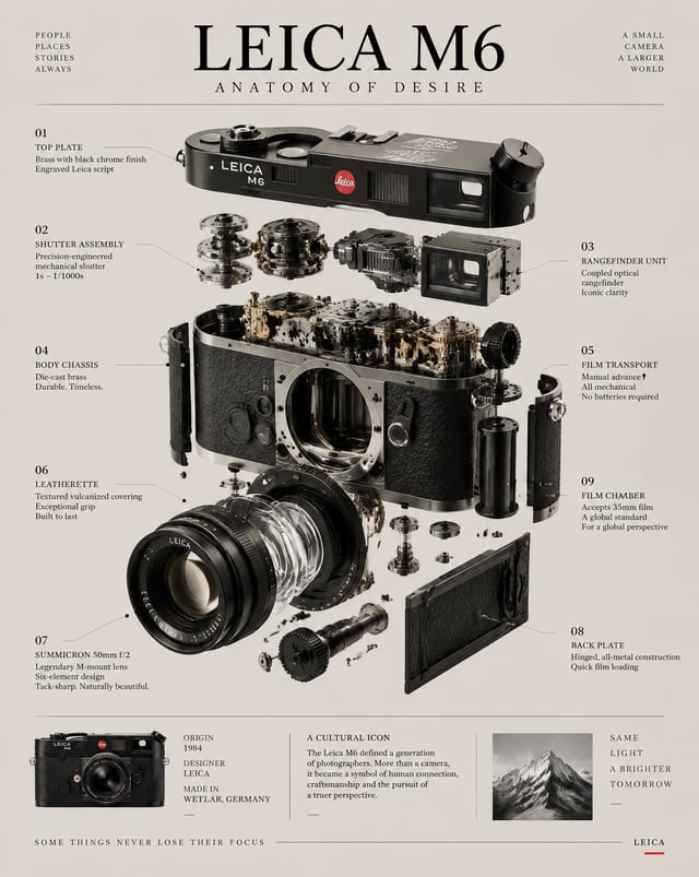
![PRODUCT: [Watch Name]](https://images.meigen.ai/cdn-cgi/image/format=auto,quality=85,width=640,fit=scale-down/tweets/2082296965136838819/0.jpg)
Back to Galleryother

16591Sep 2, 2026
Prompt
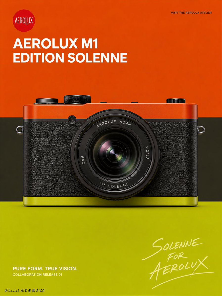
Create a Cannes-level flagship campaign board for an original premium compact camera brand named VAREN, featuring a collaboration release called VAREN C1 EDITION SOLIS. Build the artwork with a strict Transit visual logic: preserve the multi-panel campaign structure, the bold three-color graphic identity, the diagonal middle band, the product-centered hierarchy, and the handwritten collaboration signature, while removing unnecessary noise and reducing all secondary information so the entire board feels quieter, more architectural, more premium, and more globally sophisticated. The final image must feel like a fusion of ultra-real industrial product photography and high-fashion minimalist campaign design. Overall campaign structure: Use a tall vertical campaign board with one dominant flagship panel on the top and two smaller supporting panels aligned below, separated by crisp white gutters. The top panel is the main hero image. The two bottom panels are supporting product views. All three panels must share the same background logic, typography system, color palette, and collaboration identity. The full board should feel like a luxury launch presentation sheet with strong system discipline and almost no unnecessary visual noise. Transit design logic: Reduce the entire campaign to only the most essential brand signals. Keep the product as the undisputed hero in every panel. Remove busy promotional messaging, extra interface-like details, and anything that distracts from the camera and the composition. Let the color fields, the product form, the title block, and the handwritten collaboration signature carry the image. The result should feel calm, iconic, reduced, and flagship-grade. Background and graphic logic: Use a bold three-zone flat color-block structure across all panels. The upper field is a vivid burnt orange, the middle field is a restrained charcoal-olive band cutting diagonally across the layout, and the lower field is a bright chartreuse-lime plane. Keep all surfaces perfectly flat, graphic, clean, and intentional. No scenery, no props, no textural clutter, no unnecessary graphic decoration. The diagonal band is the only major motion device and must remain visually strong. Main hero panel: In the top panel, place one premium compact camera in a front three-quarter view, slightly angled, large, centered, and dominant. The camera should overlap the diagonal transition between the middle band and the lower band, so the product feels locked into the color architecture. Keep the main panel visually spacious and quiet. If any navigation dots are included, reduce them to the most minimal possible presence or remove them entirely. Supporting lower panels: In the bottom-left panel, show the rear view of the same camera with the same restrained background system. In the bottom-right panel, show a top-down or diagonal top view of the same camera, highlighting the industrial geometry and control layout. These supporting views must feel like calm system extensions of the hero image, not busy supplementary posters. Keep typography in the lower panels extremely minimal. Product design: Design an original ultra-premium compact camera with a vivid orange top plate, a dark graphite-olive body, and a subtle lime accent along the lower edge. The lens must be highly detailed, with realistic optical depth, engraved lens markings, refined concentric geometry, premium coatings, and precise reflections. Include carefully designed metal dials, tactile controls, strap lugs, hot shoe detail, and exact industrial tolerances. The camera must feel physically real, collectible, and design-iconic. Typography system: Do not use any real brand names or copied wording. Use original English-only typography. In the upper-left area of each panel, place a small circular red logo containing the word VAREN in elegant custom script. In the main panel, use a restrained white title block: VAREN C1 EDITION SOLIS aligned toward the upper-left. In the upper-right, place one tiny navigation line such as VISIT THE VAREN ATELIER in subtle dark text. In the lower text area of the main panel, keep only one concise campaign line such as PURE VISION IN MOTION. Remove all nonessential supporting copy unless absolutely needed. Typography must feel reduced, premium, editorial, and globally refined. Handwritten collaboration signature: Place a large pale cream handwritten signature in the lower-right of the main panel reading SOLIS FOR VAREN. In the lower two panels, repeat the handwritten collaboration mark more quietly and more subtly so the system remains cohesive without becoming repetitive. The handwritten element should feel emotional and luxurious, balancing the camera’s industrial precision. Lighting: Use premium studio product lighting with crisp frontal clarity, subtle top-edge highlights, quiet reflections on lens glass and metal surfaces, and clear separation between matte and satin materials. The lens must feel optically deep and expensive. The overall lighting should feel controlled, calm, and highly polished, never flashy or noisy. Material realism: Push exceptional realism on lens glass, engraved markings, textured body panels, painted top plate, metallic dials, badge enamel, and screen detail. The orange, charcoal-olive, and chartreuse palette must feel curated, daring, and fashion-led rather than playful. The camera should read like a museum-grade industrial design object. Color direction: Use a tightly edited palette of burnt orange, chartreuse lime, charcoal olive, signal red, crisp white, and pale handwritten cream. Keep the contrasts bold but disciplined. The full board must feel iconic, reduced, and unmistakably premium. Mood: quiet, iconic, reduced, architectural, design-led, collectible, editorial, premium, launch-ready, globally award-worthy Rendering style: ultra-realistic premium compact camera campaign board, flagship hero panel with two supporting product-view panels, Transit minimalist color-block composition, refined industrial product dominance, high-fashion editorial typography, subtle handwritten collaboration signature, master-level studio product lighting, 8k, world-class advertising image quality Negative prompt: real brand names, copied source text, cluttered layout, busy information blocks, extra interface details, ugly generic fonts, cheap plastic camera look, toy-like colors, weak product focus, low-detail lens, distorted camera geometry, muddy tones, dirty gradients, dead black patches, low-resolution typography, inconsistent panel design