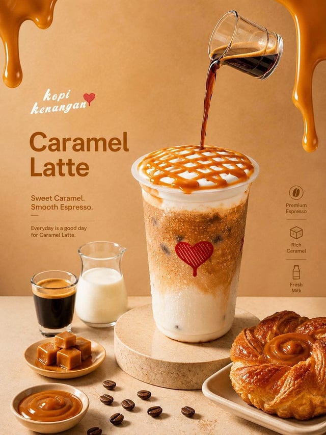
![Create a trendy 3:2 square promotional poster for “[Product Name]” using the uploaded product image](https://images.meigen.ai/cdn-cgi/image/format=auto,quality=85,width=640,fit=scale-down/tweets/2079100834202431552/0.jpg)
![Ultra-detailed premium winter coffee advertisement poster for Kream Koffee Zimbabwe [image2], vertic](https://images.meigen.ai/cdn-cgi/image/format=auto,quality=85,width=640,fit=scale-down/generations/2026-05/community_4813b98b-fde3-43a6-b976-08b9732152ed.png)
Back to GalleryGPT Image

13012.4KAug 30, 2026
Prompt
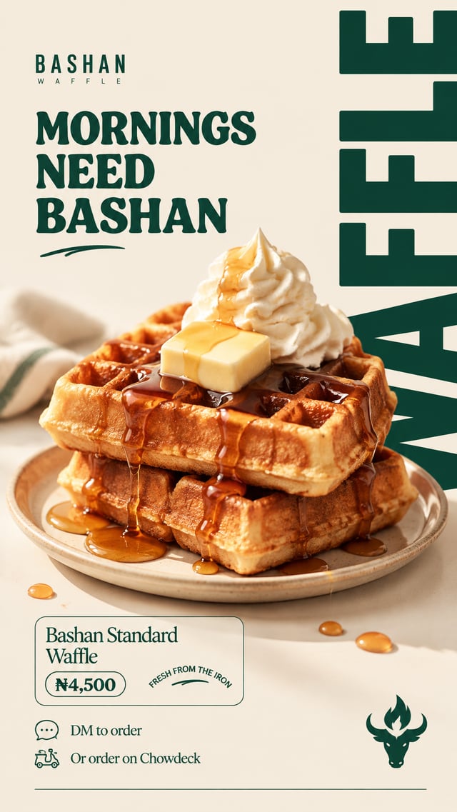
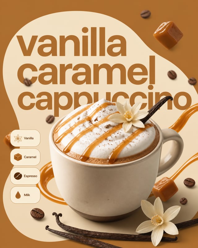
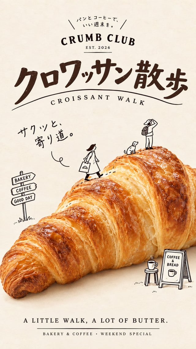
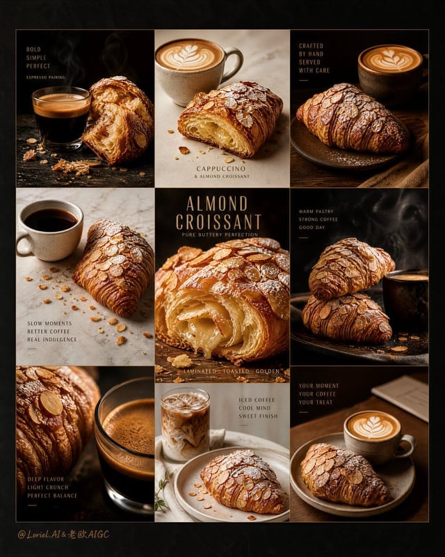
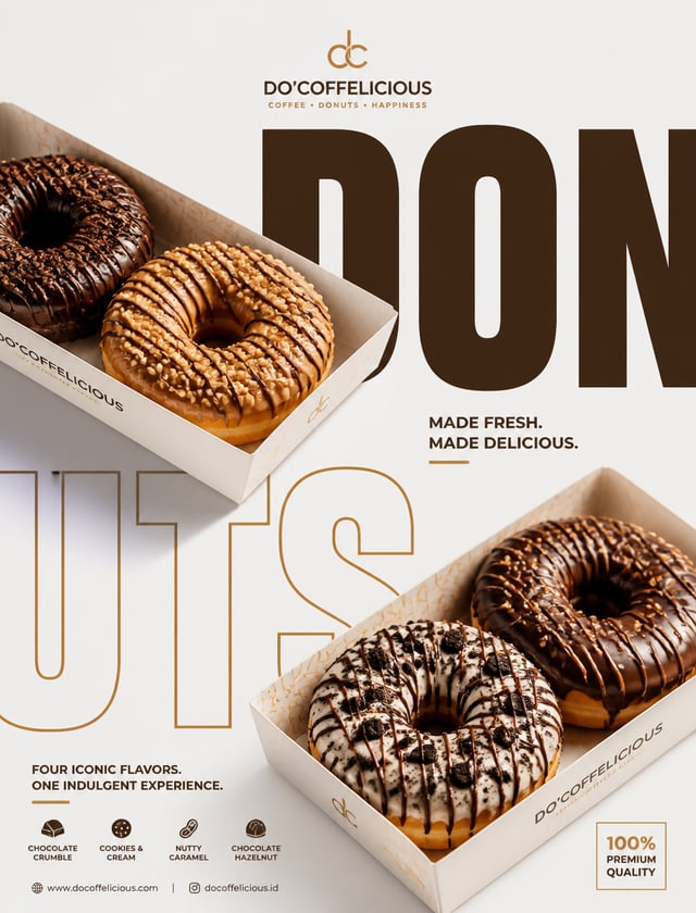
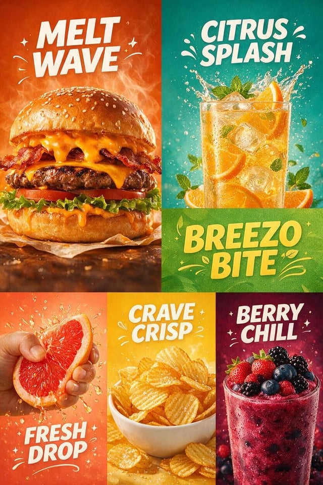
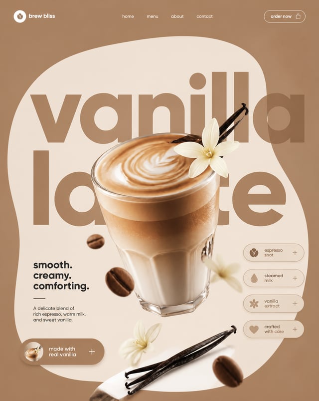
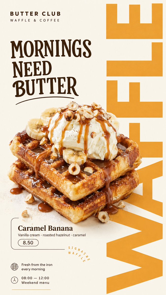
Create a 9:16 editorial food poster using the following inputs: Brand: [Brand Name] Product: [Food Or Drink] Poster theme: [Poster Theme] Headline: [Main Headline] Supporting text: [Supporting Text] Background color: [Background Color] Accent color: [Accent Color] Layout direction: [Layout Direction] Build the poster around realistic, appetizing food photography combined with bold editorial typography. Use one clear hero food or drink as the main photographic subject. Preserve realistic textures, natural highlights, shadows, crumbs, cream, glaze, bread structure, fruit surfaces, glass reflections, or other material details appropriate to the product. Avoid CGI, plastic-looking food, excessive retouching, or generic e-commerce photography. Typography should actively shape the composition rather than simply sit above or below the product. Use oversized display type, cropped letters, vertical text, repeated words, outlined typography, or text extending beyond the canvas. Allow parts of the food to overlap, cover, or break through the typography so the photography and graphic design feel integrated. Create a lively asymmetric editorial layout with a clear hierarchy: large headline or display type, hero food photography, product or campaign information, price / time / date if relevant, and a few small supporting details. Keep the information meaningful and relatively compact. Do not fill the poster with Lorem Ipsum or random placeholder text. Use a restrained color system: a light neutral or softly colored background, the natural colors of the food, and one dominant brand accent color. Add only a few supporting graphic elements such as thin lines, small circles, open frames, simple blocks, or subtle organic shapes. The final result should feel like a professionally art-directed café, bakery, dessert, brunch, or food brand campaign: bold, playful, editorial, appetizing, clean, and visually active.