Back to GalleryGPT Image

988.9KAug 30, 2026
Prompt
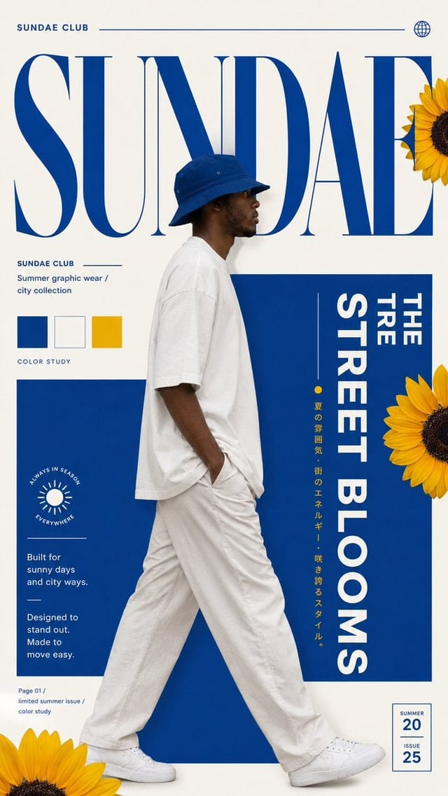
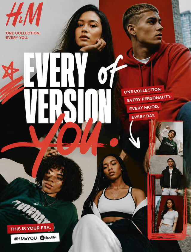
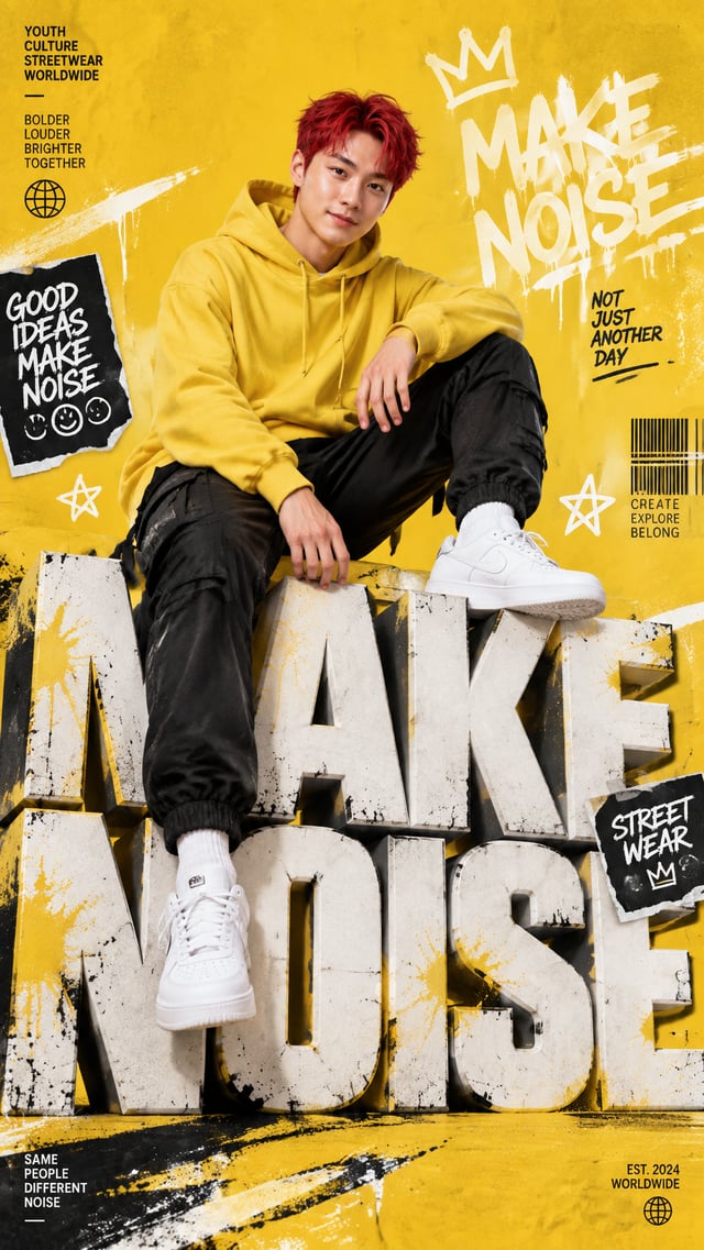
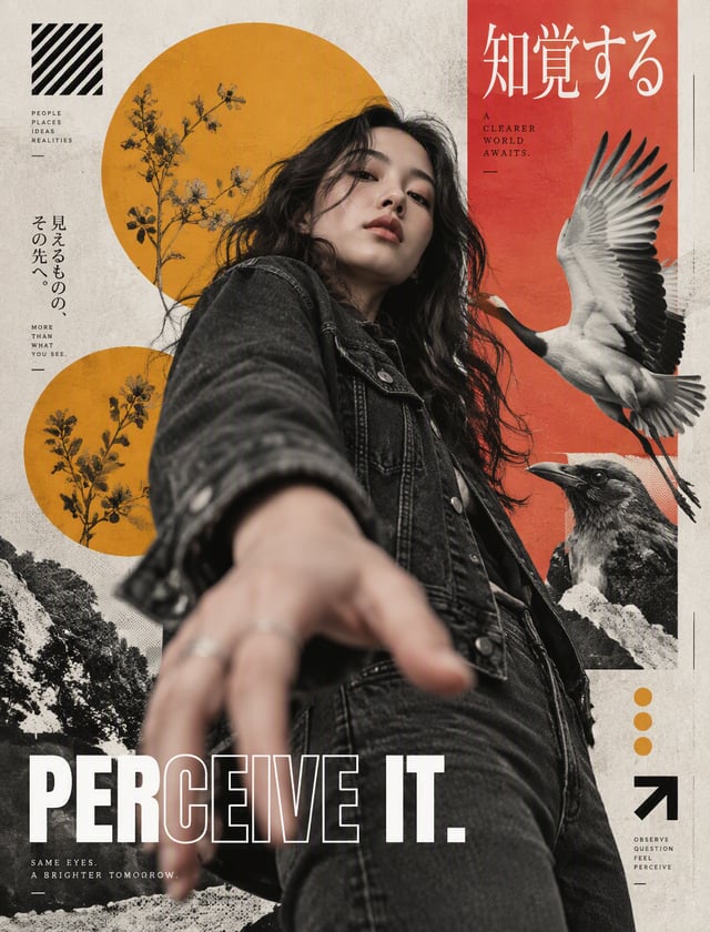
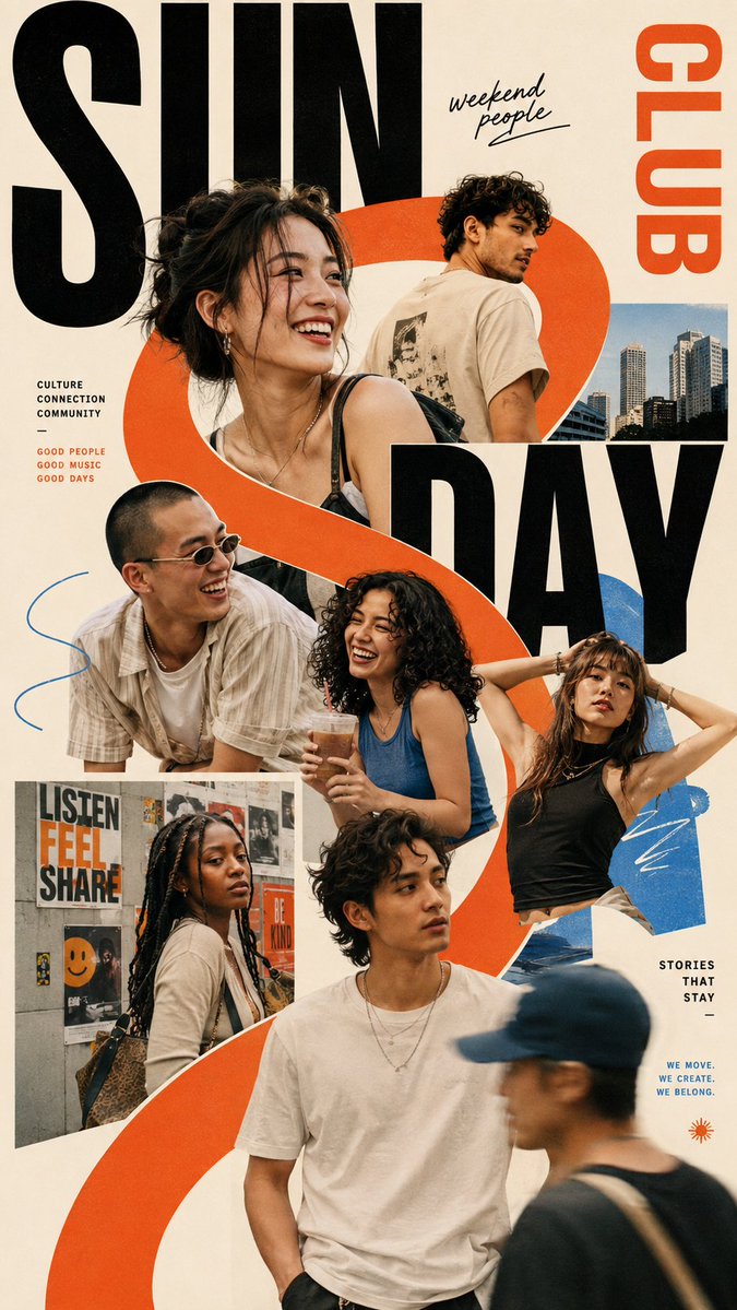
Theme = [Theme] People = [People] Layout = [Layout] Headline = [Headline] Palette = [Palette] Ratio = 9:16 Create a bold multi-person editorial poster where the people themselves become the composition. Use different portrait scales instead of giving everyone equal space. Choose one clear visual hierarchy with one or two dominant subjects, several supporting portraits, and a few cropped details. Let faces, shoulders, hands or hair break outside their image areas so the layout feels alive rather than like a clean photo grid. Build the poster around one strong organizing idea. The people can follow an irregular curve, sit inside different-sized photo blocks, be divided into angled narrative slices, or appear through oversized typography. Keep the structure intentional but slightly unpredictable. Mix portrait photography with a few different visual treatments when useful — close-ups, side profiles, hard light, soft shadow, slight motion blur or one intentionally out-of-focus image. Don’t apply every effect at once. Typography should connect the whole group. Use one strong headline with real meaning, make it large enough to cross several portraits, and allow people to cover parts of the letters or appear through their negative space. Keep the palette controlled. Start with neutral photography, then use one dominant accent color and optionally one secondary color to connect the modules, backgrounds and typography. Small text should stay minimal. One series label and one short supporting line are enough. The poster should feel like a finished cultural, fashion or editorial visual rather than an event template. Aim for strong contrast between crowded and quiet areas. Some parts can be dense with overlapping portraits and type, while another area is left open to give the composition room to breathe. Keep faces realistic, skin natural, hair detailed and every person visually distinct.