![[UPLOAD YOUR IMAGE] Edita imagen según esta descripción:](https://images.meigen.ai/cdn-cgi/image/format=auto,quality=85,width=640,fit=scale-down/generations/2026-10/community_a32f8c4d-08ff-4117-95ae-b7430f4ac0be.png)
![围绕[主题对象]组织成明亮广告视觉:让大面积开阔天空或同等通透的户外场域占据主要空间,背景干净、高明度、中高饱和,带轻微自然颗粒和柔软远处云影,只服务于空气感与留白,不加入复杂景物。主题对象被缩成精确](https://images.meigen.ai/cdn-cgi/image/format=auto,quality=85,width=640,fit=scale-down/tweets/2084662806931239074/0.jpg)
Back to Galleryother

19559Aug 28, 2026
Prompt
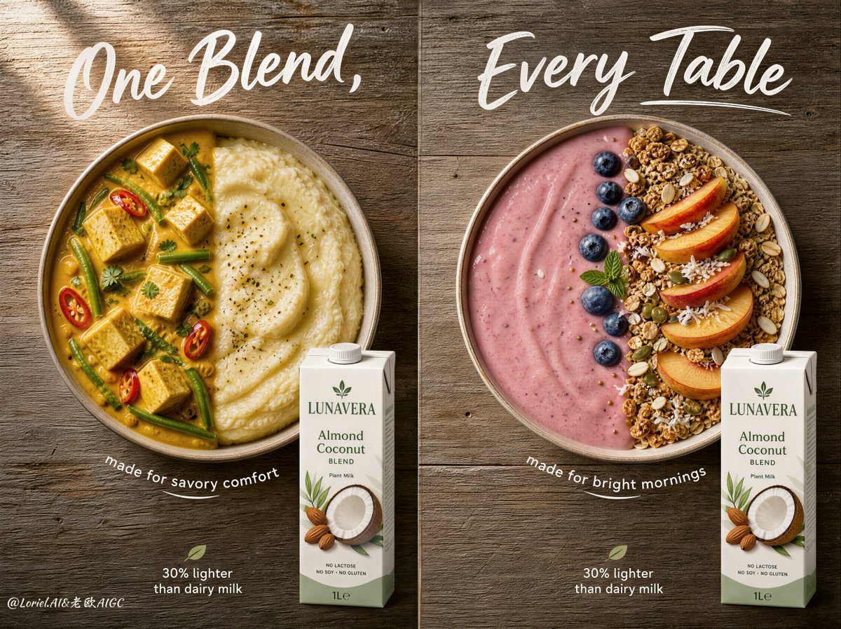
Create a premium dual-panel commercial campaign poster for an original plant-milk brand named "LUNAVERA". Use an ultra-realistic top-down food photography style with a clean, high-end editorial advertising layout. Preserve the exact structural logic: two equal vertical panels placed side by side in one horizontal campaign board, each built on a rustic weathered wood tabletop, each with one large flowing white hand-lettered headline across the upper area, one oversized circular split-food composition in the middle, one short curved supporting line near the lower middle, one identical product carton packshot at the lower-right corner, and one minimal nutritional claim near the bottom. The whole campaign must feel like a Cannes-level FMCG visual system: fresh, versatile, elegant, and instantly memorable. Style lock: Premium plant-based food campaign, ultra-real still-life photography, rustic tabletop styling, clean product-first hierarchy, modern organic branding, soft daylight realism, polished supermarket flagship finish. Core composition: Use a strict two-panel layout with equal panel width, equal visual weight, equal top margin, equal packshot size, and identical camera angle. The two main bowls or glasses must be exactly matched in diameter, height, crop size, perspective, and visual weight. The campaign should read as one unified system rather than two separate ads. Port super-symbol logic: Turn the idea of one identical plant-milk carton paired with two perfectly matched circular food applications into the brand’s unmistakable super-symbol. The same product must clearly bridge both worlds: savory comfort and fresh breakfast energy. The repeated circle shape and repeated carton placement should become the visual identity code of the brand. Even at thumbnail scale, the viewer should immediately recognize the system through one product, two equal circles, two lifestyles. Orbit motion logic: Create a strong left-to-right and back-again reading loop across the two panels. The eye should begin at the left upper headline, move into the left circular savory dish, descend through the curved supporting line into the left carton, jump across to the right carton, rise into the right circular breakfast composition, then return upward through the right headline and back across the pair as a complete visual loop. Use the curved rims of the containers, arc-shaped copy, ingredient placement, and matched carton positions to create one elegant campaign-wide orbit. Left panel: Create a savory meal application scene. Use one large round bowl composition cropped identically to the right panel. One half should show a creamy golden vegetable curry with visible green beans, tofu cubes, and red chili slices; the other half should show a pale creamy mash or grain puree. The textures must feel warm, smooth, rich, and comforting. Keep the product carton at the lower-right corner, identical in size and angle to the right panel. Right panel: Create a breakfast application scene using the same exact container scale and perspective. One half should show a soft pink berry smoothie or yogurt-like blend in a round vessel, while the other half shows a breakfast bowl with granola, sliced peach, blueberries, oats, and seeds. The textures must feel cool, fresh, and naturally wholesome. Place the same product carton again at the lower-right corner with identical size and alignment. Product design: Design one original almond-coconut plant milk carton for "LUNAVERA Almond Coconut Blend" with elegant cream, soft green, and coconut-almond illustration details. The carton must feel premium, shelf-ready, realistic, and globally marketable. Both packshots must be perfectly consistent. Lighting: Use soft diffused daylight from upper-left with gentle ambient fill. Keep food surfaces bright, clean, and appetizing, with subtle shadow falloff and natural texture detail. Maintain fully consistent lighting logic across both panels so they feel part of one premium campaign system. Materials and realism: Render the curry with creamy viscosity, soft oil shimmer, realistic vegetables, tofu porosity, and appetizing sauce depth. Render the mash or grain puree with smooth whipped texture and subtle surface ridges. Render the smoothie with blended foam softness and fruit density. Render the breakfast bowl with crisp oats, juicy fruit texture, seed detail, and natural freshness. Render the cartons with crisp folds, matte-coated paperboard, and clean printed detail. Render the wooden tabletops with realistic grain, scratches, and subtle aging. Color strategy: Use a natural plant-based palette: muted driftwood gray, warm cream, almond beige, coconut white, leaf green, berry pink, peach gold, and golden curry yellow. Keep the campaign bright, wholesome, and premium. Let the left panel feel warmer and the right panel feel fresher while preserving overall harmony. Typography and layout: Use only original English text. Suggested upper headline direction across both panels: "One Blend, Every Table" Use short curved supporting lines such as: "made for savory comfort" and "made for bright mornings" Use one minimal bottom claim such as: "30% lighter than dairy milk" Do not copy any existing brand name, slogan, or wording from any source image. Quality target: Hyper-detailed, high-resolution commercial print finish, pristine food realism, accurate equal-container scale, sharp packshot clarity, clean rustic background, strong symbolic readability, no clutter, no muddy colors, no cheap grocery-flyer look. Negative prompt: copied branding, copied slogan, mismatched bowl size, mismatched glass size, inconsistent perspective, unequal visual weight, low-detail food texture, blurry carton, cluttered tabletop, muddy wood texture, oversaturated colors, unreadable typography, weak product hierarchy, random props, black blotches, cheap supermarket leaflet aesthetic