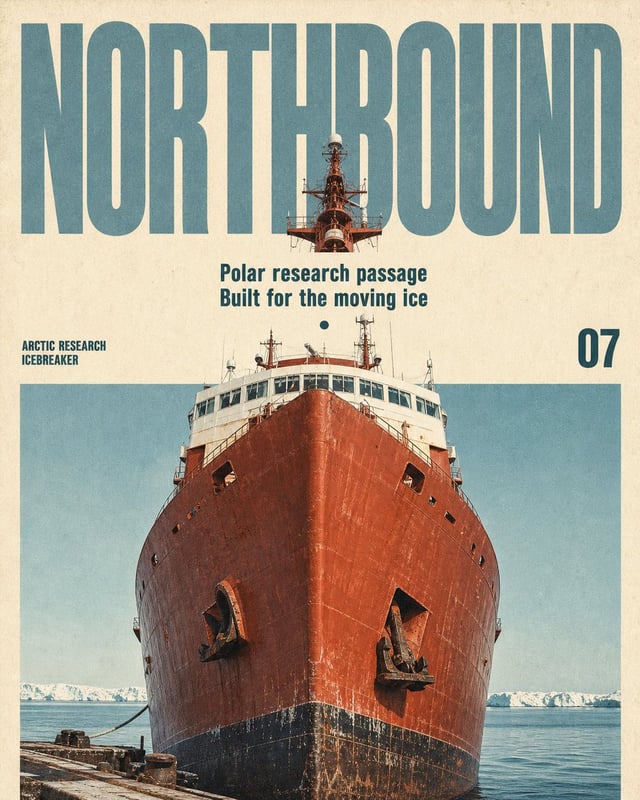
![Ultra-premium editorial magazine cover / collectible poster design featuring [Subject] as the domina](https://images.meigen.ai/cdn-cgi/image/format=auto,quality=85,width=640,fit=scale-down/generations/2026-09/community_ccd6bcbf-b674-48f2-90de-bdb546c786d1.png)
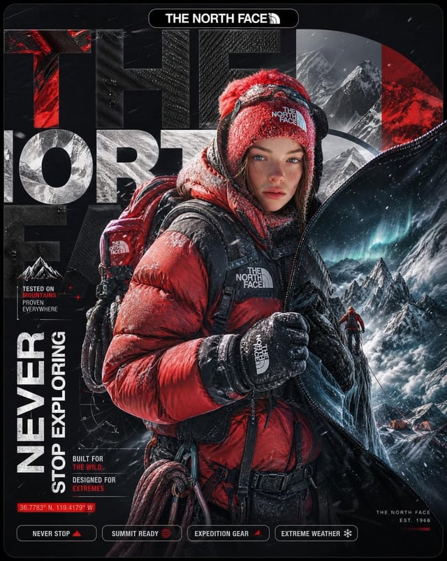


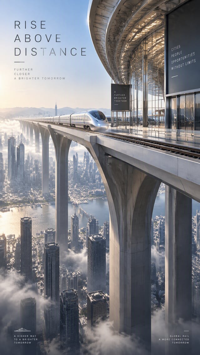
![[Word]: {MASS / VOID / FLOW / SKIN / 4–6 letter word}](https://images.meigen.ai/cdn-cgi/image/format=auto,quality=85,width=640,fit=scale-down/tweets/2089995645973389582/0.jpg)
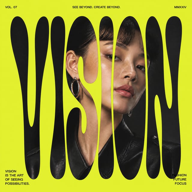
![Créez une couverture de magazine éditoriale minimaliste premium avec [Character] de [Série]. Le port](https://images.meigen.ai/cdn-cgi/image/format=auto,quality=85,width=640,fit=scale-down/generations/2026-08/community_8fe2a3df-e9a4-47a8-aaad-81748fbc537c.png)
![Vertical editorial collage poster featuring [CHARACTER] in [CLOTHING], full-body cutout positioned a](https://images.meigen.ai/cdn-cgi/image/format=auto,quality=85,width=640,fit=scale-down/tweets/2090662002054303832/0.jpg)


Back to GalleryGPT Image

421.9KAug 22, 2026
Prompt
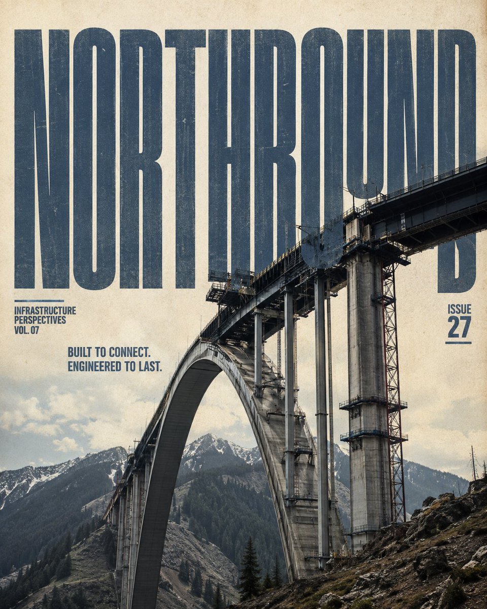
Create a sophisticated 4:5 vertical editorial magazine cover featuring [Subject] in [Location], designed as a premium printed infrastructure publication. Visual Foundation Use a warm cream/aged ivory paper background with subtle paper fibers, fine grain, faint ink imperfections, and authentic print texture. The result should feel like a physical high-end architecture or infrastructure magazine—not a glossy digital poster or UI design. Typography Place [Title] as a massive ultra-condensed, heavy sans-serif display title across the upper section in muted slate blue-gray. The title should have slight printed wear and imperfect ink texture. Most importantly, make the typography physically interact with the infrastructure. Parts of [Subject] must overlap, pierce, pass through, or naturally occlude sections of the title, creating genuine depth between foreground structure and lettering. Never place the title as a separate floating text layer. Below the main title, add two clean editorial subtitle lines: [Subtitle Line 1] [Subtitle Line 2] Use a smaller blue sans-serif style with precise spacing and understated magazine typography. Main Photography Make [Subject] the dominant visual element, occupying approximately 55–65% of the lower composition. Render it as highly realistic infrastructure photography with authentic construction, materials, weathering, joints, cables, metal, concrete, stone, glass, or other relevant structural details. Use a dramatic low-angle perspective that makes the structure feel monumental and engineered. Preserve realistic proportions and believable physical construction. Use natural directional lighting, crisp material detail, subtle atmospheric depth, and realistic shadows. Environment Integrate the structure naturally into [Location]. Include appropriate surrounding terrain, water, vegetation, buildings, snow, mountains, coastline, desert, or other environmental elements relevant to the location. Keep the background visually open enough to support the typography and maintain strong negative space. Editorial Layout Place [Series Label] as a small, compact editorial label on the left side, and [Issue Number] on the right. Keep both understated and aligned with the overall grid. Maintain a strong hierarchy: Large title → infrastructure subject → subtitle → metadata The composition should feel balanced, intentional, architectural, and publication-ready. Style & Quality Premium editorial photography, architectural magazine aesthetic, tactile paper surface, restrained slate-blue and warm cream palette, subtle vintage print character, realistic exposure, sharp structural detail, sophisticated composition, natural depth, refined typography, slight ink imperfections, high-resolution print quality. Avoid Floating or disconnected typography, sticker-like text, excessive graphic elements, UI interfaces, neon cyberpunk colors, oversaturated grading, pure white studio backgrounds, unrealistic architecture, distorted structures, random landmarks, excessive clutter, or people as the primary subject.