![Generate a square-format campaign image by reimagining a specific product inspired by [Brand Name],](https://images.meigen.ai/cdn-cgi/image/format=auto,quality=85,width=640,fit=scale-down/generations/2026-06/community_ccb934c3-7a55-42b6-b574-9a0aa8e010e1.png)
Back to Galleryother

10410Aug 22, 2026
Prompt
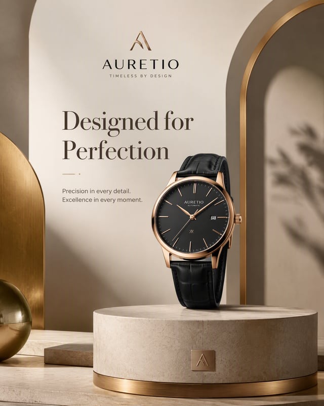
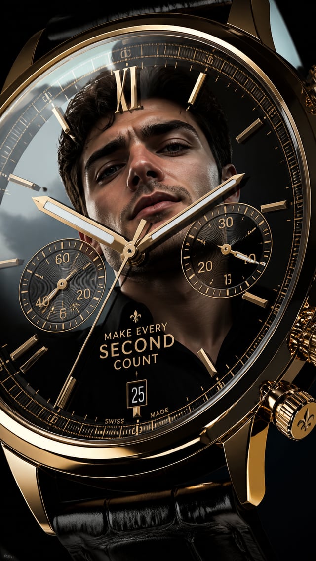
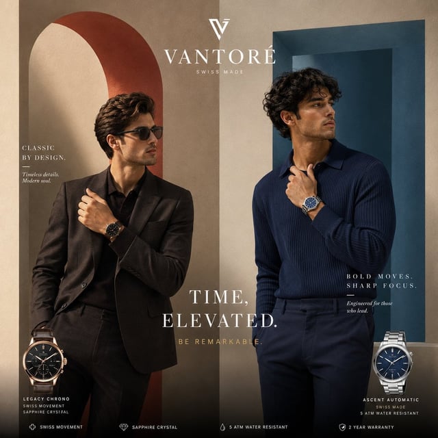
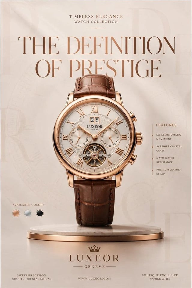
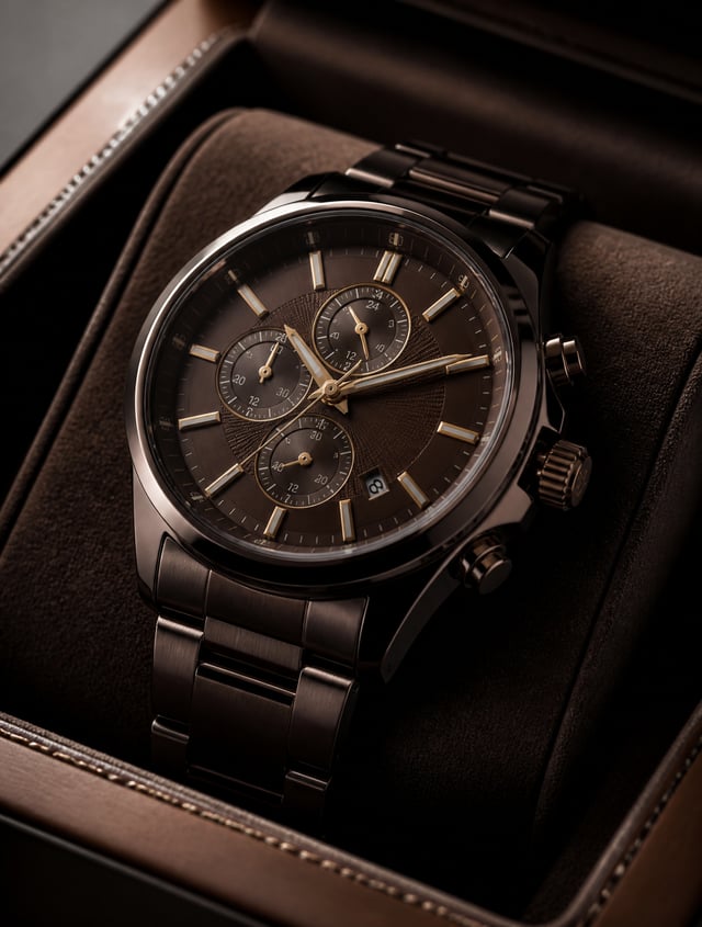
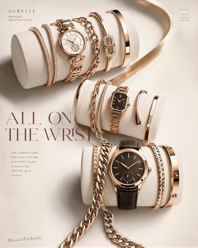
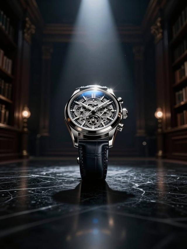
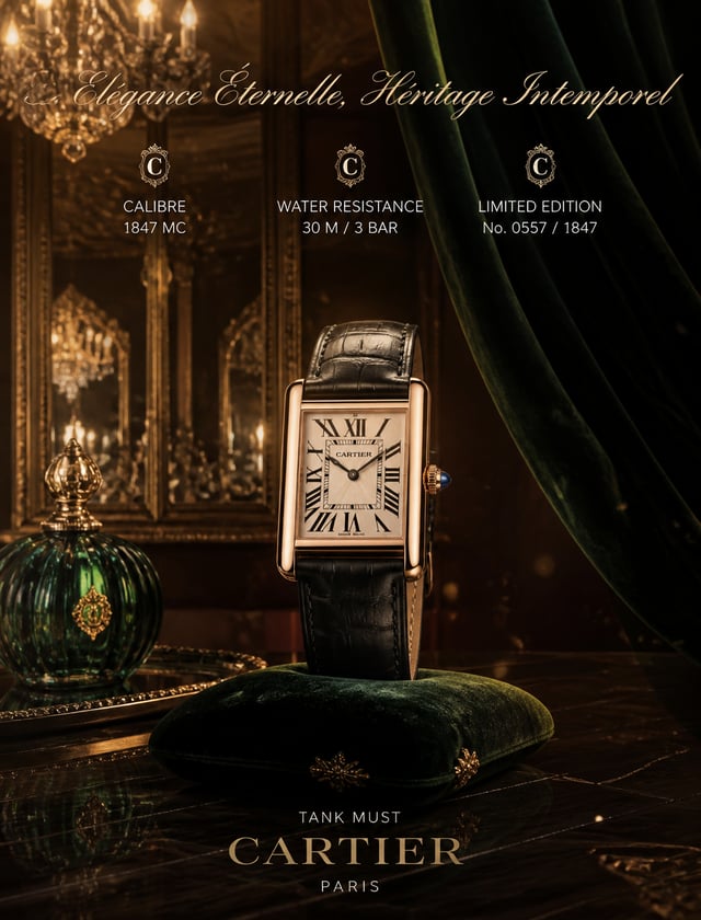
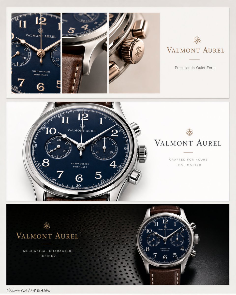
Create a premium luxury watch campaign presentation board for a fictional Swiss-inspired maison called VALMONT AUREL, combining Orbit-style viewing flow with Transit-style editorial restraint. The board must be designed as three elegant horizontal advertising banners stacked vertically on a pale warm-grey presentation sheet, with each banner presenting the same hero chronograph in a different luxury composition language. The watch must remain the absolute visual hero throughout the entire system. Core board structure: A tall vertical presentation board with generous outer margins and three evenly spaced horizontal campaign banners stacked from top to bottom. The three banners must feel like one coherent luxury advertising family, not separate random ads. The visual rhythm should guide the eye naturally from top detail study, to middle flagship product reveal, to bottom dark prestige statement. Product design: A museum-grade luxury mechanical chronograph wristwatch with a deep navy or midnight-blue dial, crisp Arabic numerals, clean subdials, polished stainless-steel or white-metal case, finely knurled crown and pushers, sapphire crystal, and a rich brown leather strap with visible stitching and natural grain. The watch must feel ultra-refined, masculine-luxury, highly engineered, and completely photoreal. For the top strip, introduce a rose-gold or warm-metal macro variation only as a premium material accent, while keeping the same design family. Orbit direction: The three banners must create a strong top-to-bottom premium browsing flow. Top banner draws the eye through macro detail slices of dial, crown, strap, and case finishing. Middle banner delivers the clean flagship reveal of the full watch face as the main recognition hit. Bottom banner resolves the system in a more dramatic dark-luxury close-up, making the brand feel powerful and final. This progression should feel like the viewer is moving closer into the identity of the watch, then recognizing it fully, then experiencing its prestige in a deeper tone. Transit restraint: Keep the board highly controlled and minimal. Each banner should contain only essential typography and large clean breathing zones. Avoid visual clutter, excessive body copy, decorative elements, or over-explained branding. The final board should feel like an international luxury print campaign study, calm, exact, and collectible. Top banner: A bright warm-white luxury strip divided into three narrow vertical macro crop windows on the left and center, showing extreme close-up details of the watch: one dial-and-hand detail, one strap-and-case junction, one crown/pusher/case finishing detail with warm metallic reflections. On the right side, leave a quiet text area with the brand name and one short original English line. This strip should feel airy, detail-driven, and elegantly technical. Middle banner: A clean flagship white strip featuring one oversized cropped view of the navy-dial chronograph dominating the left and center, with beautifully rendered bezel, dial, numerals, subdials, crown, and pusher details. On the right, keep only a minimal brand/title block. This is the clearest product recognition banner and should feel the most iconic and commercially direct. Bottom banner: A darker prestige strip with a black or charcoal luxury textured background, such as perforated metal or soft technical grain. On the right half, place a large near-full view of the watch glowing against the dark field. On the left, keep a restrained brand wordmark and one short campaign line. This strip should feel bold, high-status, and conclusive without becoming aggressive or flashy. Typography and branding: Use only original English typography. Brand name: “VALMONT AUREL” Possible short lines: “Crafted for Hours That Matter” “Precision in Quiet Form” “Mechanical Character, Refined” Each strip should use only the minimum amount of text necessary. Typography should be premium serif and restrained sans-serif, with elegant spacing, using muted gold, charcoal, or soft grey depending on the strip. No copied wording from the reference. Lighting: Luxury studio lighting with very controlled reflections. Top strip: soft bright directional light revealing dial texture, leather grain, and polished case edges. Middle strip: clean white-background product lighting with crisp contour separation and refined chrome highlights. Bottom strip: moodier directional light with selective highlights on bezel, numerals, sapphire crystal, and pushers. All reflections must feel intentional, premium, and physically coherent. Material rendering: Ultra-real polished and brushed metal, sapphire crystal, deep blue dial lacquer or subtle sunburst finish, precise dial printing, sharp hands, realistic crown knurling, leather strap grain and stitching, refined chronograph subdial depth, and impeccable macro craftsmanship. No fake CGI gloss, no warped geometry, no plastic textures. Color system: Warm white, pale grey, charcoal black, muted gold typography accents, polished silver or warm rose-metal highlights, deep navy dial, and rich brown leather. The palette must feel coherent, luxurious, and internationally premium. Style: Cannes-level luxury watch campaign board, Swiss-horology editorial advertising, premium print-ad system, minimal design sophistication, highly polished commercial realism, globally marketable, collectible, and timeless. Image quality and physical constraints: Ultra-detailed, high resolution, crisp watch geometry, flawless dial alignment, readable numerals, accurate subdial spacing, elegant spacing between banners, clean margins, no clutter, no watermark, no copied logos, no cheap brochure feeling. Negative prompt: copied original text, copied original brand, warped watch case, distorted dial, unreadable numerals, fake CGI metal, plastic leather, cluttered layout, cheap ecommerce ad, excessive body copy, oversharpened reflections, low-detail macros, muddy whites, random icons, watermark, noisy background