
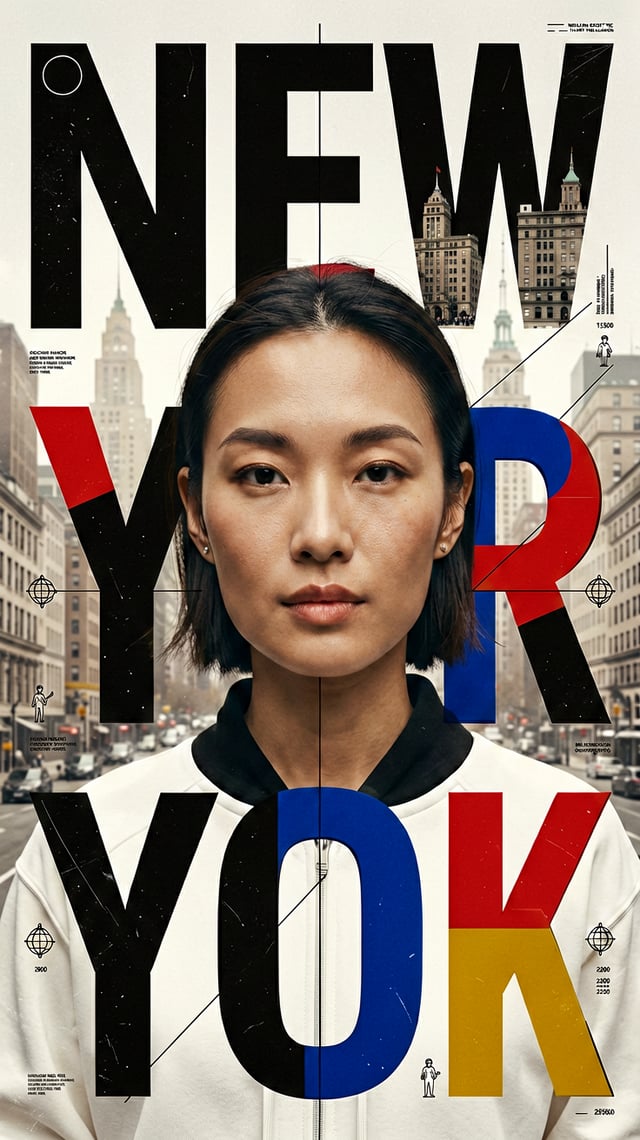
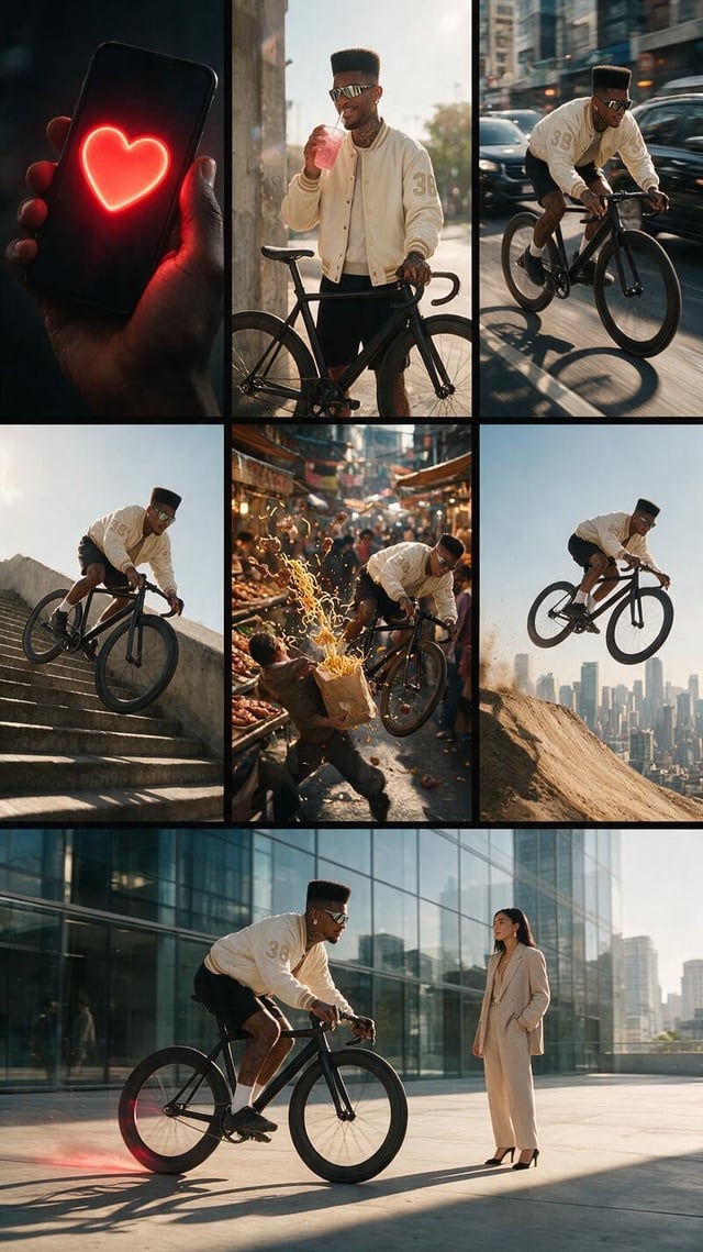
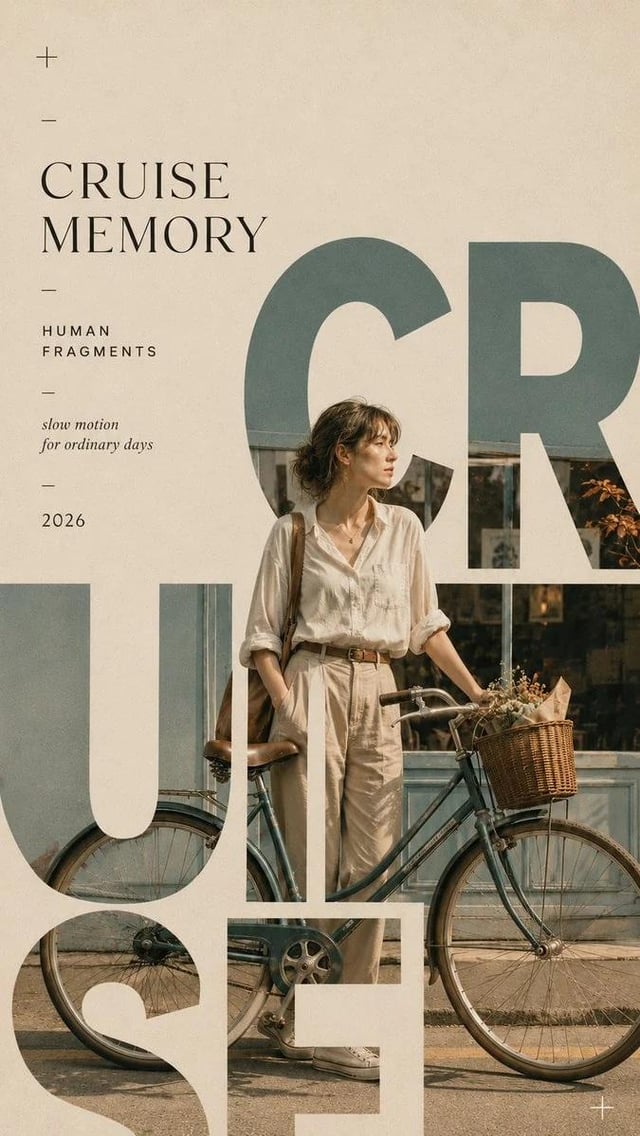
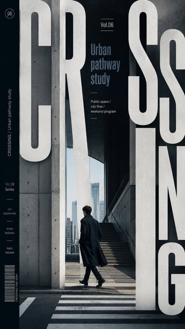
![Vertical editorial collage poster featuring [CHARACTER] in [CLOTHING], full-body cutout positioned a](https://images.meigen.ai/cdn-cgi/image/format=auto,quality=85,width=640,fit=scale-down/generations/2026-08/community_9c2546da-c2ea-4728-9b5e-52ffeeb5642b.png)
Back to GalleryGPT Image

30131.7KAug 20, 2026
Prompt
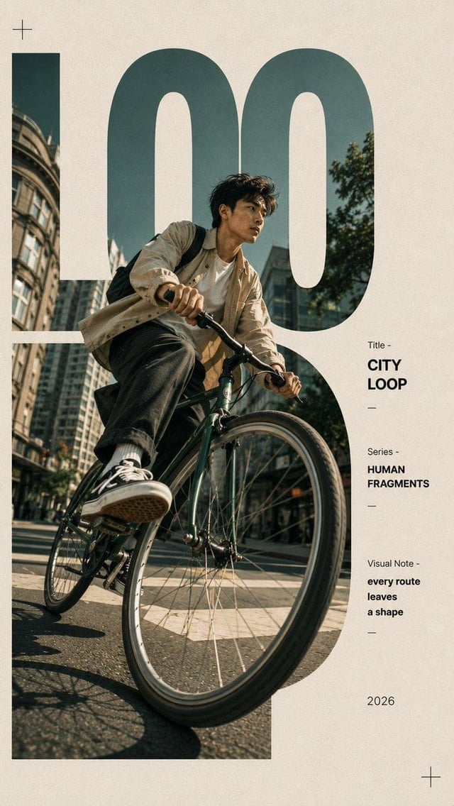
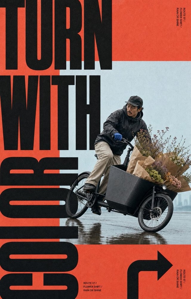
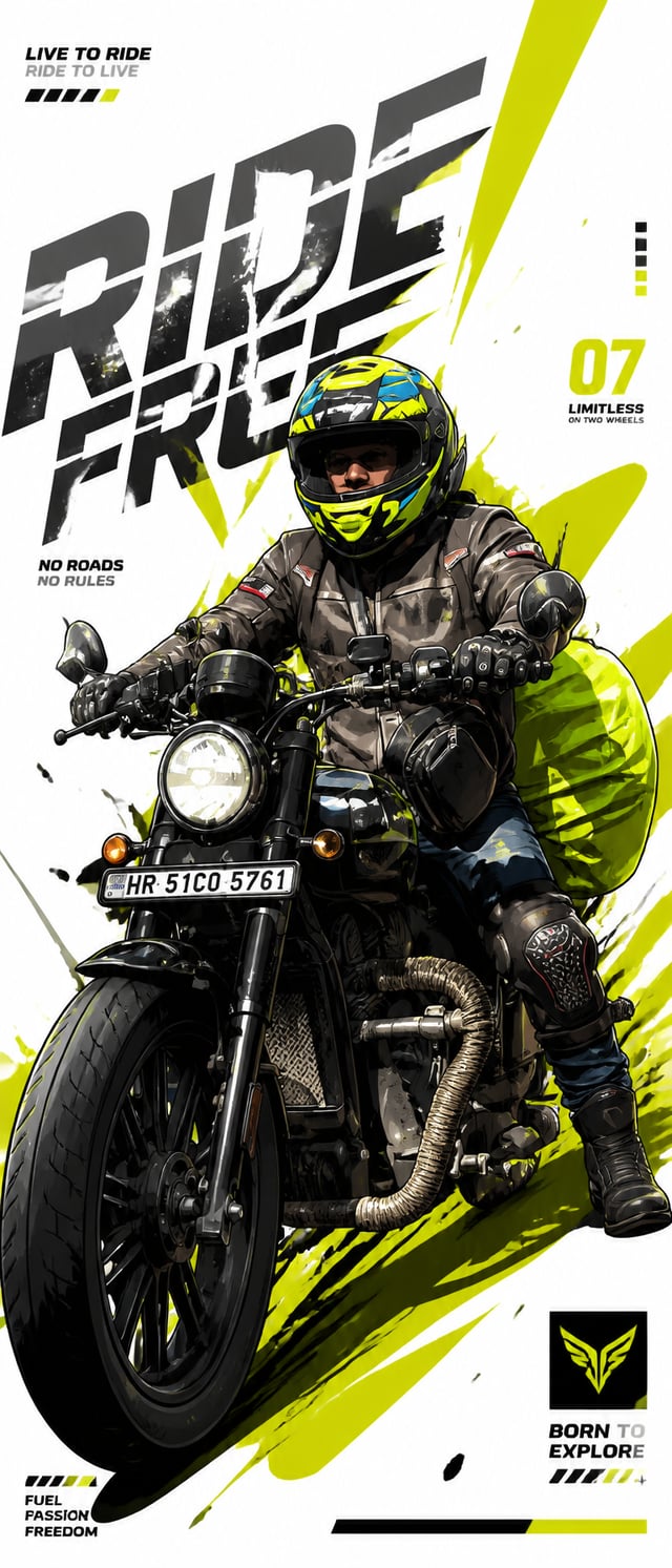
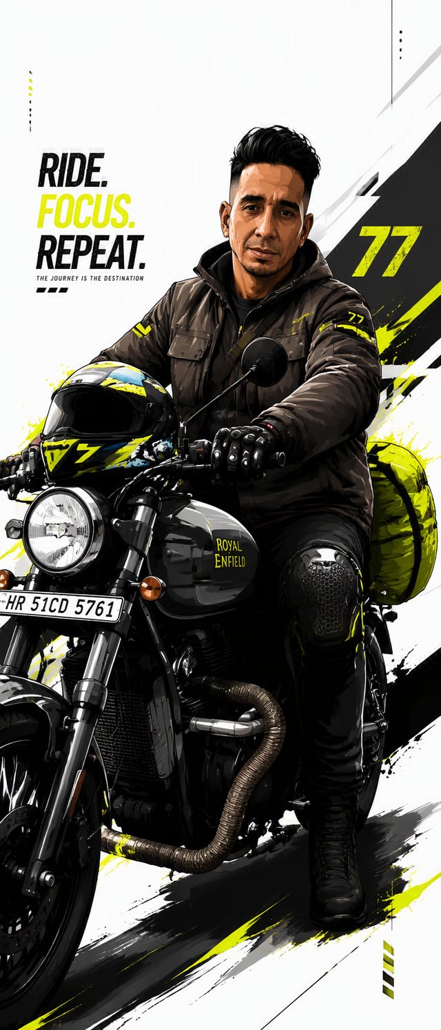
[SUBJECT]: [Subject] [TITLE]: [Title] [THEME]: [Theme] [SCENE]: [Scene] [ACCENT COLOR]: [Accent Color] [SHORT LINE]: [Short Line] [FORMAT]: 9:16 Create an experimental editorial poster combining photography, oversized typography, and subtle print texture. Use [Subject] as the main visual inside [Scene]. Keep it realistic, distinctive, and large enough to hold the composition. The subject should feel like a real cultural or everyday observation, not a generic stock image. Set [Title] in oversized bold condensed sans-serif type. Do not simply place the title over the image — let the subject and typography overlap, interrupt, frame, or pass behind each other so they become one composition. The typography can respond naturally to the subject’s shape, direction, or architecture. Use a warm off-white, concrete gray, or deep charcoal base with subtle paper grain and slightly aged print texture. Keep most of the palette neutral and use [Accent Color] only in a few small lines, blocks, or graphic marks. Add restrained editorial details such as thin guide lines, diagrams, maps, grids, annotations, or geometric elements only when they support the subject. Keep the layout rich but controlled, with clear hierarchy and intentional negative space. Keep all supporting text meaningful and minimal. Avoid random placeholder words, excessive technical data, unnecessary numbering, logos, watermarks, sparkles, and decorative clutter. Overall style: contemporary editorial design × photographic collage × experimental typography × subtle neo-retro print aesthetics.