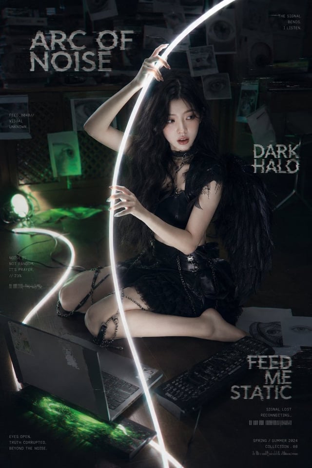
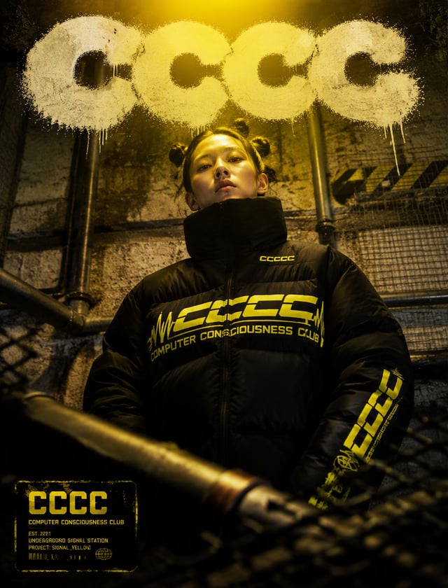
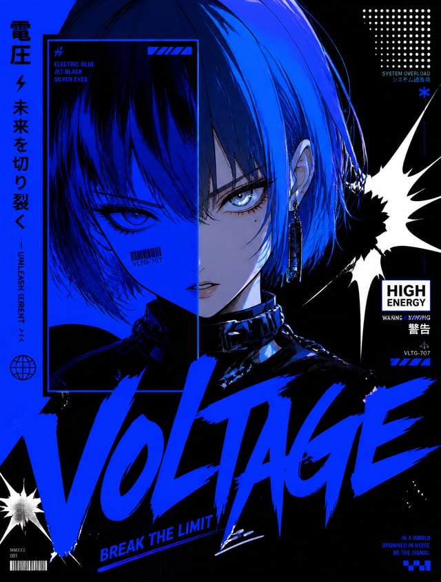
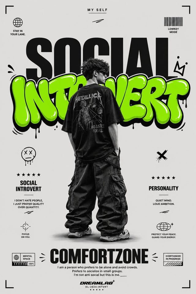
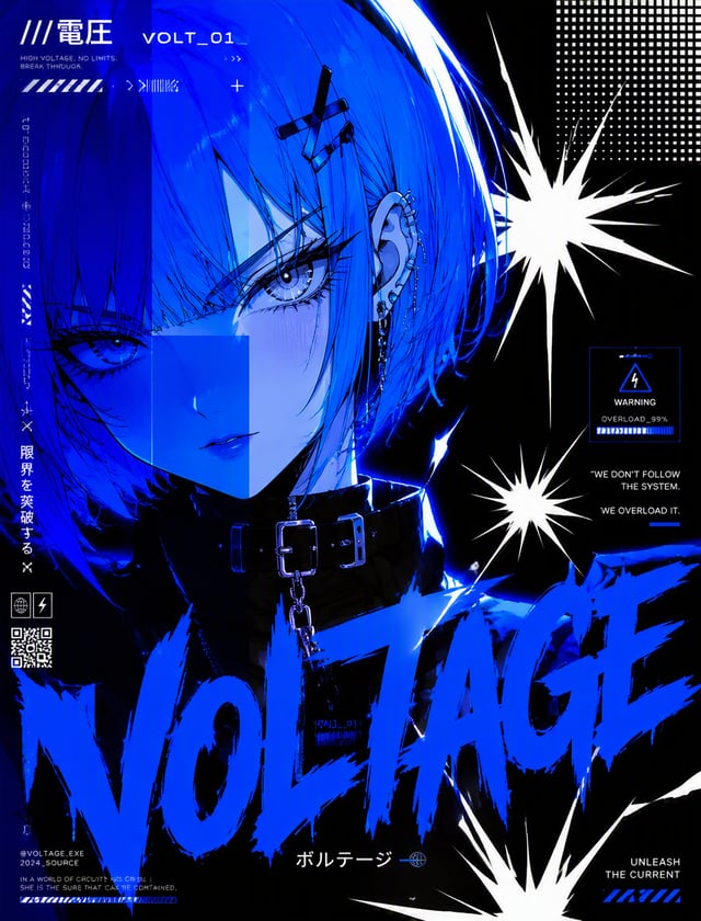
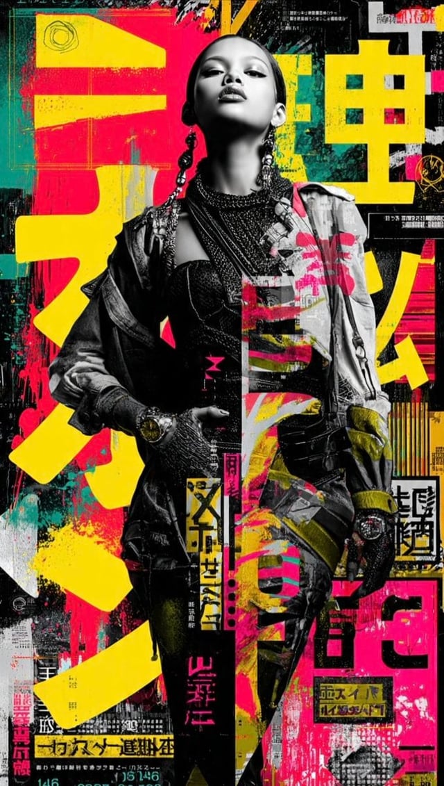
![Create a 9:16 K-pop apocalypse ransom zine poster featuring [SUBJECT] [SUBJECT_ACTION], styled in [W](https://images.meigen.ai/cdn-cgi/image/format=auto,quality=85,width=640,fit=scale-down/tweets/2052412191559795157/0.jpg)
Back to GalleryGPT Image

376.3KAug 20, 2026
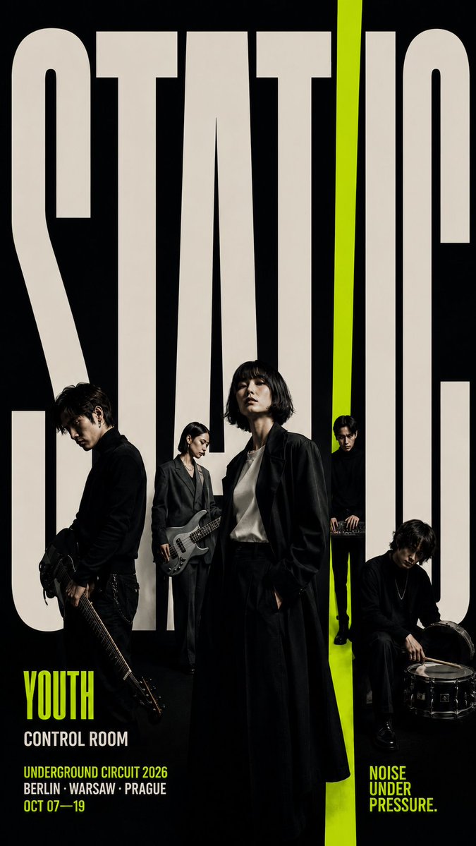
Prompt
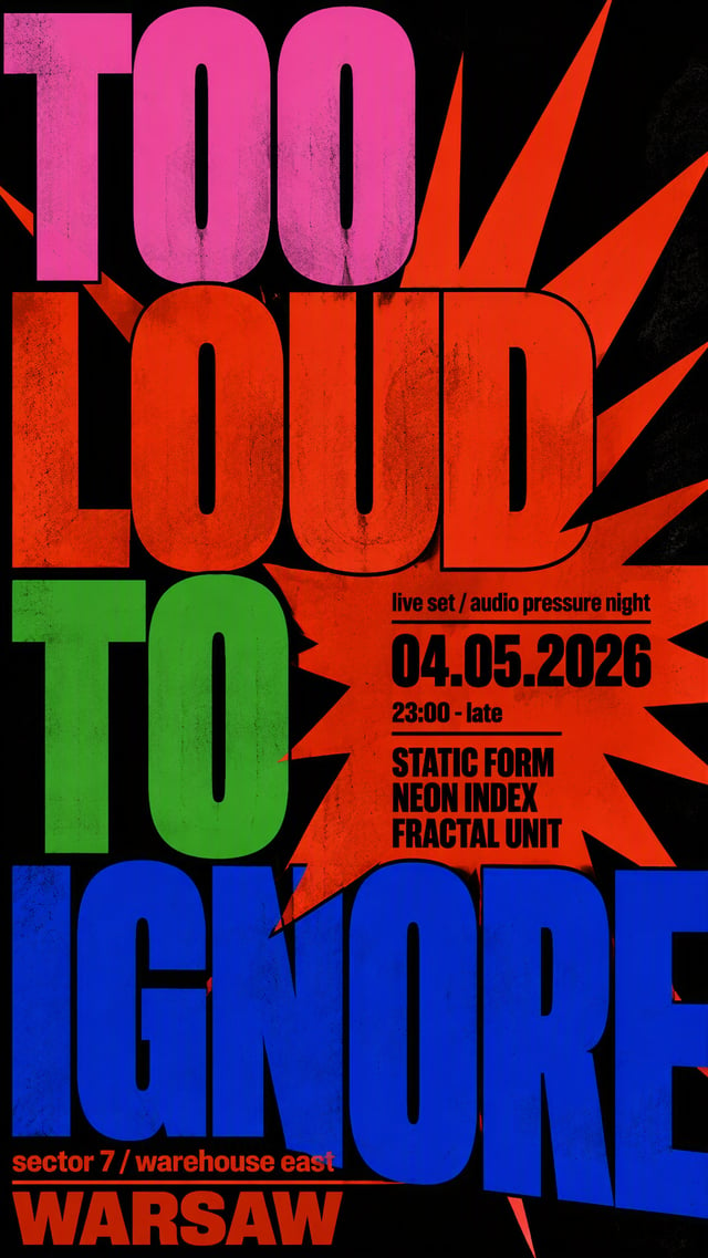
[THEME]: [Theme] [TITLE]: [Title] [CHARACTERS]: [Characters] [BACKGROUND]: [Background] [ACCENT]: [Accent] [TYPE BEHAVIOR]: [Type Behavior] [INFO]: [Info] [FORMAT]: 9:16 vertical Create a bold editorial group poster where oversized typography becomes part of the physical composition. Use a clean background, a restrained color palette, realistic photographic characters, and one strong accent color. Make the main title extremely large, occupying roughly 50–70% of the composition. Let the letters extend beyond the frame and interact with the characters instead of sitting behind them. Place the characters at different scales, heights, and depths. Avoid lining everyone up evenly. Let some figures stand in front of the letters, some appear between letterforms, and others occupy the negative spaces inside the typography. Use the typography to express the concept through [Type Behavior]: e.g. * connection — extend type into paths or spatial bands Keep the visual hierarchy strong: giant type, clear character focus, then small supporting information. Use only meaningful text and avoid excessive credits or filler words. Characters should look like real editorial photography with natural skin, realistic hair, authentic clothing materials, and distinct identities.