![[Product Type]: [Product Type]](https://images.meigen.ai/cdn-cgi/image/format=auto,quality=85,width=640,fit=scale-down/tweets/2082780660163305895/0.jpg)
Back to Galleryother

29663Aug 19, 2026
Prompt
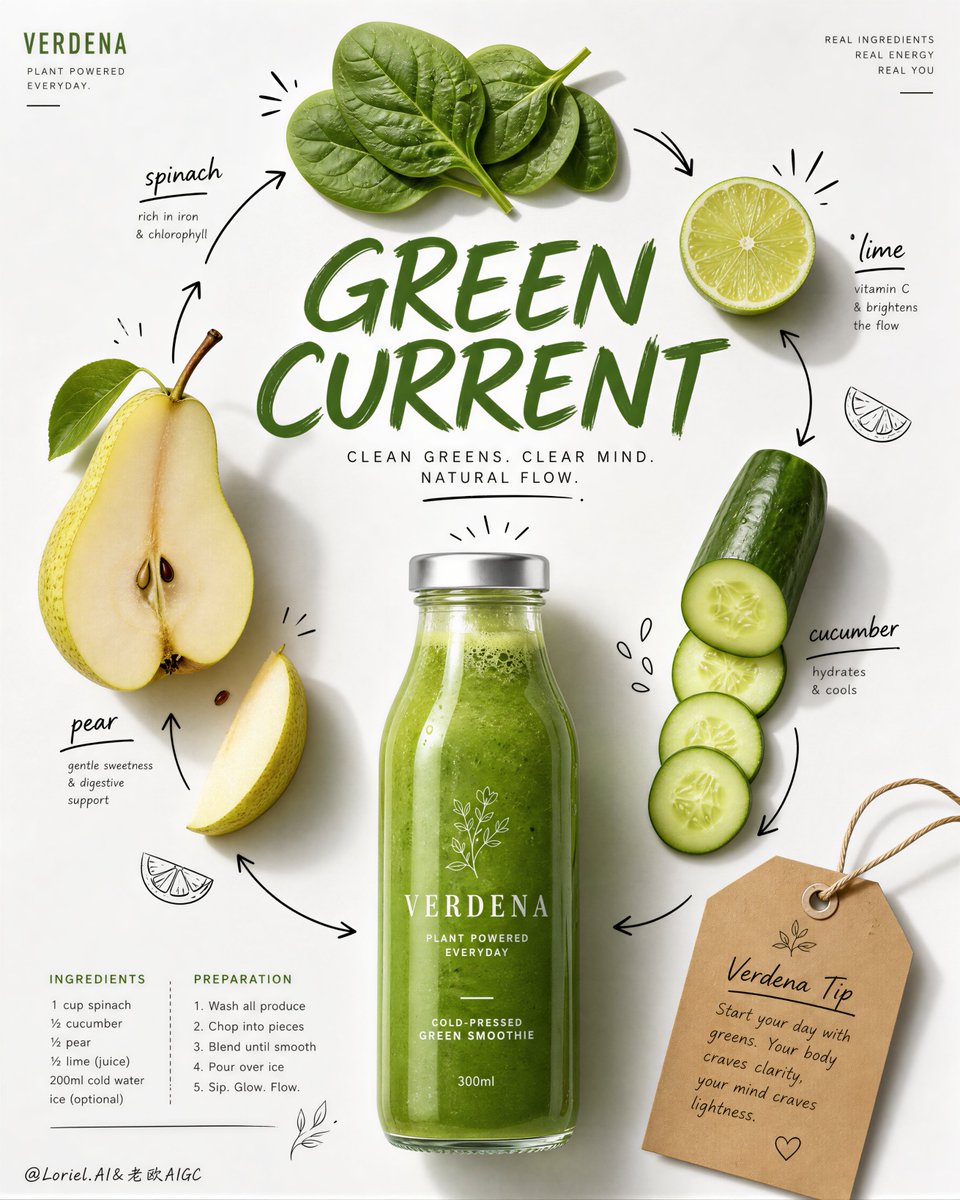
Create a premium editorial juice-campaign poster for a fictional wellness beverage brand called AURORA PRESS, refined in a more international, cleaner, and more luxurious Transit direction. Vertical format, bright white paper-like background, one realistic orange juice bottle centered near the lower-middle as the main product hero, a carefully curated arrangement of fresh ingredients around it, one large expressive editorial headline across the middle, a compact recipe block below, restrained black doodle-style ingredient annotations, and one elegant kraft-paper tip tag near the upper-left. The whole image must feel like a flagship health-drink editorial page from a top-tier global lifestyle magazine. Main composition: Place one clear glass bottle filled with vivid fresh orange juice in the lower-center as the visual anchor. Around it, arrange a highly disciplined ingredient constellation: a halved apple near the upper-right center, one large orange slice near the upper-left center, a piece of fresh ginger near the upper-middle, a few carrot coin slices placed with editorial precision, one lemon wedge near the upper-right, and one small ginger slice below. Keep the ingredient spacing more refined and intentional, with increased breathing room and less visual noise. The bottle must remain the unquestioned hero. Product realism: The bottle must be rendered with premium realism: transparent glass, vivid orange liquid, subtle pulp density, soft reflective highlights, natural meniscus, light refraction, and a clean white cap. Ingredients must look fresh and elevated: juicy orange pulp, moist apple flesh with visible seed cavity, realistic ginger fiber texture, crisp carrot cross-sections, glossy lemon flesh, and subtle organic imperfections. All materials should feel more polished and editorial than a casual recipe page. Graphic design layer: Use a restrained hand-drawn black doodle system with cleaner hierarchy and fewer marks: a few sketched fruit outlines, minimal arrows, and elegant accent lines only where they help the composition. Add original ingredient labels in a mix of hand-drawn and editorial type, all fully original. Place one large expressive orange headline across the middle such as “Fresh Lift” or “Bright Fuel,” fully original, but keep it cleaner and more internationally art-directed than a playful craft page. Below or left of the bottle, include a compact ingredients list and short preparation guide in refined editorial microcopy. Near the upper-left, place one kraft-paper tip tag with string and original tiny note text, but keep it smaller, neater, and more premium. Style: Luxury wellness editorial, premium juice recipe campaign, global health-magazine commercial page, clean real-fruit photography fused with restrained hand-drawn annotation, sophisticated and highly shoppable. The whole page must feel like a polished brand-sponsored editorial feature. Lighting and mood: Soft natural daylight from upper-left or upper-front, with delicate object shadows, clean bottle highlights, and gentle separation from the white background. Keep the image bright, airy, and health-oriented, but more refined and internationally premium. Avoid overly playful contrast; use subtle tonal discipline. Color system: Bright white background, vivid juice orange, carrot orange, citrus yellow, soft apple cream and red, ginger beige, restrained black doodle lines, muted kraft-paper beige, and subtle dark gray editorial text. Keep the palette clean, optimistic, and globally premium. Negative prompt: no copied text, no existing magazine layout, no cluttered ingredient arrangement, no dirty background, no warped fruit shapes, no low-detail bottle, no muddy orange liquid, no black blotches, no messy doodles, no watermark, no existing logos, no chaotic typography.