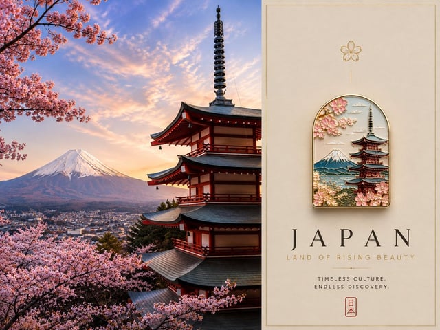
![Create a premium 4:5 vertical contemporary travel artwork featuring [COUNTRY] reimagined as a refine](https://images.meigen.ai/cdn-cgi/image/format=auto,quality=85,width=640,fit=scale-down/tweets/2091188015427424629/0.jpg)
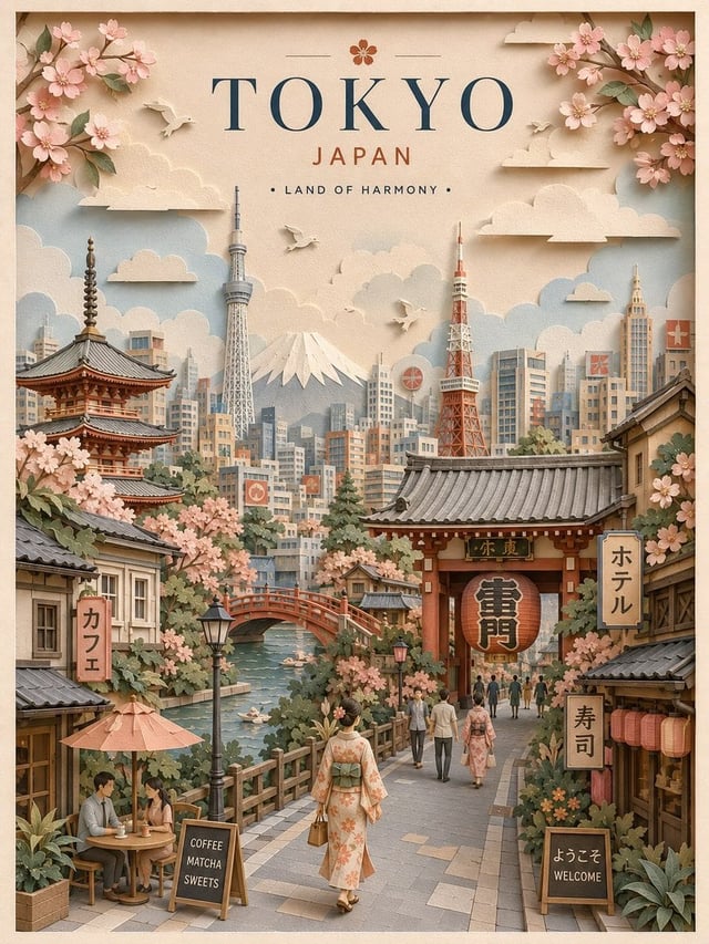
![Create a charming handcrafted 3D paper-cut travel poster representing [Destination]. Build the entir](https://images.meigen.ai/cdn-cgi/image/format=auto,quality=85,width=640,fit=scale-down/tweets/2096451812807356737/0.jpg)
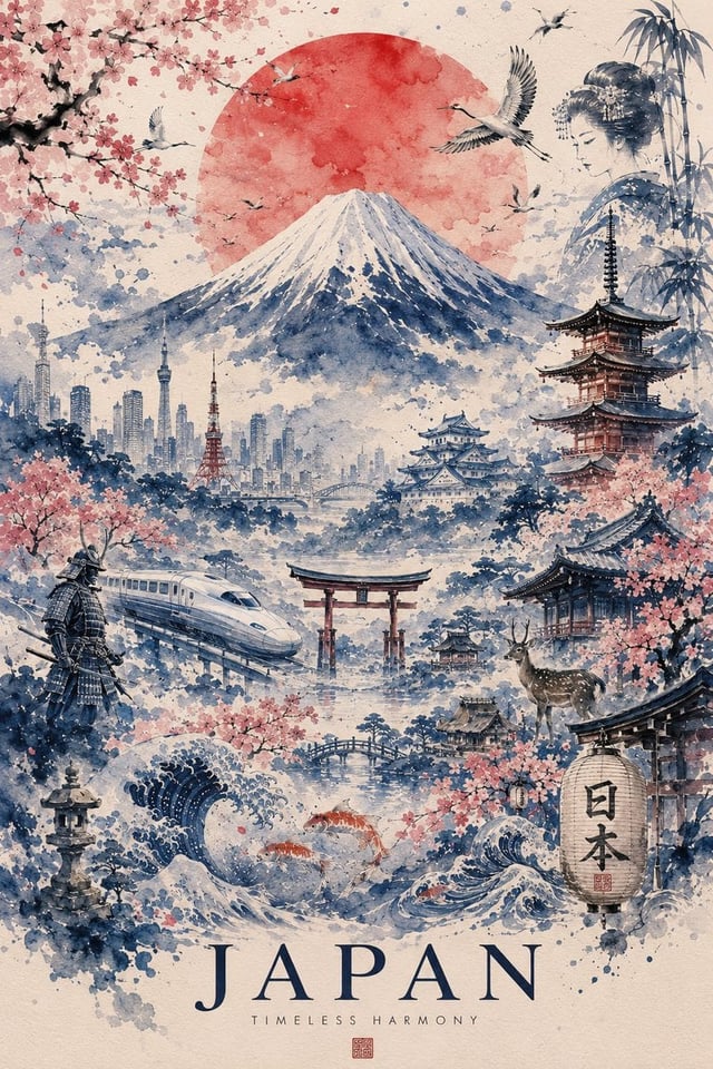
![Create an isometric miniature 3D diorama highlighting the natural landmark [NATURAL WONDER] from [CO](https://images.meigen.ai/cdn-cgi/image/format=auto,quality=85,width=640,fit=scale-down/tweets/2019267462647439770/0.jpg)
![Ultra-premium cinematic 3D travel poster for [Country], bright luxury aesthetic, soft sunlight, drea](https://images.meigen.ai/cdn-cgi/image/format=auto,quality=85,width=640,fit=scale-down/tweets/2065052791043653705/0.jpg)
![创作一幅精美的[日本东京]宽幅风景旅行海报插画。核心概念:将城市描绘成一幅宁静、优雅、风格化的粉彩纸拼贴画,将城市最具标志性的地标和最易辨识的交通工具巧妙地融合在一个和谐的构图中。插画应呈现出博物馆级](https://images.meigen.ai/cdn-cgi/image/format=auto,quality=85,width=640,fit=scale-down/generations/2026-08/community_4572e6e1-6f7d-4e5d-8b15-e005bb68f883.png)
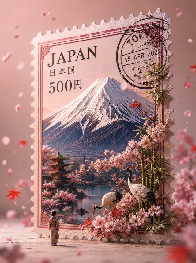
![Design a premium 4:5 collectible postal-stamp poster for [CITY], where the entire composition is one](https://images.meigen.ai/cdn-cgi/image/format=auto,quality=85,width=640,fit=scale-down/tweets/2054257333598077100/0.jpg)

Back to Galleryother

523.8KAug 18, 2026
Prompt
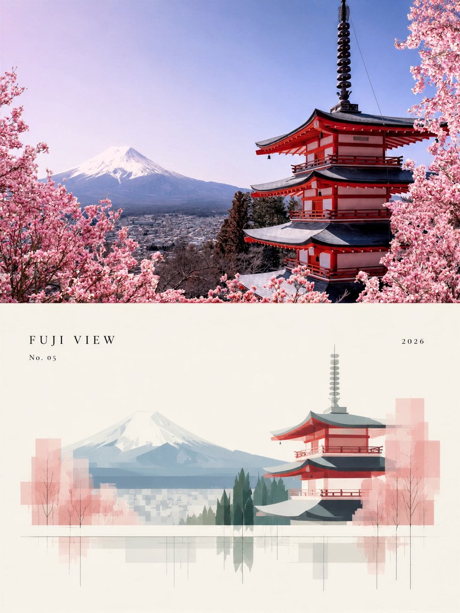
Create a premium minimalist architectural editorial poster based on the supplied landscape photograph. VERTICAL 3:4 FORMAT. The composition is divided horizontally into exactly two equal sections, 50% / 50%. TOP HALF — PHOTOGRAPH: Preserve the supplied original photograph as a realistic photographic image. Maintain the exact architecture, landscape structure, perspective, lake, vegetation, mountains, reflections and natural proportions. Do not redesign or distort the location. Apply only subtle museum-quality editorial photography grading: refined contrast, restrained saturation, natural atmospheric depth, sophisticated fine-art travel photography. If additional vertical space is required for the 3:4 composition, naturally extend only sky, water, ground or environmental background. Never stretch or warp the original structures. BOTTOM HALF — ABSTRACT ARCHITECTURAL INTERPRETATION: Warm ivory / gallery-paper background with generous negative space. Reinterpret the exact same scene from the photograph as an extremely refined minimalist architectural illustration. Preserve the recognizable silhouette, relative placement and proportions of the major buildings and landscape so the viewer immediately recognizes it as the same location shown above. Reduce architecture into elegant geometric blocks and simplified planar shapes. Reduce mountains and vegetation into large restrained overlapping color masses. Represent trees using minimal vertical silhouettes. Represent the lake with thin horizontal lines and subtle translucent vertical reflections extending downward. Use flat muted colors sampled directly from the photograph: deep forest green, sage green, charcoal teal, soft blue-grey, warm architectural white, subtle muted brown. Mix solid geometric forms with a few transparent overlapping rectangles, extremely thin construction lines, vertical drafting lines and subtle architectural-diagram elements. No realistic illustration in the lower section. No cartoon. No detailed painting. No thick outlines. No decorative clutter. No template aesthetic. TYPOGRAPHY: Very sparse Swiss / international editorial typography. Small elegant uppercase serif title with wide letter spacing near the upper-left area of the lower section. Small catalog number underneath. Year aligned far right. Typography should occupy very little space. Overall aesthetic: international architecture exhibition poster, Japanese art-book editorial design, Swiss graphic design, premium museum catalog, contemporary architectural visualization, quiet luxury, restrained, precise, balanced, sophisticated. Large areas of empty ivory space are essential. The two halves must feel intentionally connected: REAL PLACE above, DESIGN ABSTRACTION of the SAME PLACE below. No collage. No multiple photographs. No decorative frame. No gradients in the illustration. No glossy commercial advertising style. No cheap poster template. No cartoon aesthetic. No watermark.