Back to GalleryGPT Image

344KAug 16, 2026
Prompt
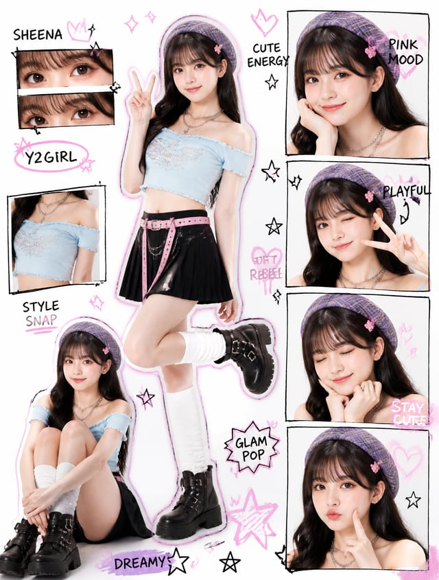
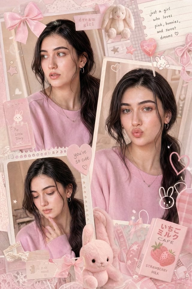
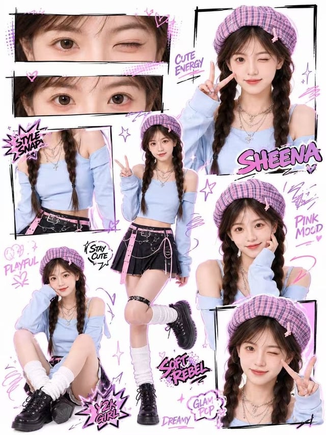
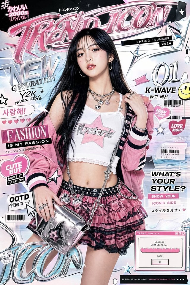
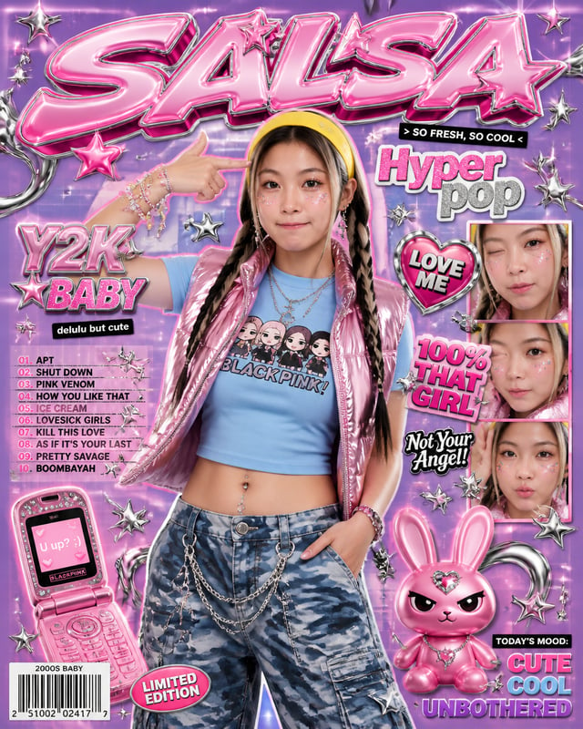
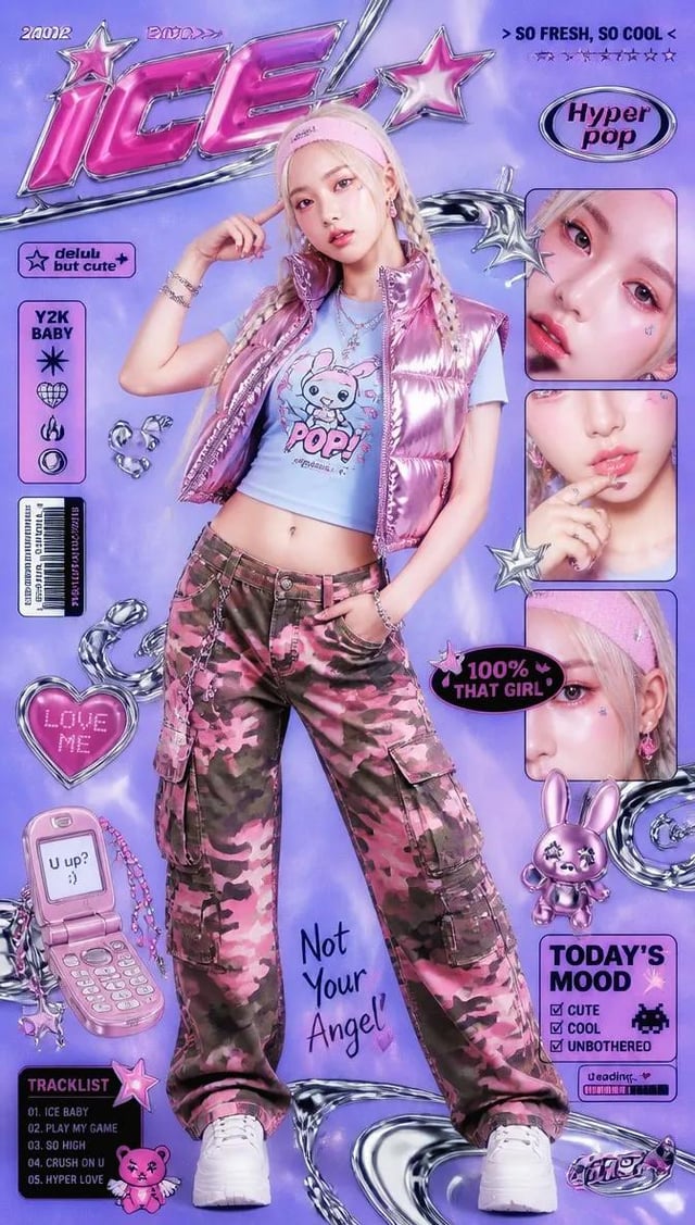
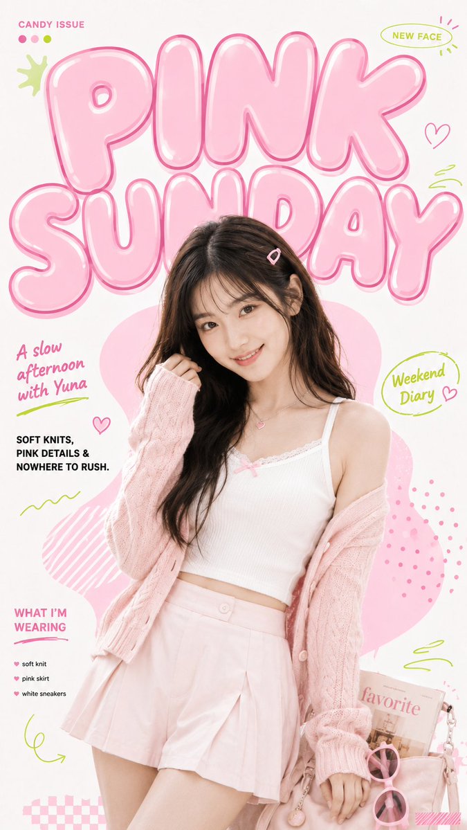
Theme: [Theme] Main title: [Title] Subject: [Subject] Outfit: [Outfit] Pose & props: [Pose And Props] Main color: [Main Color] Accent color: [Accent Color] Cover lines: [Cover Lines] Create a 9:16 cute youth magazine cover with a clean white or soft cream graphic background. Use one young adult character as the main photographic subject, framed in a 3/4 body composition with natural skin texture, expressive eyes, relaxed body language, and a lively candid feel. Place an oversized glossy bubble title across the upper 30–38% of the poster. The letters should feel soft, inflated and playful, with bold outlines, subtle offset shadows, curved white highlights, and slight hand-drawn irregularity. Let the character naturally overlap part of the title. Behind the character, add one large organic graphic shape in the secondary color to build depth without creating a realistic environment. Keep the editorial information clear and moderate: use only 3–4 small text areas, with strong contrast between the huge display title and tiny supporting typography. Add 6–10 lightweight graphic accents such as dots, curves, open frames, checker patterns, brush marks, brackets or simple hand-drawn icons. Keep them playful but visually controlled. Use only 2–3 real props related to the theme. Let props communicate the story instead of building a full realistic scene. Overall look: sweet, youthful, playful, polished, graphic editorial, visually rich but never cluttered.