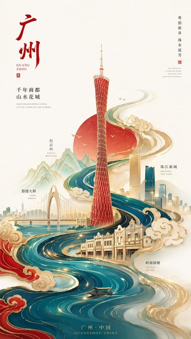
![Create a premium 3:4 vertical handmade-paper editorial artwork for [Subject].](https://images.meigen.ai/cdn-cgi/image/format=auto,quality=85,width=640,fit=scale-down/tweets/2101958048827027839/0.jpg)
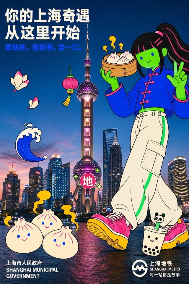
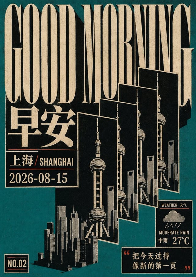
![[image1]参考,生成上海市](https://images.meigen.ai/cdn-cgi/image/format=auto,quality=85,width=640,fit=scale-down/generations/2026-07/community_3e37f9ab-fdc8-4619-855b-cbc5b700887c.png)
![Create a premium vertical 4:5 travel poster for [Country], illustrated as one elegant continuous han](https://images.meigen.ai/cdn-cgi/image/format=auto,quality=85,width=640,fit=scale-down/tweets/2092079254775435448/0.jpg)
![CITY: [City Name]](https://images.meigen.ai/cdn-cgi/image/format=auto,quality=85,width=640,fit=scale-down/tweets/2088976148801716425/0.jpg)
Back to GalleryGPT Image

521.9KAug 16, 2026
Prompt
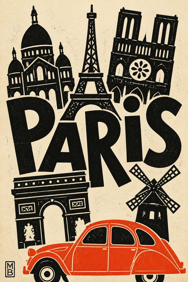
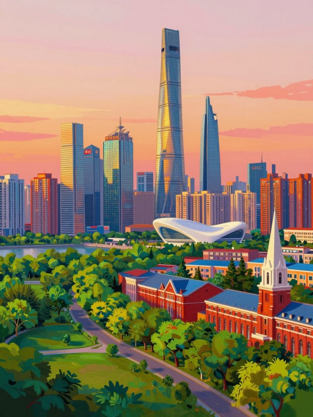
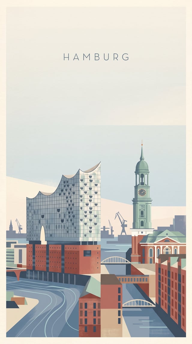
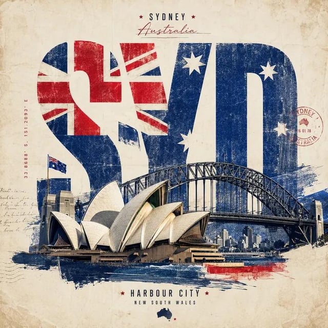
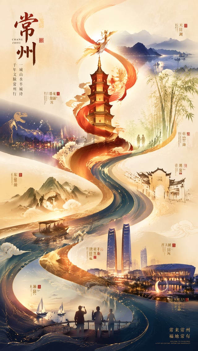
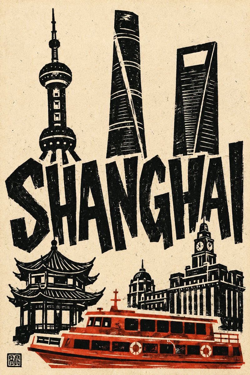
Create a bold hand-cut linocut / papercut travel poster of [City], vertical 2:3, printed on warm ivory paper with visible handmade texture. Choose five instantly recognizable symbols of [City], using landmarks with clearly different silhouettes. Simplify them into chunky flat black cut-paper shapes with large white negative-space details. Distort scale freely for stronger graphic impact. Build a loose asymmetric collage: three landmarks across the upper area, the city name dominating the middle, two landmarks framing the lower area, one iconic local vehicle across the bottom foreground. Set “[City]” in huge irregular hand-cut capitals. Make the letters thick, uneven, slightly tilted and tightly spaced, interacting and overlapping with the landmarks rather than behaving like a separate title. Render the vehicle in strict side profile using one flat accent colour based on its real local livery. Keep windows black and structural details as simple white cutouts. Let the vehicle crop naturally at the frame edge. Style everything like a primitive hand-pulled linocut or screenprint: rough edges, uneven ink coverage, dry-brush gaps, scattered speckles and imperfect registration. Palette: warm ivory paper, solid black ink, one strong vehicle accent colour, optional tiny secondary warm detail. Keep the image flat, graphic, playful and deliberately imperfect. Avoid photorealism, perspective, shading, gradients, fine architectural detail, realistic proportions, dense backgrounds, people, sky, streets, shadows, readable signage, digital-looking fonts and decorative borders. Add a tiny black carved chop mark in the bottom-left corner.