![Create a premium, high-impact commercial infographic advertisement for [Product Name] in a modern ed](https://images.meigen.ai/cdn-cgi/image/format=auto,quality=85,width=640,fit=scale-down/tweets/2081230665736224807/0.jpg)
![Pastel pop advertising illustration of [Human] beside a tilted [Brew] can bursting through a dramati](https://images.meigen.ai/cdn-cgi/image/format=auto,quality=85,width=640,fit=scale-down/tweets/2085920561348108308/0.jpg)
Back to GalleryGPT Image

421.6KJul 7, 2026
Prompt
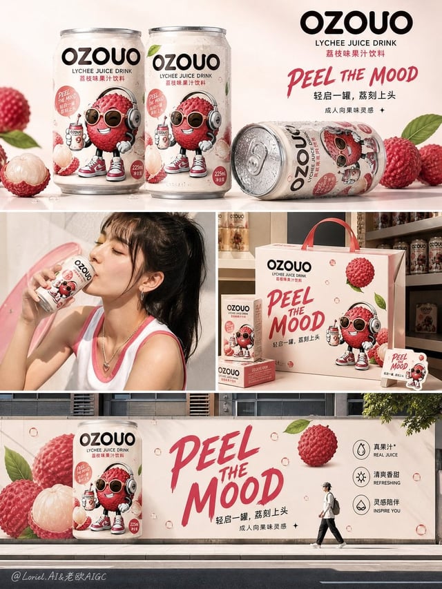
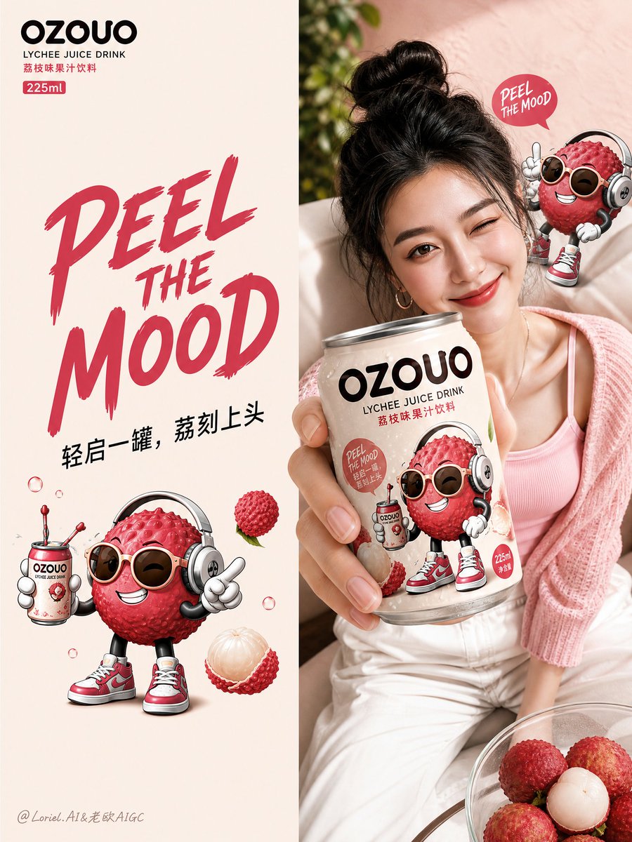
Create the fourth image of the unified brand visual system for “OZOUO” fruit drinks, keeping exactly the same brand identity, mascot illustration style, typography system, 225ml can proportion, lychee flavor hero design, and overall color DNA as the established OZOUO visual system. This image must serve a new responsibility: a retail touchpoint and brand-extension application board, not a packaging sheet, not a flavor lineup poster, and not a broad campaign collage. Core role: This image should show how the OZOUO brand system extends into real consumer touchpoints, including point-of-sale materials, retail-ready packaging extensions, fridge display, branded lifestyle accessories, and human interaction moments. It should feel like a polished brand application board for a modern beverage launch. Overall composition: Use a clean multi-panel layout on a soft warm beige or creamy neutral background, with 5 or 6 sections arranged in a tidy brand-presentation collage. Each panel should feel visually distinct but clearly belong to the same OZOUO world. The whole image must remain calm, premium, playful, and highly coherent. Brand consistency: Keep exactly the same OZOUO identity system: same “OZOUO” wordmark, same lychee hero flavor, same adult-oriented cartoon lychee mascot, same 225ml compact can design, same creamy base + lychee pink + deep brown typography, same “PEEL THE MOOD” tone of voice, same balance between cute and grown-up. Everything must clearly feel like one brand. Suggested panel structure: Panel 1: Branded print materials such as postcards, flyers, mini posters, or brand cards laid flat in a neat presentation. Use the same OZOUO logo, lychee mascot, and creamy-pink color system. The style should feel simple, graphic, and collectible. Panel 2: A compact retail multipack or gift carton designed for the OZOUO 225ml cans. Show a realistic branded paper carrier or small boxed set using the same mascot and typography system. It should feel commercially believable and shelf-ready. Panel 3: A refrigerated retail shelf display with multiple OZOUO lychee cans lined up neatly inside a cooler. The cans should look cold, fresh, slightly condensed, and highly recognizable. This panel demonstrates shelf impact and retail visibility. Panel 4: A stylish young adult holding or presenting an OZOUO can in a natural lifestyle moment. Keep the person fashionable, modern, and brand-appropriate, with the can clearly visible. The mood should feel social, confident, and urban, not like a generic stock photo. Panel 5: A branded tote bag, shopping bag, or soft lifestyle accessory using the OZOUO visual system. The bag should feel trendy, useful, and premium, extending the brand into daily life. Use the logo and mascot in a more graphic, simplified way. Optional Panel 6: A small point-of-sale or countertop display, sticker sheet, shelf wobblers, or branded cooler decal system, proving the OZOUO design language works across retail details. Visual tone: The board should feel more practical and retail-facing than the previous campaign image. It must communicate how OZOUO appears in real purchase environments and branded consumer touchpoints. Each panel should be simple, strong, and brand-consistent. Typography: Typography should stay concise and highly recognizable, using the same OZOUO system: “OZOUO” “LYCHEE JUICE DRINK” “PEEL THE MOOD” “轻启一罐,荔刻上头” “成人向果味灵感” Use text sparingly and strategically. Avoid cluttered copy. Color palette: Use the established OZOUO lychee palette: creamy warm beige, soft blush pink, lychee rose, berry-pink accents, deep espresso-brown typography, small fresh green leaf accents. All applications should clearly feel part of the same family. Styling: Adult playful, stylish, retail-ready, social-media friendly, clean, modern, premium FMCG branding, cute but not childish, polished and commercially believable. Rendering: hyper-detailed 225ml can mockups, realistic packaging materials, premium print finishes, clean collage composition, realistic fridge display, lifestyle application realism, soft studio shadows, 8k, brand presentation quality. Negative prompt: repeated technical packaging board, barcode-heavy design, random flavor changes, inconsistent mascot style, childish kids drink branding, messy collage, unrelated products, weak retail realism, low detail, inconsistent can proportions, generic supermarket branding, cluttered layout