Back to GalleryGPT Image

361.7KJul 6, 2026
Prompt
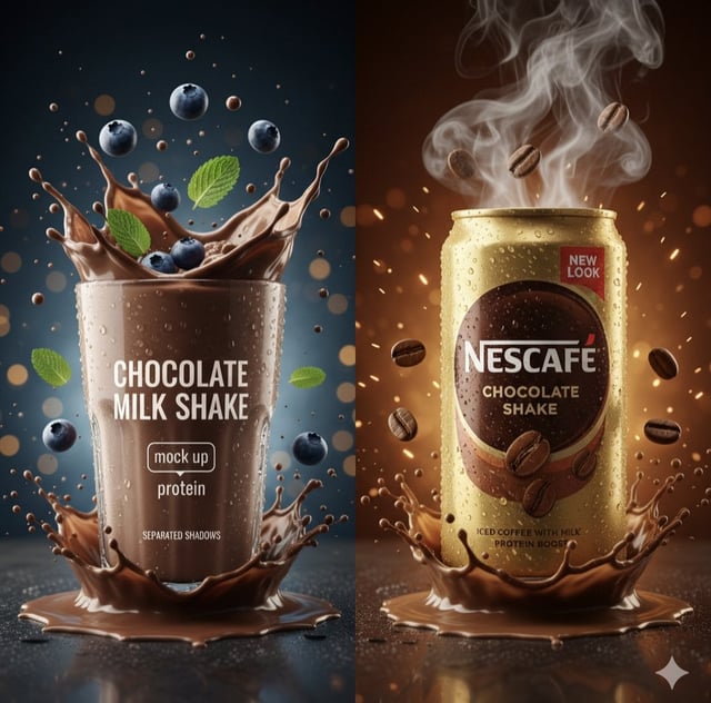
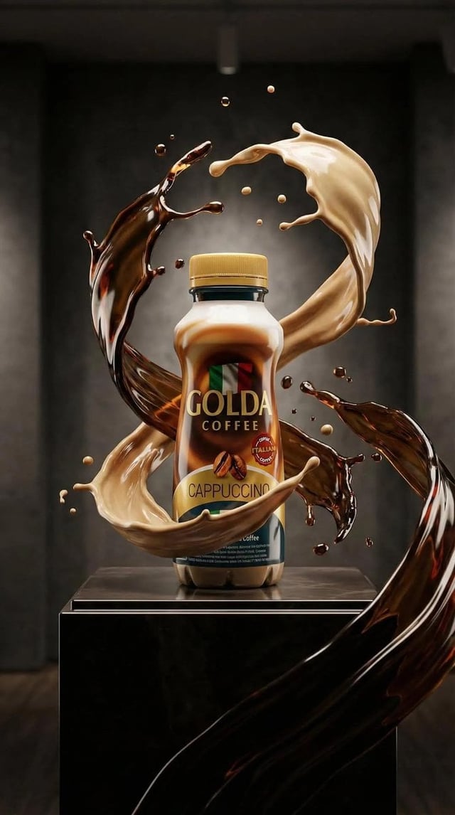
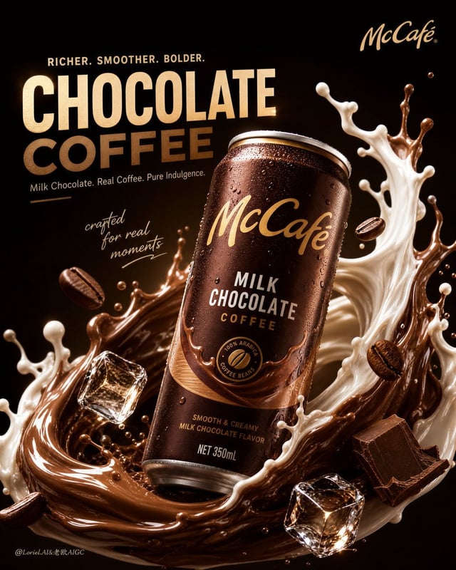
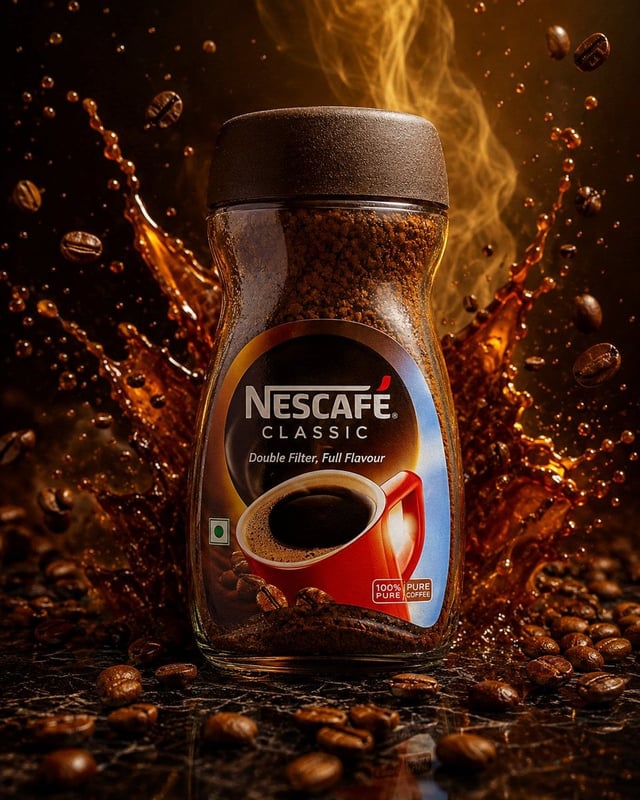
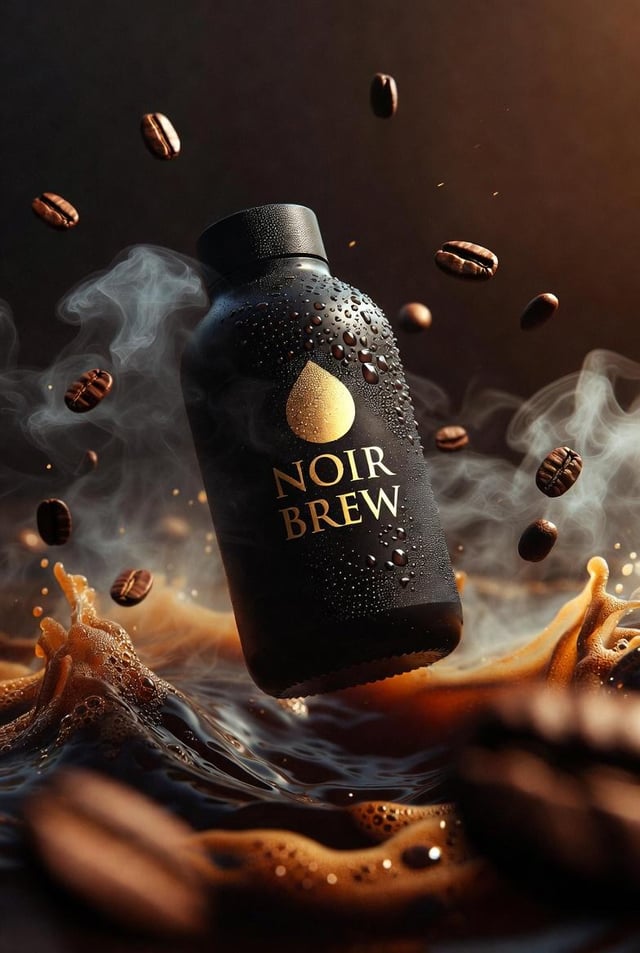
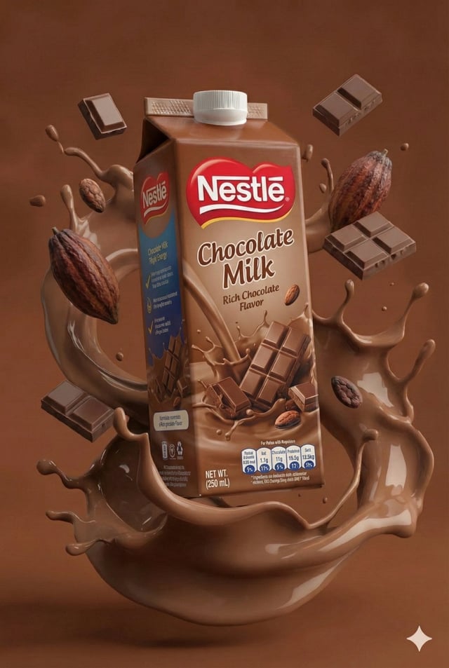
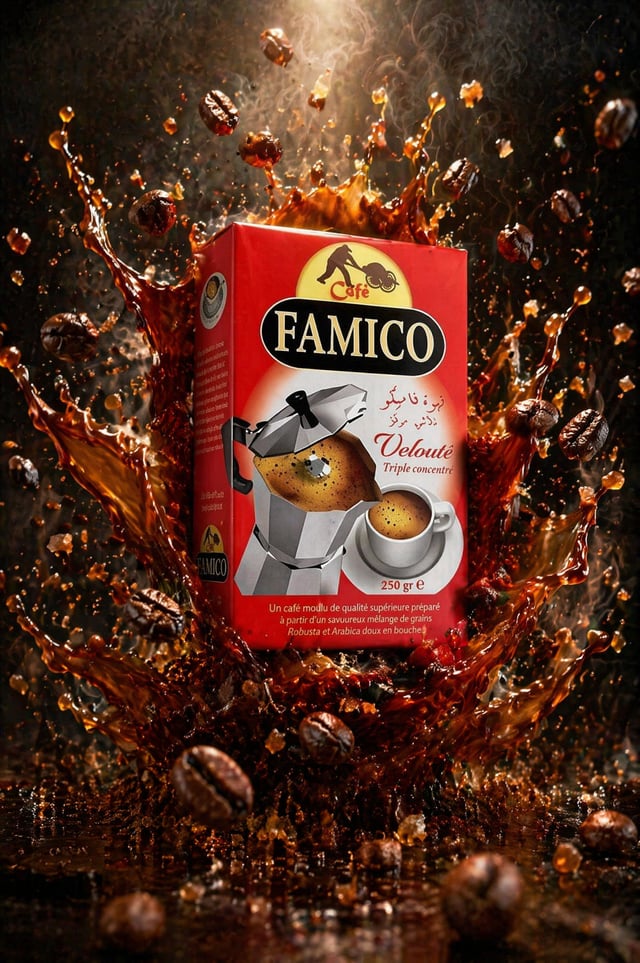
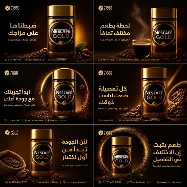
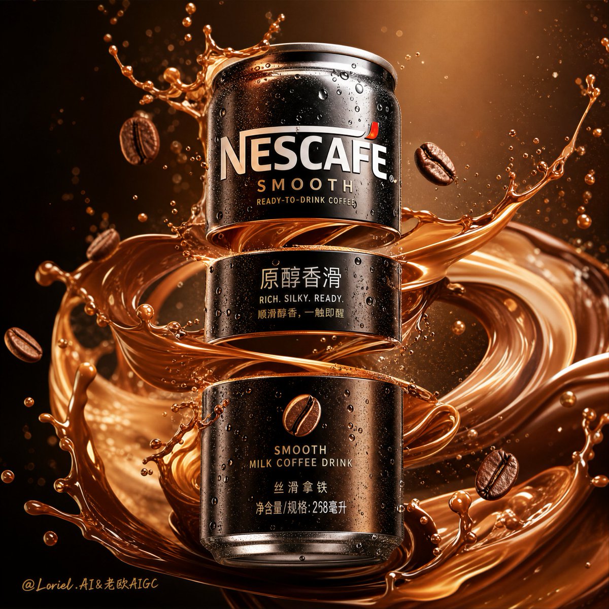
Create an ultra-premium commercial product poster for Nescafé smooth ready-to-drink canned coffee, designed as a high-impact liquid-motion advertising visual with extreme detail, clean composition, and luxurious coffee realism. The can must be the absolute hero, centered and sharply focused, with realistic Nescafé branding, accurate can proportions, premium metallic texture, and a rich ready-to-drink coffee identity. The entire image should feel like a world-class beverage campaign poster: bold, elegant, kinetic, clean, addictive, and highly premium. Main composition: a realistic can of Nescafé smooth canned coffee stands at the center of the frame in a heroic vertical composition. The can must look authentic and commercially believable: true-to-brand Nescafé identity, premium coffee can proportions, realistic metal surface, condensation droplets, subtle cold sheen, and readable product name. The can should feel rich, smooth, indulgent, and refreshingly chilled. Key visual structure: the can body should have a dramatic segmented split structure with strong visual tension. The can is artistically divided into 2 or 3 horizontal floating sections with narrow gaps between them, creating a high-impact fractured suspension effect. However, it must still clearly read as one unified Nescafé can, not multiple separate cans. The upper, middle, and lower parts must align perfectly in perspective, branding, and shape, so the object remains visually whole. Unified split effect: the gaps between the can sections are bridged by flowing coffee liquid, silky cream ribbons, suspended droplets, glossy caramel-brown splash trails, cold mist, and smooth dynamic arcs. The effect should feel like the coffee’s aroma, body, and creaminess are physically stretching the can apart while still keeping it unified as a single premium product. Fluid dynamics: build the poster around a dramatic sculptural coffee splash. Use rich flowing coffee streams, swirling creamy ribbons, glossy espresso-brown fluid arcs, suspended droplets, micro-spray, creamy foam accents, and smooth liquid folds wrapping around the can. The movement should feel elegant and explosive at the same time, like a frozen instant of pure coffee indulgence. The splash must be powerful but clean, never messy. Coffee realism: the coffee liquid must look extremely realistic: - deep roasted brown tones - silky crema-like highlights - smooth milk-coffee blending if appropriate - subtle caramel or latte-like flow accents - believable viscosity and splash weight - realistic reflections and transparency variation in thinner edges The liquid should instantly communicate “smooth, rich, aromatic, creamy coffee”. Flavor support elements: include a few premium supporting elements only if they enhance the coffee identity and remain clean: - floating roasted coffee beans - subtle cream swirl accents - tiny caramel-toned droplets - soft coffee mist - minimal micro foam or milk silk Do not overload the composition with props. Everything must support the can. Visual impact: the image must feel immediate and high-energy. The viewer should instantly read: Nescafé, coffee, smoothness, richness, chilled indulgence, dynamic motion. The segmented can body adds visual shock, while the flowing coffee and creamy trails create unity and refinement. Background: keep the background extremely clean and premium, with a smooth studio gradient in warm espresso brown, bronze, deep caramel, or creamy mocha glow. The backdrop should enhance the product and fluid without introducing clutter or scene distractions. Lighting: premium studio beverage lighting, strong specular highlights on the can, realistic metallic reflections, glossy highlights on the coffee splash, soft glow through thinner liquid edges, rich controlled shadows, cinematic product polish, and clean separation from the background. Color palette: deep espresso brown, roasted coffee black-brown, caramel bronze, creamy latte beige, warm mocha glow, subtle metallic silver can highlights, rich amber reflections. The palette should feel smooth, rich, premium, and indulgent. Typography: if additional text is included beyond the can design, keep it minimal, elegant, and art-directed. Use refined English and Chinese campaign text such as: “Nescafé” “Smooth Ready-to-Drink Coffee” “原醇香滑” “RICH. SILKY. READY.” “顺滑醇香,一触即醒” Typography must feel premium, sharp, and beautifully composed, not crude or generic. Style: ultra-realistic, hyper-detailed beverage photography, premium commercial advertising, sculptural coffee fluid dynamics, frozen motion, segmented can body, unified product identity, extreme detail, clean luxury poster aesthetic, 8K, masterpiece. Negative prompt: multiple separate cans, disconnected can pieces, unreadable Nescafé label, distorted packaging, cartoon liquid, muddy colors, weak coffee texture, flat lighting, cheap beverage ad, fake droplets, excessive props, cluttered background, plastic-looking coffee, ugly typography, watermark