Related creations
![Professional advertising product photography of [PRODUCT NAME] in its original packaging, hero shot](https://images.meigen.ai/cdn-cgi/image/format=auto,quality=85,width=640,fit=scale-down/generations/2026-06/community_3bab0153-80b1-425a-abfb-96d239fb43cf.png)
![A premium [BRAND NAME] [PRODUCT TYPE] centered in the frame, iconic [BRAND COLOR / PACKAGING STYLE]](https://images.meigen.ai/cdn-cgi/image/format=auto,quality=85,width=640,fit=scale-down/tweets/2006643289185989070/0.jpg)
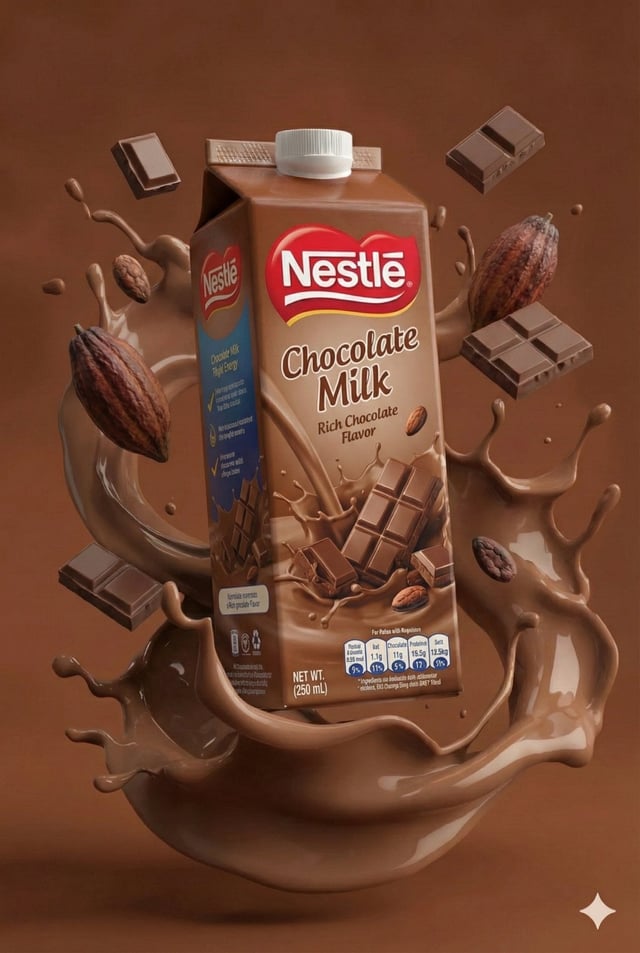
![Create a premium playful 3D advertising poster for [Brand Name] using the attached brand logo as the](https://images.meigen.ai/cdn-cgi/image/format=auto,quality=85,width=640,fit=scale-down/tweets/2068467943487271067/0.jpg)