Related creations
![[BRAND NAME] + [HERO COLOR]](https://images.meigen.ai/cdn-cgi/image/format=auto,quality=85,width=640,fit=scale-down/tweets/2038707148981432392/0.jpg)
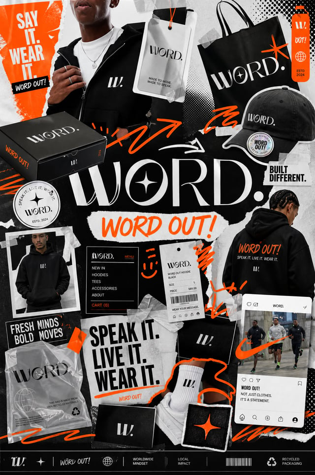
![[BRAND NAME]](https://images.meigen.ai/cdn-cgi/image/format=auto,quality=85,width=640,fit=scale-down/tweets/2051737055680397362/0.jpg)
![Create a typographic illustration shaped like a [OBJECT], where the text [BRAND SLOGAN] forms the sh](https://images.meigen.ai/cdn-cgi/image/format=auto,quality=85,width=640,fit=scale-down/tweets/2038261502696648942/0.jpg)
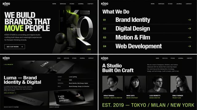
![Design a high-end, cinematic landing page website concept for the brand [BRAND NAME]. The layout sho](https://images.meigen.ai/cdn-cgi/image/format=auto,quality=85,width=640,fit=scale-down/generations/2026-06/community_3e5b4d18-83ae-402f-a4a0-506d0467efc5.png)
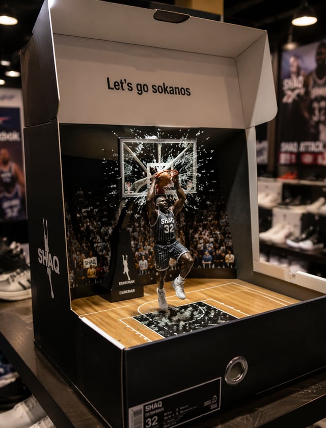
![Create a premium UGC-style advertising poster for [Product] by [Brand]. Use the product as the clear](https://images.meigen.ai/cdn-cgi/image/format=auto,quality=85,width=640,fit=scale-down/tweets/2068736795827646513/0.jpg)