Related creations
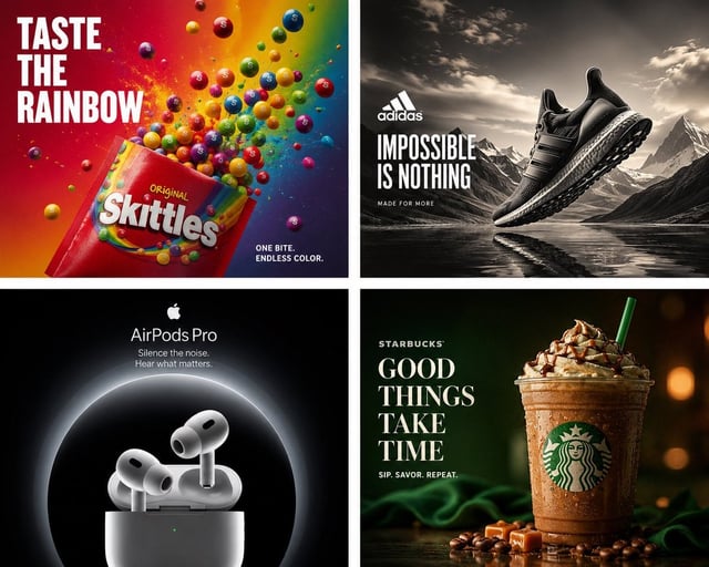
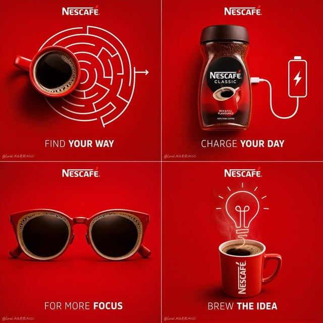
![Create a 16:9 horizontal bento-grid brand collage for [BRAND NAME] in a polished contemporary campai](https://images.meigen.ai/cdn-cgi/image/format=auto,quality=85,width=640,fit=scale-down/tweets/2047423024068952489/0.jpg)

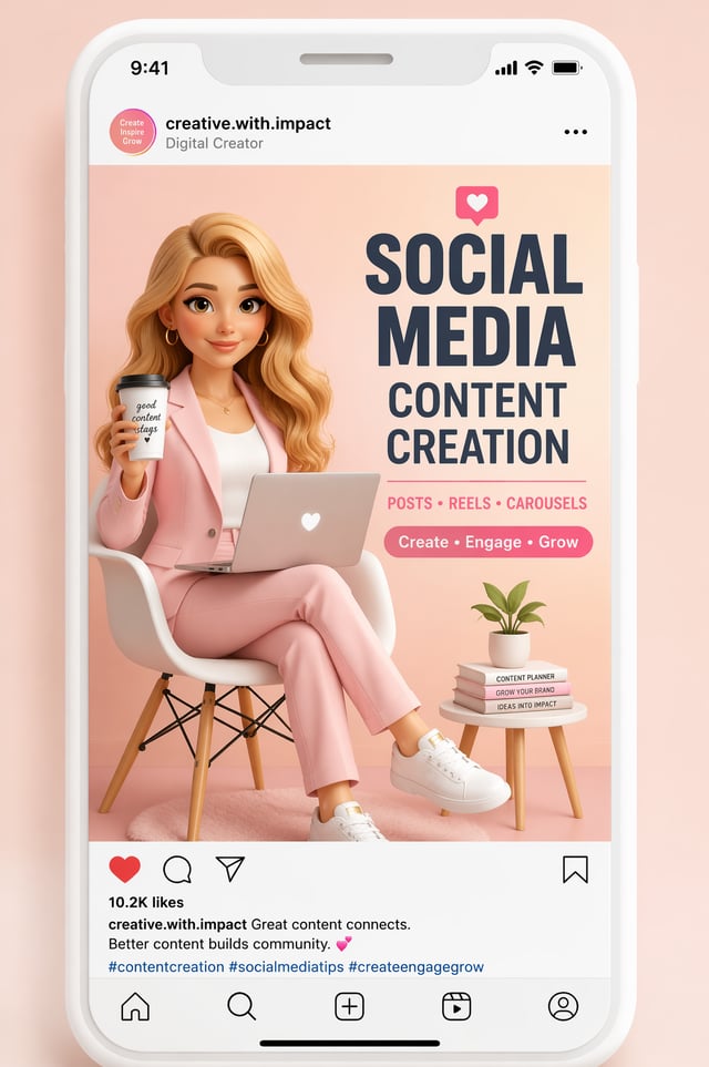
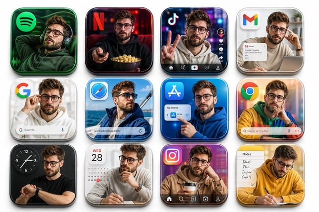
![[BRAND NAME]](https://images.meigen.ai/cdn-cgi/image/format=auto,quality=85,width=640,fit=scale-down/tweets/2031446250214572438/0.jpg)
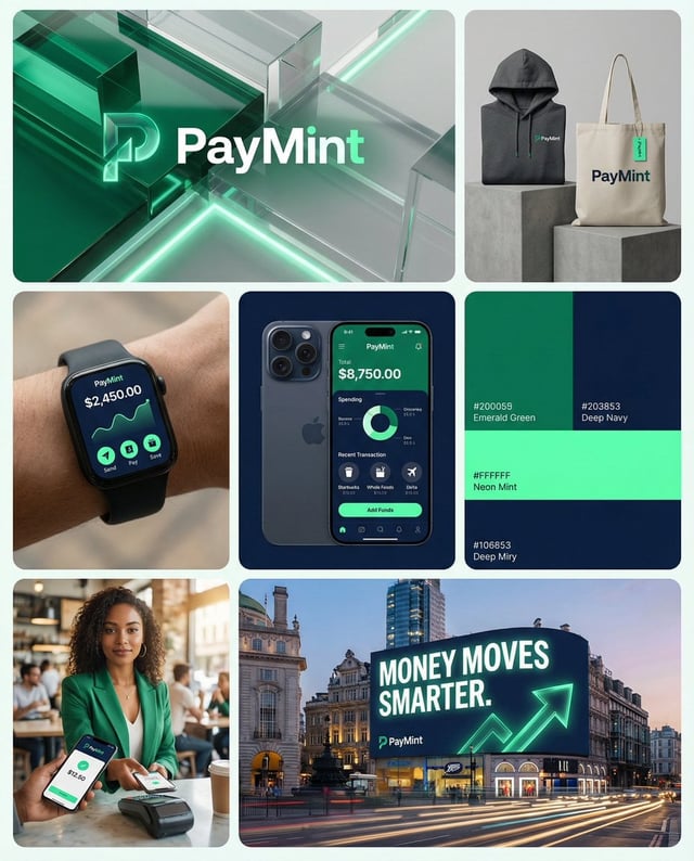
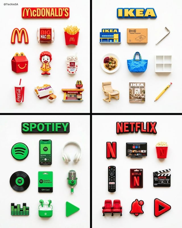
![[BRAND NAME]](https://images.meigen.ai/cdn-cgi/image/format=auto,quality=85,width=640,fit=scale-down/tweets/2072419986220675238/0.jpg)