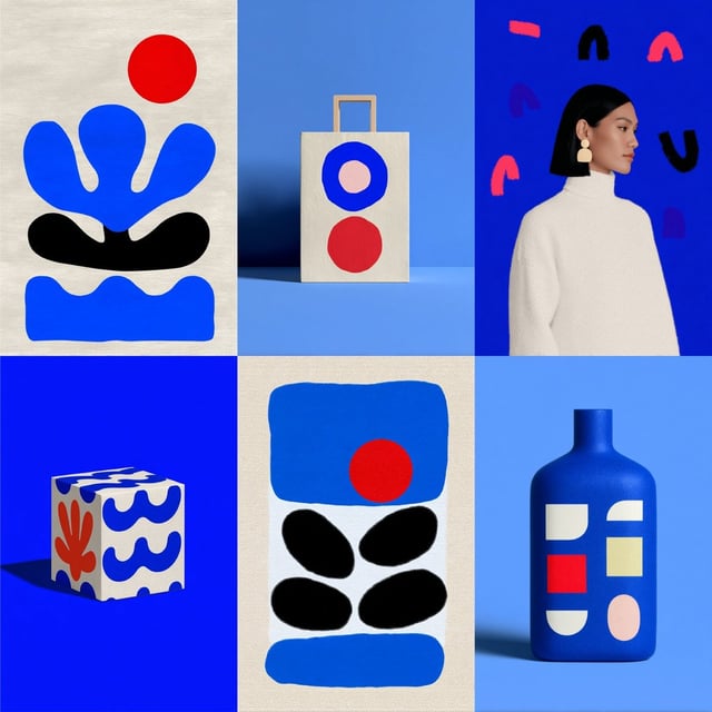
Related creations
![[BRAND]. A hyperrealistic editorial photo of a figure wearing a unique helmet or mask that embodies](https://images.meigen.ai/cdn-cgi/image/format=auto,quality=85,width=640,fit=scale-down/tweets/2041238850962382939/0.jpg)
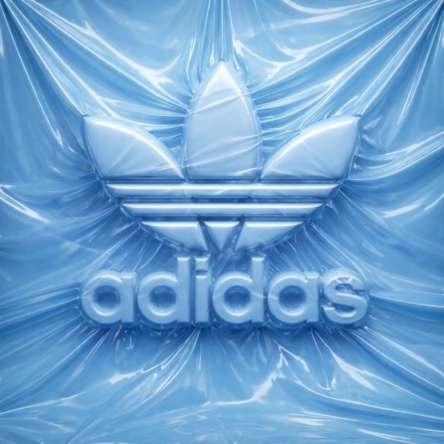
![Create an ultra-detailed hyper-realistic 3D render of [Logo], formed from thick industrial rubber tu](https://images.meigen.ai/cdn-cgi/image/format=auto,quality=85,width=640,fit=scale-down/tweets/2076305333556015443/0.jpg)
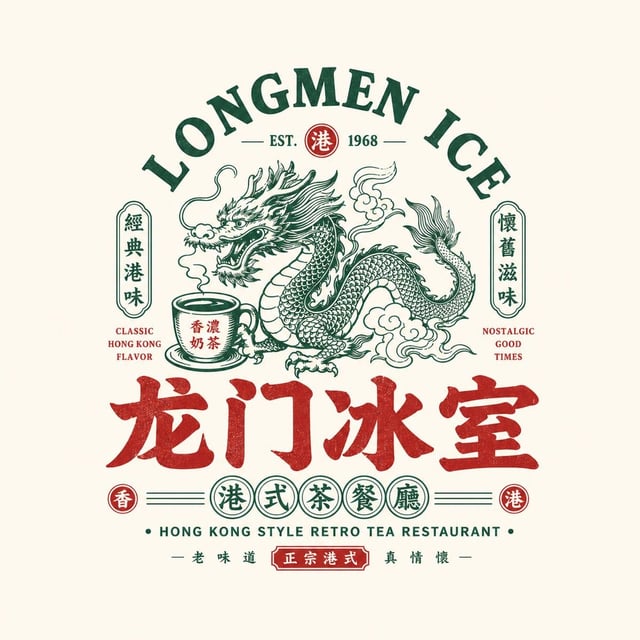
![[BRAND NAME] + [COLOR] (optional).](https://images.meigen.ai/cdn-cgi/image/format=auto,quality=85,width=640,fit=scale-down/tweets/2072368874746429869/0.jpg)
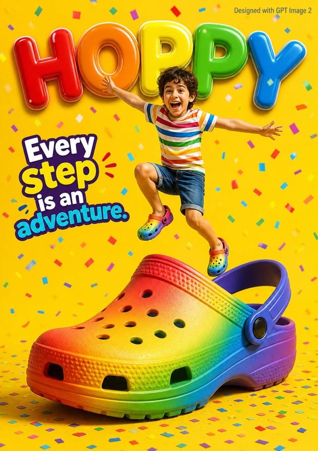
![Create a typographic illustration shaped like a [OBJECT], where the text [BRAND SLOGAN] forms the sh](https://images.meigen.ai/cdn-cgi/image/format=auto,quality=85,width=640,fit=scale-down/tweets/2038261502696648942/0.jpg)
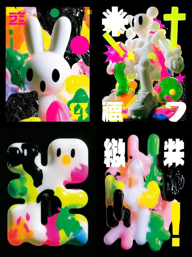
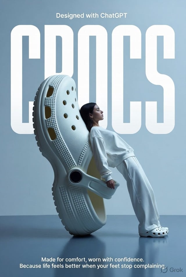
![[BRAND NAME]](https://images.meigen.ai/cdn-cgi/image/format=auto,quality=85,width=640,fit=scale-down/tweets/2040157426775724206/0.jpg)
![A high-end editorial photo of a [PRODUCT] placed flat on a [TEXTURED SURFACE], captured from a direc](https://images.meigen.ai/cdn-cgi/image/format=auto,quality=85,width=640,fit=scale-down/tweets/2008559850968473671/0.jpg)