
Prompt
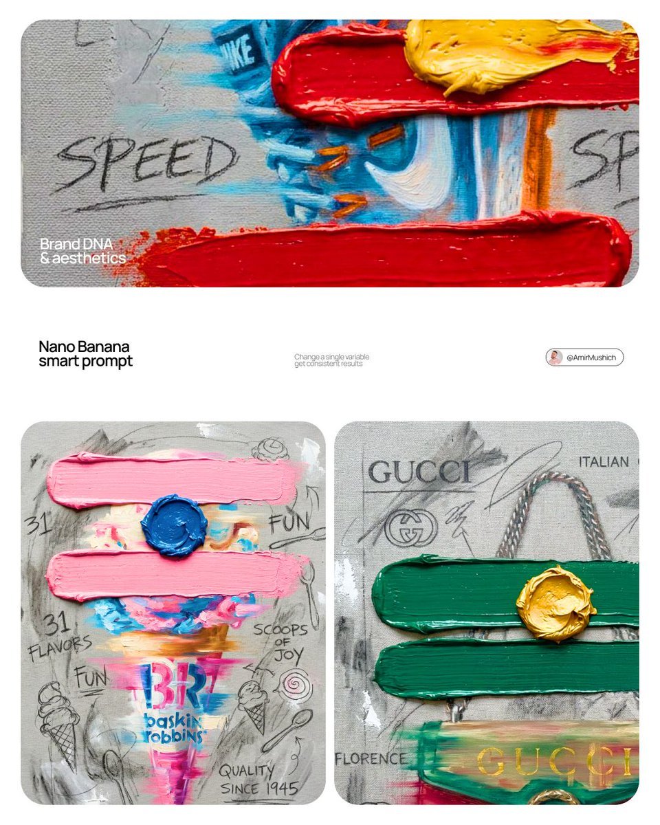
[BRAND NAME]. Goal: Generate a professional mixed-media oil painting on textured canvas where the color palette and graphics are dynamically adapted to the brand identity. 1. BRAND COLOR ADAPTATION - Analyze the visual identity of [BRAND NAME]. - Use the primary brand color for the two main horizontal impasto strokes. - Use a contrasting secondary brand color for the thick, raised central dollop of paint. - Replace the original red and yellow with this new adaptive color scheme. 2. PAINTED SUBJECT & MOTION - Object: A central, vertically oriented product related to [BRAND NAME], rendered as a cohesive OIL PAINTING directly on the canvas. - Technique: Apply a "motion blur" oil painting effect with visible horizontal brushstrokes to create a sense of dynamic movement. - Integration: The object must be part of the painted layer, sharing the same heavy-grain canvas texture as the background, not an overlay. - Branding: Paint the "[BRAND NAME]" logo using distressed, semi-transparent oil paint layers within the object's silhouette. 3. ADAPTIVE IMPASTO & TEXTURE - Primary Strokes: Two thick, physical, horizontal impasto oil paint strokes applied over the painted object in the brand's primary color. - Detail: One heavily textured, raised dollop of the brand's secondary color oil paint placed precisely on the center stroke. - Surface: Background is a raw, heavy-grain grey textured canvas with visible weave, charcoal smudges, and gesso dabs. 4. BRAND-CENTRIC GRAPHICS - Handwriting: Use charcoal and graphite to scribble keywords, slogans, and values associated with [BRAND NAME] across the canvas. - Symbols: Replace the original $ and doodles with hand-drawn, messy abstract icons representing [BRAND NAME]. - Execution: All text and symbols must look like they were scratched or drawn with graphite over the dried oil paint layers. 5. STYLE - Contemporary mixed-media pop-art. 8K macro photography focusing on the physical thickness of oil paint and the raw canvas grain.